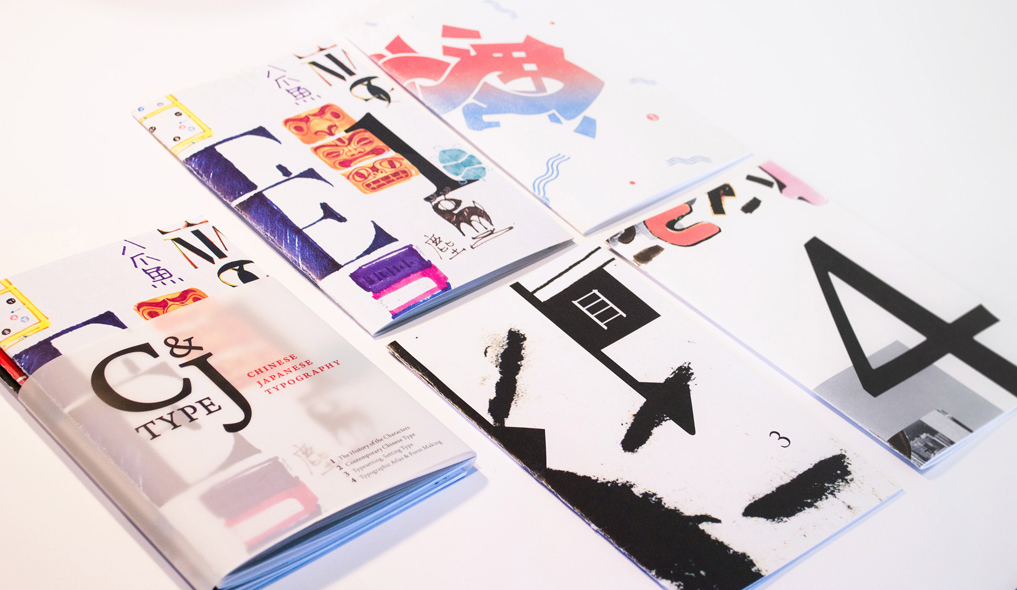
C&J Type Covers
C&J Type (Chinese and Japanese Typography) is a four-part zine authored and designed by Jessica Kao, Miyu Shirotsuka, Kennis Wong, and Karin Yamauchi, under the tutelage of faculty Caryn Aono. This project took shape over the spring 2014 semester, and was supported by the CalArts Diversity Grant. Jessica introduces the project with further comments from her collaborators Miyu and Kennis.

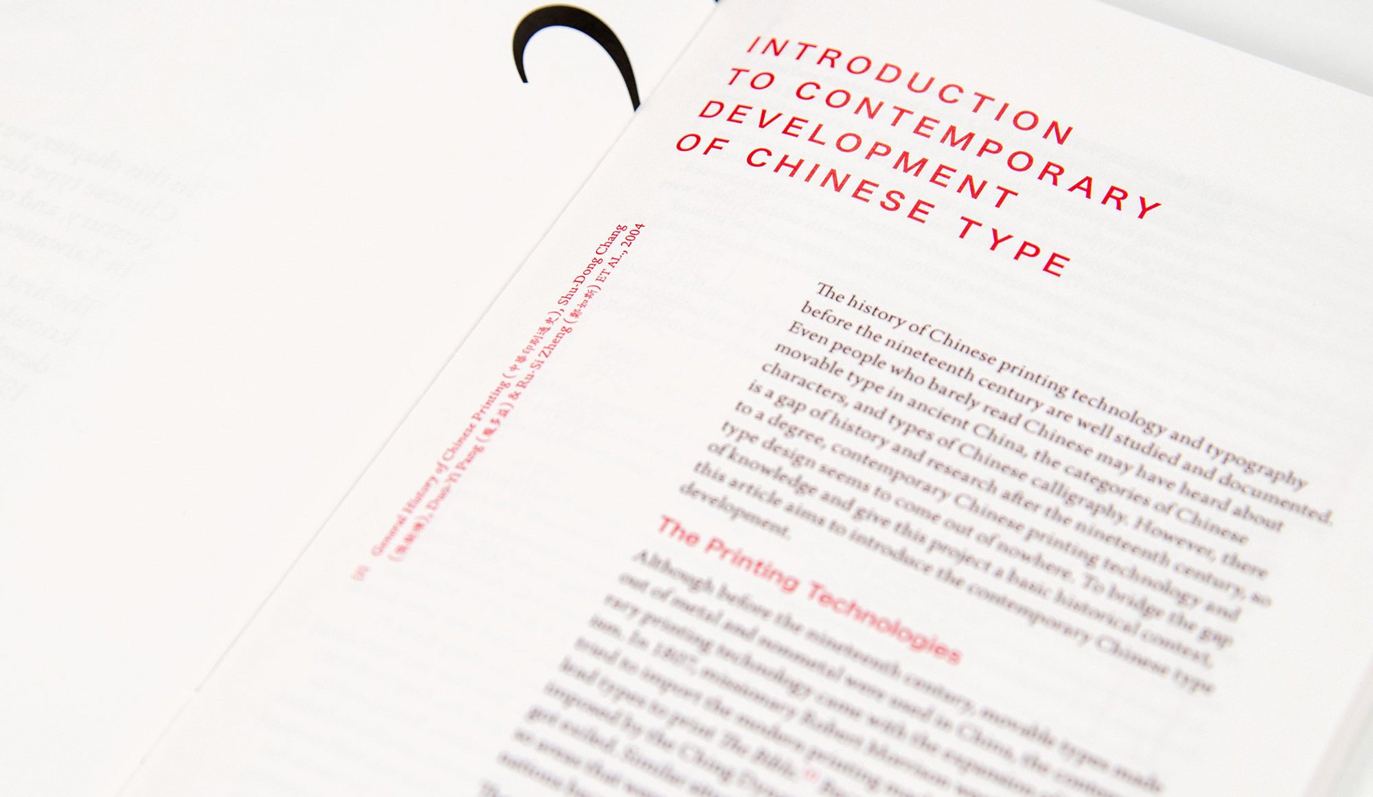
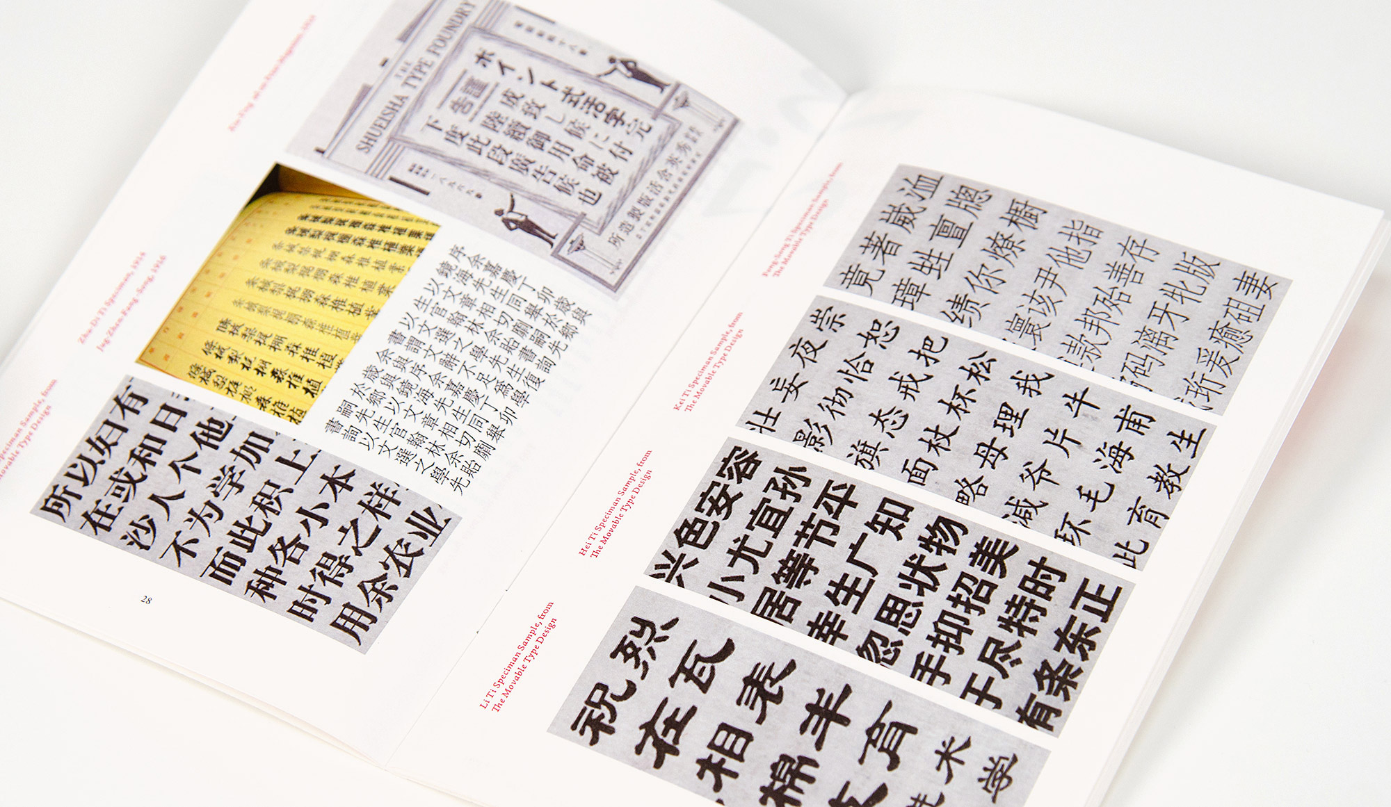
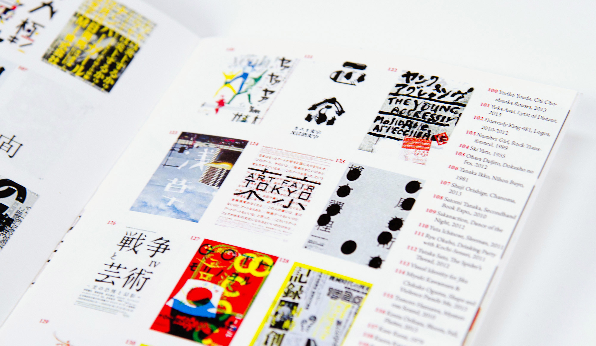
C & J Type, Zine #1, The History of the Characters, designed by Kennis Wong
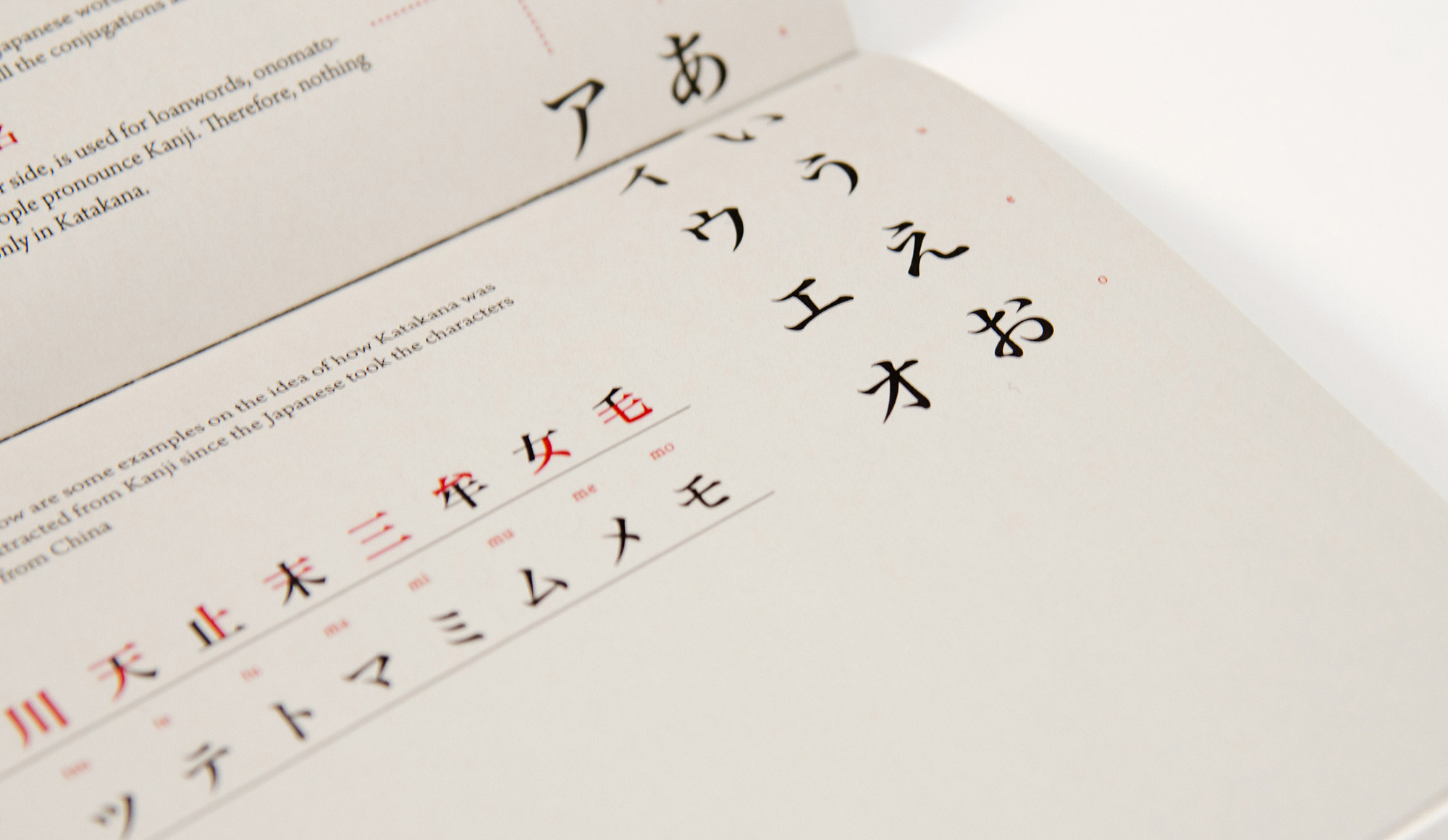
Detail of C & J Type, Zine #1
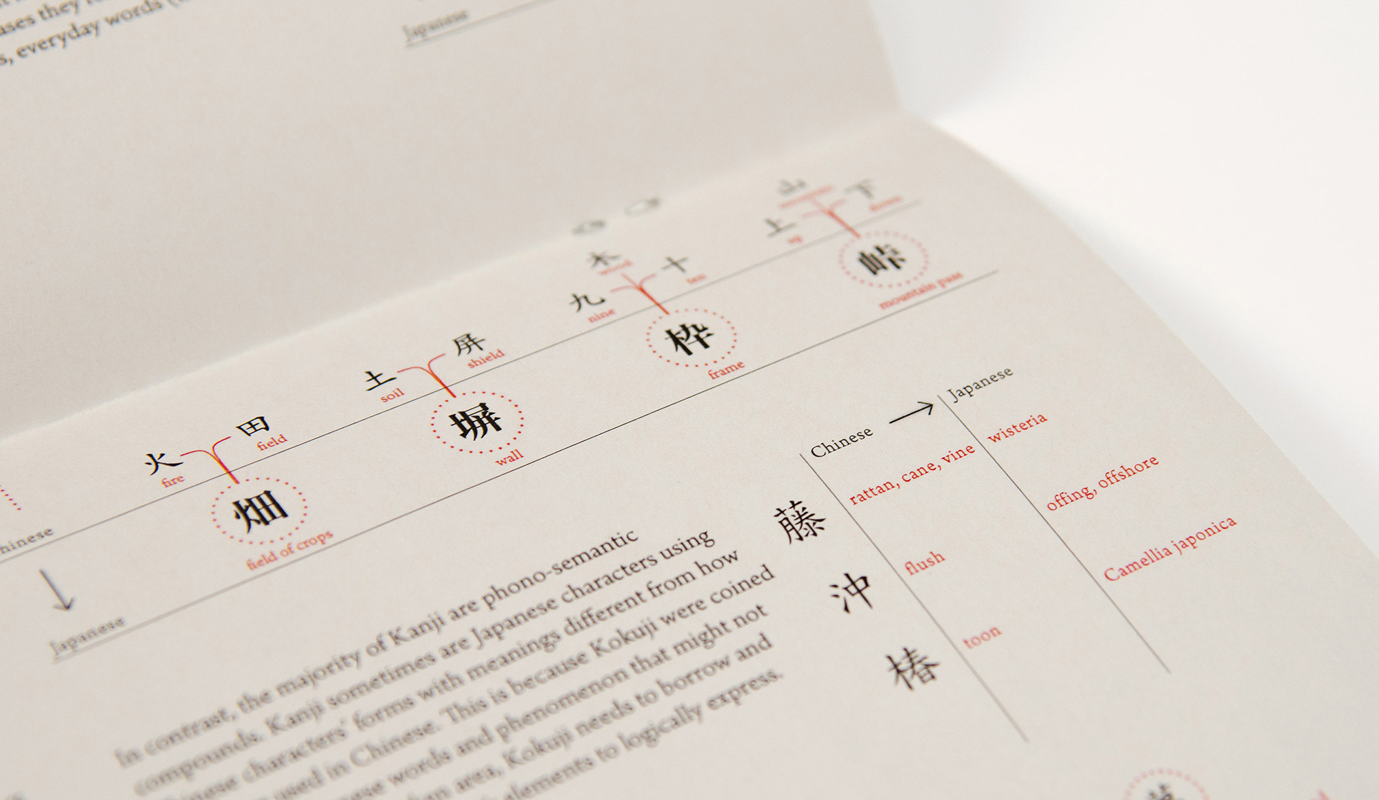
Detail of C & J Type, Zine #1
Jessica Kao (MFA 2)
As a designer coming from a non-design background and from Taiwan, I learnt type and typography firstly in English, with the Roman alphabet. I found myself deeply drawn to type and typography, and have been amazed by how much effort and attention is dedicated to typography. So I started to wonder, how about traditional Chinese, my mother language? How did Chinese designers think about Chinese typography, and how did they play with it? Were there commonalities between Chinese and Roman typography, and what would the differences be? That was the starting point. I was very concerned, since I did not have any Chinese type and typography training and the weight of its history caused me to hesitate. Fortunately, I had a caring and knowledgeable instructor, Caryn Aono. She encouraged me to start a project, even if it was just a small step, and she introduced Karin, Kennis and Miyu to me, who had similar experiences: we are all Asian woman, and first learned typography with the Roman alphabet here. We were also eager to explore our own languages (Japanese and Chinese), after we “tasted” the wonderfulness of typography. We decided to explore together, and it was an awesome team that made this project possible together.
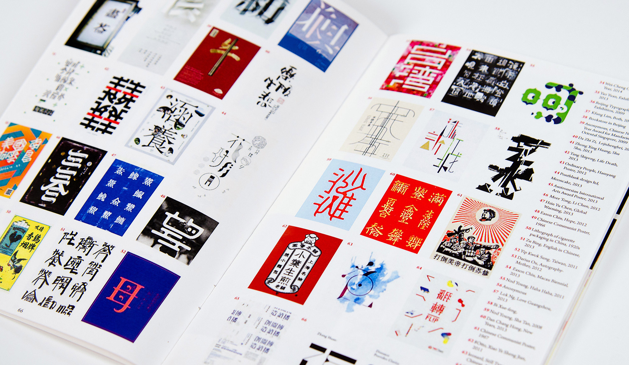
C & J Type, Zine #2, Contemporary Chinese Typography, designed by Jessica Kao
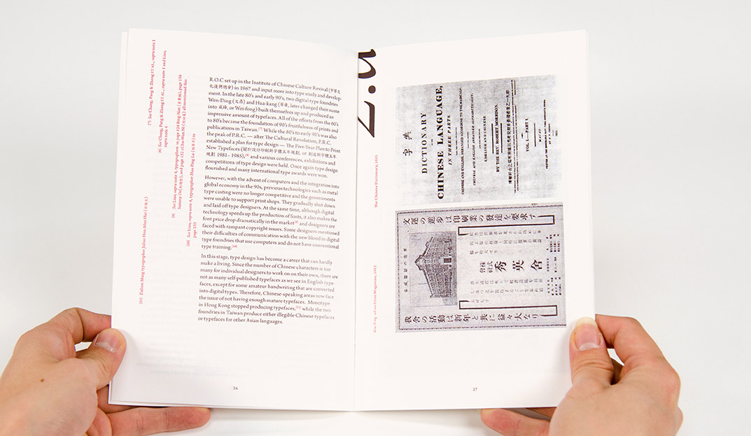
Detail of C & J Type, Zine #2
Detail of C & J Type, Zine #2
Miyu Shirotsuka (BFA 3)
When I first came to CalArts to study graphic design, I was constantly referring to Japanese design and culture. But after the first semester of my second year, I started to feel ashamed that I was expressing my nationality so much in my designs. I thought that maybe my attachment to Japan is hindering me from becoming a more well-rounded designer. This made me start to disregard Japanese design, forcing myself to open my eyes to new things and do things that I usually don’t do. It was interesting…and eye-opening…but kind of unsatisfying. When I started researching Japanese design through the C&J type project, I realized again how beautiful Japanese culture and design is, and that I might have been hindering my learning by denying my identity as a Japanese designer. It helped me appreciate the advantages I have in being a Japanese designer and that I shouldn’t be ashamed of it.
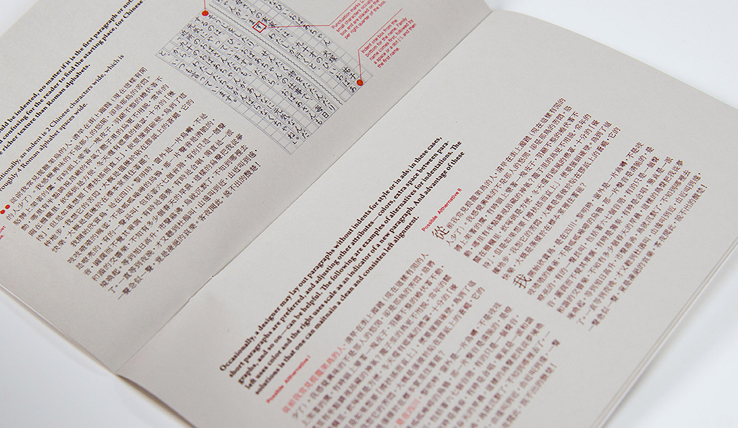
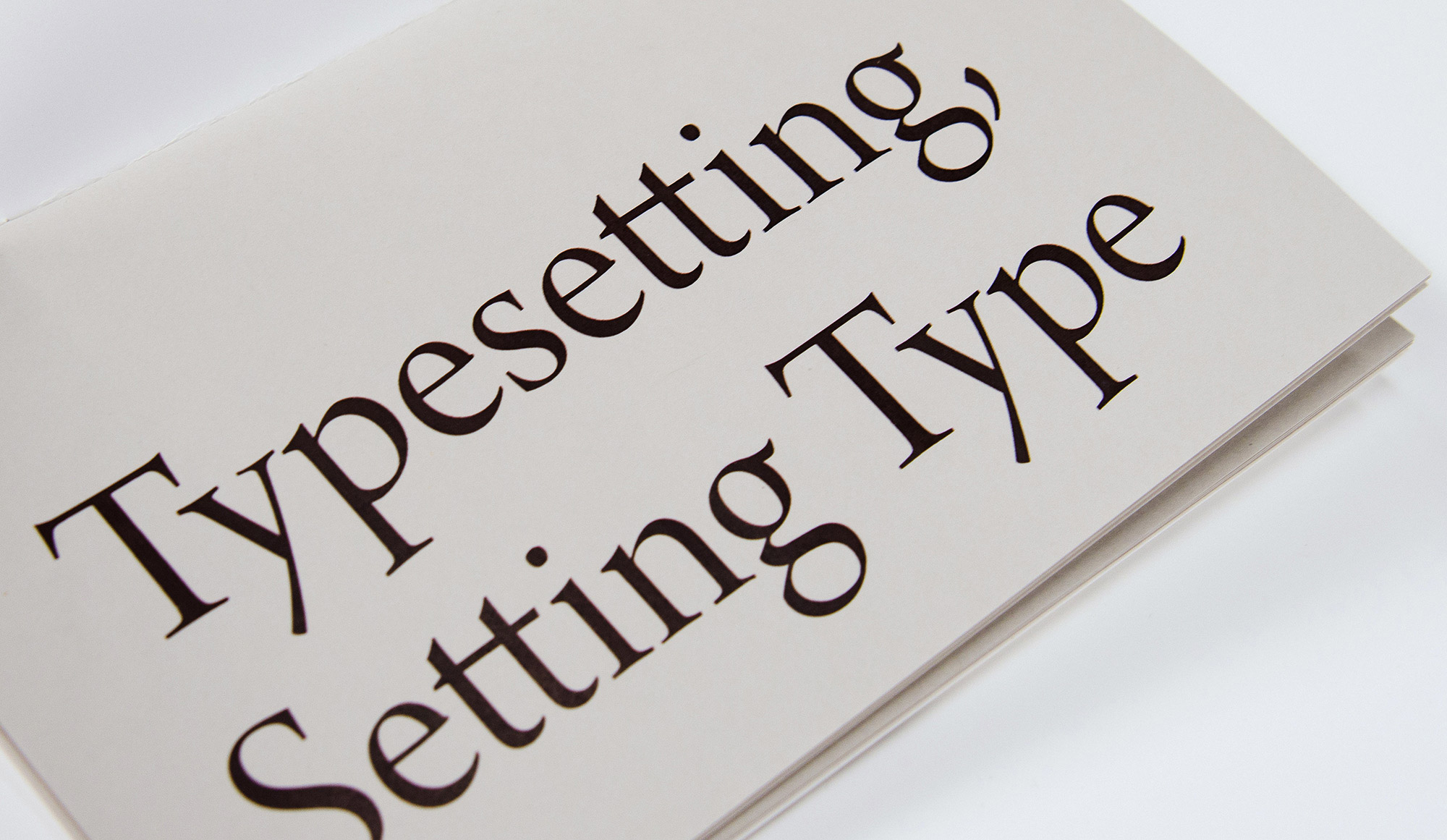
C & J Type, Zine #3, Typesetting, Setting Type, designed by Miyu Shirotsuka
Detail of C & J Type, Zine #3
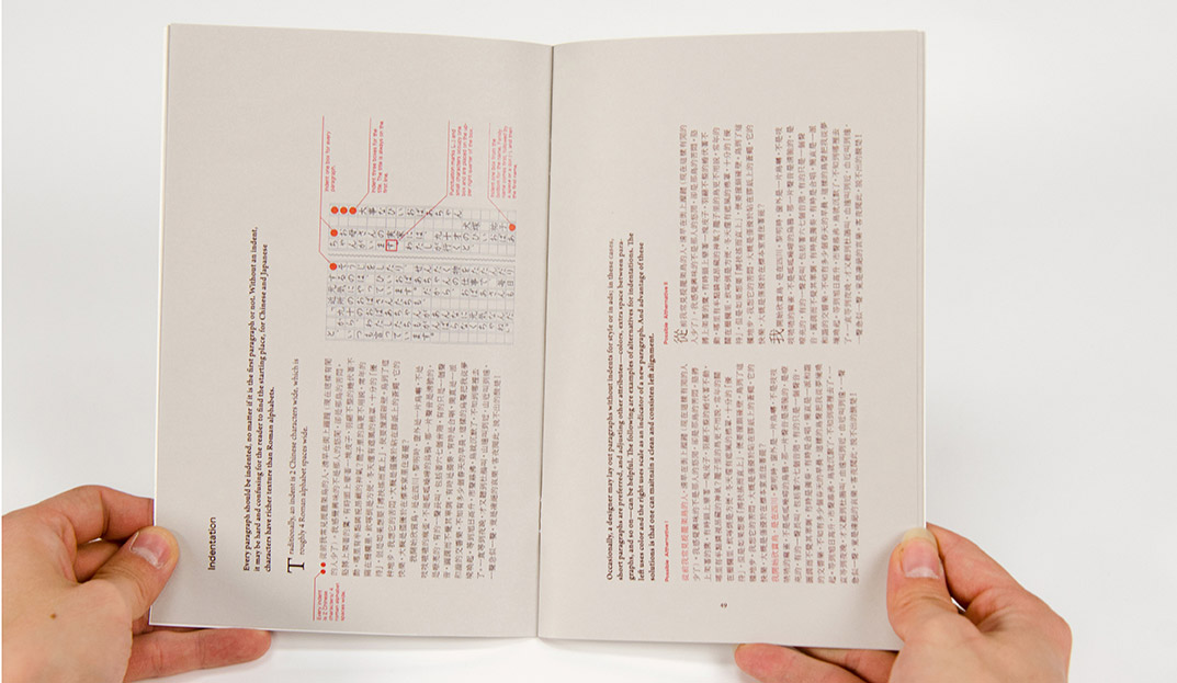
Detail of C & J Type, Zine #3
Kennis Wong (BFA 3)
For zine #3 we were able to demonstrate a new kind of typesetting knowledge, with Jessica Kao showing us efficient ways to set Chinese and Japanese type in InDesign. Since I didn’t know much about typesetting in Chinese or Japanese, the topic helped lead my research for zine #1. I was interested in comparing typesetting methods between English and Chinese, and I learned about the evolution of Chinese typography from pictorial to character based. We got more creative in zine #4, with Karin applying her image making skills to create images with Chinese and Japanese type. We included work that influenced us in zine #4 with the hope of building context for the other three zines, as well as demonstrating the beauty of Japanese and Chinese typography.
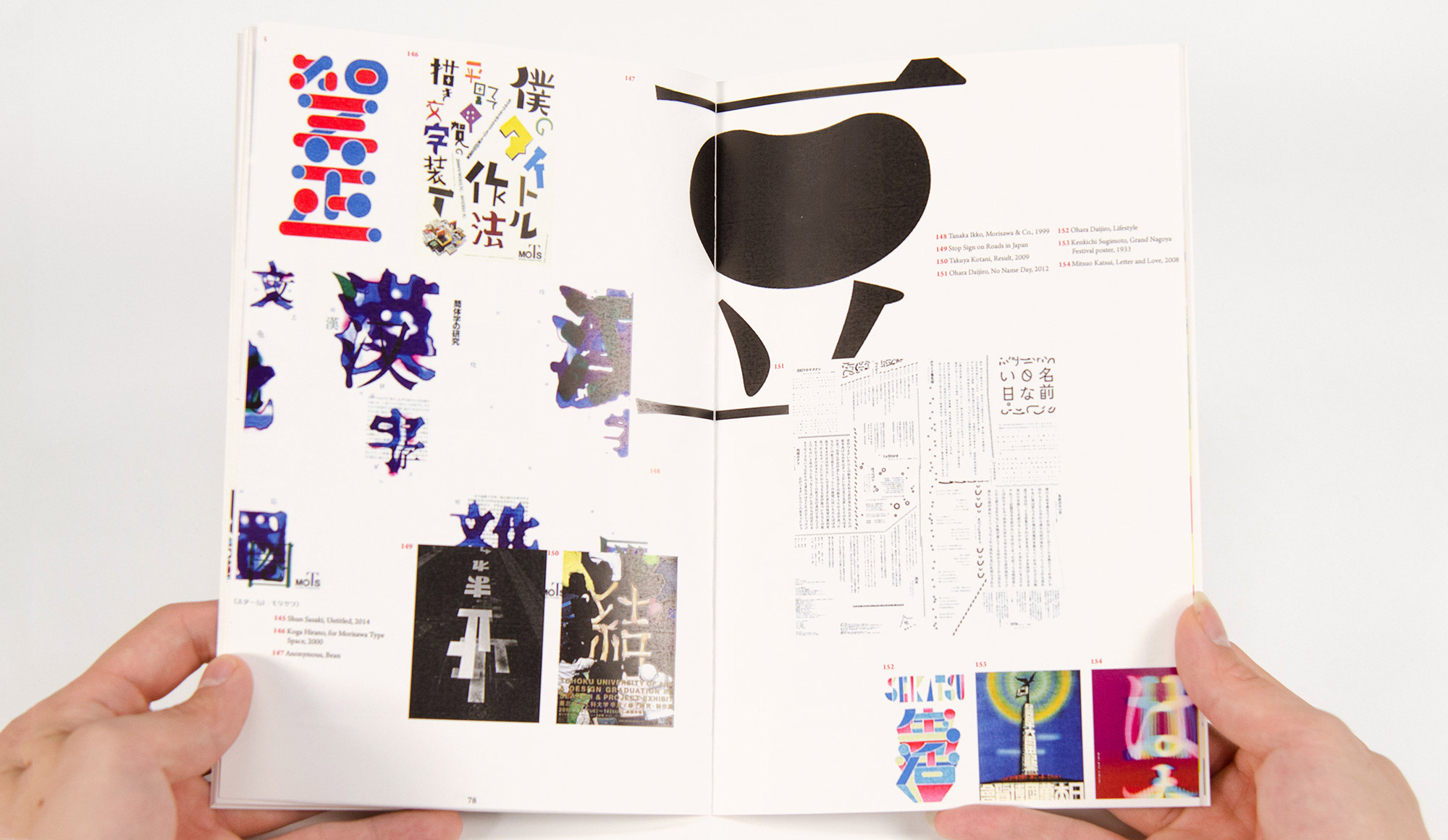
C & J Type, Zine #4, Typographic Atlas and Form Making, designed by Karin Yamauchi
Detail of C & J Type, Zine #4
Detail of C & J Type, Zine #4
Caryn Aono, Design Faculty
Jessica’s deep-dive into the C&J Type pool with Kennis, Miyu, and Karin is a terrific example of the independent study faculty like to see. It’s a smart collaboration of four diverse inquiries finishing with a chapter of applied expression. I’m so pleased they published their findings and hope it continues to typo-inspire beyond our studios.