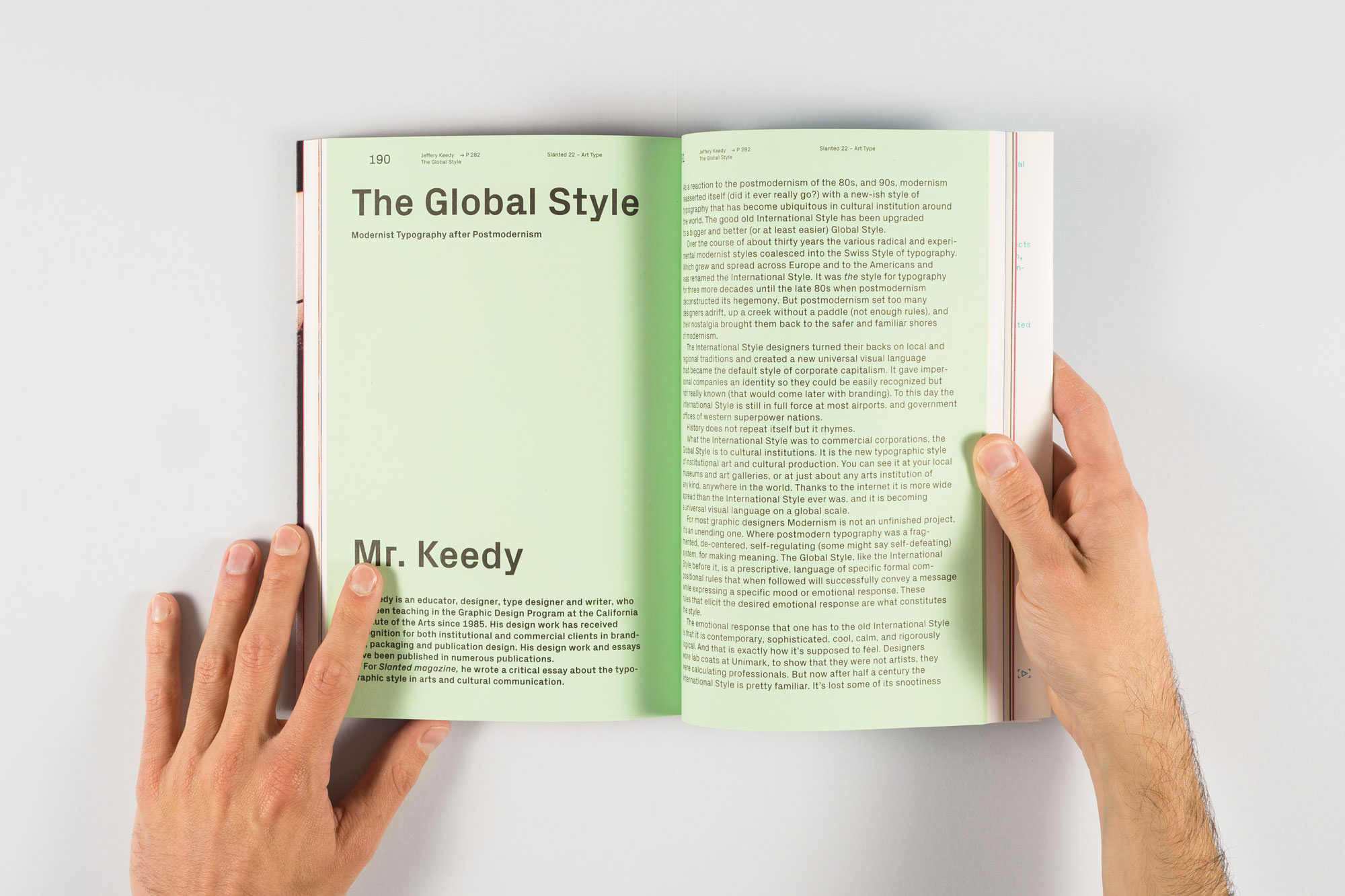
Mr. Keedy’s article, ‘The Global Style’ as it appears in the winter 2013/2014 issue of Slanted magazine.
Last winter, faculty member Mr. Keedy published an article in the German typography periodical Slanted, identifying and critiquing a ‘new Global Style’ in contemporary graphic design. Mr. Keedy criticized adherents of the style for serving up tired International style formal tropes with an irony-tinged mixture of nostalgia and studied naïveté. New faculty member Anther Kiley, probably guilty of such design transgressions himself, revisits the discussion with Mr. Keedy, a year after the article’s initial publication.
You begin your article by characterizing — well, dismissing — the ‘Global Style’ as a “bigger and better” incarnation of “the good old International Style,” returned to out of “nostalgia.” You suggest that the style has nothing to express other than “cool, ironic, ennui.” Is this entire aesthetic current really just an ironic-nostalgic re-hash of Modernism?
Since George Howe said “Modernism is not a style” in 1930, it has been repeated endlessly by other architects and graphic designers like Paul Rand. Graphic designers have misconstrued this to mean that Modernism is some kind of meta-style that is timeless. Modernism is a genre of styles not a singular style so the Global Style is not a re-hash of Modernism, it’s just the most recent iteration. This essay is an update to my previous essays “Zombie Modernism” and “Modernism 8.0.” I am just trying to keep up with the endlessly evolving styles of Modernism because it is the aesthetic that is most important to graphic design.
Previous iterations have also been “cool” and “ironic” but it is the world weary surrender to “been there, done that” ennui (thanks to the internet and globalization) that I think is new and worth noting. It is a style that says “I’m not going to try and impress you with skill, craft, technique, originality, or complexity, because thats been done already.” Is that a worthy addition to the Modernist canon? No, I don’t think so but it is understandable.
You talk a lot about grids. You point out that, for International Style designers, the grid had to be intentionally delineated by the designer; today it is a pervasive, but scale-less and dimension-less default of digital space, and this new reality is reflected in a similarly scaleless and dimension-less treatment of space in Global Style design. This is one of the few places where you attribute a characteristic of the Global Style to something other than Modernism. Do you think that the aesthetic influence of the digital might also explain other characteristics of the style?
The digital is a product of Modernism so it was always already there. Theo Van Doesburg’s orthogonal typefaces preceded Zuzana Licko’s bitmapped fonts. The digital in itself has added very little because the aesthetic was embedded in the technology. What has had an effect is what the digital technology has done to society and how we communicate with each other.
The scale-less and dimension-less space we now inhabit for an alarming amount of time is completely disassociated from human scale, the base unit by which we previously calibrated our experience. And the difference between the 2-D tangible object in space and 4-D intangible images in time, have been destabilized. If you have seen the videos of babies pushing on images in printed books expecting them to change like they do on an iPad, you know it is because they assume graphic images are mutable and subject to instant change. And why wouldn’t they be? The Global Style assumes that all graphic images we see are not only ephemeral they are transient. That’s new.
You see this transience in the handy type compositions that are designed for a quick timeframe, limited attention, and indeterminate scale. Because the context these compositions reside in are unknown, they bring with them their own white space and are delineated with a border or diagonal line to demarcate the brief time and unknown scale and space they occupy. They don’t ask for much and they expect even less from the viewer. That’s new, too.

The formal tropes of the ‘New Global Style’: posters generated with trendlist.com’s ‘Trend Generator’ app by Mr. Keedy.
In a 2003 interview with Rudy VanderLans, Rob Giampietro attributed many of the stylistic gestures of what was perhaps a then emerging ‘Global Style’ to an interest in digital defaults — RGB blue, Times New Roman, underlines, and centered layouts, for instance, are all HTML default styles, while scattered typography, geometric shapes, and wavy strokes are default Adobe. Might this interest in defaults, which themselves often deploy Modernist tropes, account for the Global Style’s stylistic similarities to Modernism, rather than pure nostalgia? Or are the two connected?
From Le Corbusier’s “grain elevators” to Piet Zwart’s “the more uninteresting the letter, the more useful it is to the typographer” the ordinary, basic, and functional are mainstays in the Modernist ode to “authenticity.” The nostalgia is for the authentic, the true, and the timeless. This explains the great esteem that steadfast aesthetes hold for defaults and Helvetica. For that they should be awarded with a golden cornball!
At the end of the article, you lament that, having finally transcended our former position as “problem solving commercial tools,” we have traded one master for another, the cultural institution. At the same time, you dismiss self initiated work by designers as “of no use or interest to anyone but [the designers] themselves and a few under-employed friends.” Wherever does this leave us?!
Self-initiated work has existed as long as designers have been designing but once a designer shows it to anyone else it is self-promotion. Keep it to yourself and it will remain a private disappointment or point of pride, only you can say. Self-initiated self-promotion is useful, even essential for some, but to what end are you promoting yourself? To demonstrate a set of skills, a style, intellectual acuity, a political or social ideology? Are you looking for work, community, or attention? It is increasingly unclear why some design work is done at all and who it is for.
So called “speculative design” or “critical design” are in reality institutional projects that have little use or interest outside of the institutions that generate them. Whilst this crit room fodder can have a lot of pedagogical value in school, it is a mistake to presume as the fine artist does, that your particular brand of self-indulgent navel-gazing is something the rest of the world needs or wants. Ironically the lack of any criteria for “speculative” or “critical” design makes critical evaluation impossible. It doesn’t have to do anything (outside of the classroom). Your fantasy praxis is the residue of privilege. Obviously if the work is brilliant, beautiful or interesting, that is reason enough for it to exist – but mostly it’s just dumb and boring.
I don’t think the way forward is to dump clients and follow your bliss unless you’re rich or retired. The future, like the past, is in the real world, with real projects, self-initiated as well as by commission. Make the world you actually live in not the world you can imagine living in, a little bit better. An entrepreneurial, collaborative, nomadic, polymorphic, practice seems to be what will work best in the 21st century. Designers can shape their practice any way they choose. Make good choices.