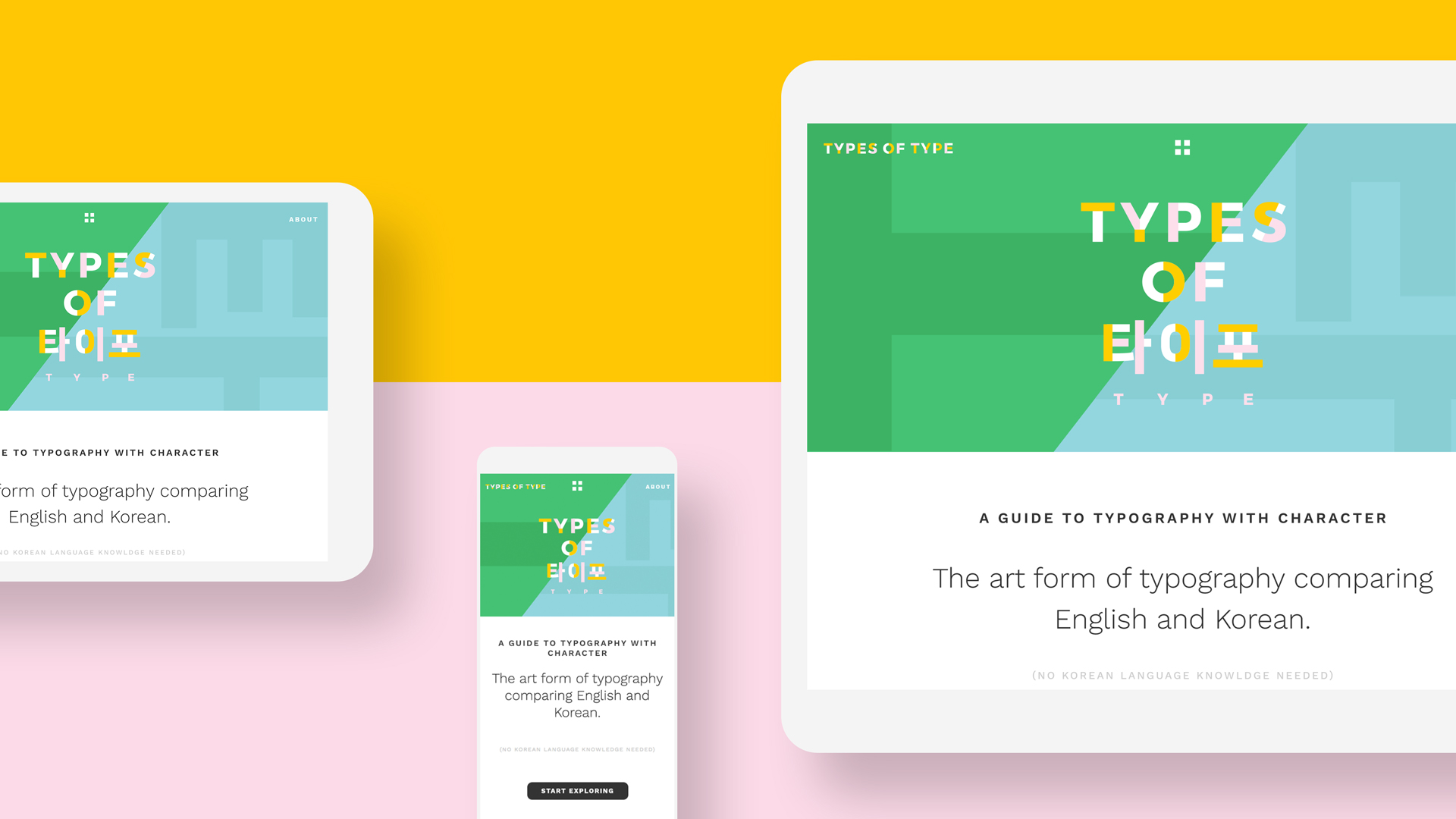
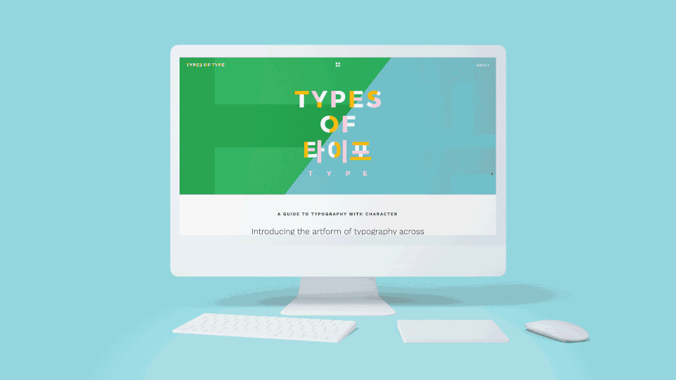
Types of Type website on various screen sizes from typesoftype.com
The website Types of Type, conceived by CalArts alum Amanda Lui, is a guide to typography for beginners and type enthusiasts alike. It introduces the fundamentals of type by comparing English and Korean typography. Below, Amanda Lui tells the story of how her project came to life.
By the time my fourth year at CalArts began in 2013, my passions were strongly rooted in typography, interactivity, and cultural comparison—with a special place in my heart for Korea. I’m Chinese-American but during my time at Calarts I dated a Korean student, who provided the main source of my interest in Korea. (Today, we are married.) During that time, I made a few attempts at combining graphic design and explorations of culture, each with a different approach. However, with Types of Type I feel like I created a meaningful relationship between typography and culture, all wrapped up in an interactive medium.
The Cultural Differences in Typography
The first iteration of Types of Type was created through an independent study with CalArts faculty and alum Roman Jaster. Jen Hofer’s Art of Translation class was also a big influence—it helped me see how difficult it is to precisely translate between languages without understanding the cultural contexts of both sides. I began to think about how similar words can have very different connotations. Consider the English words childish and youthful—the latter sounds much more positive.
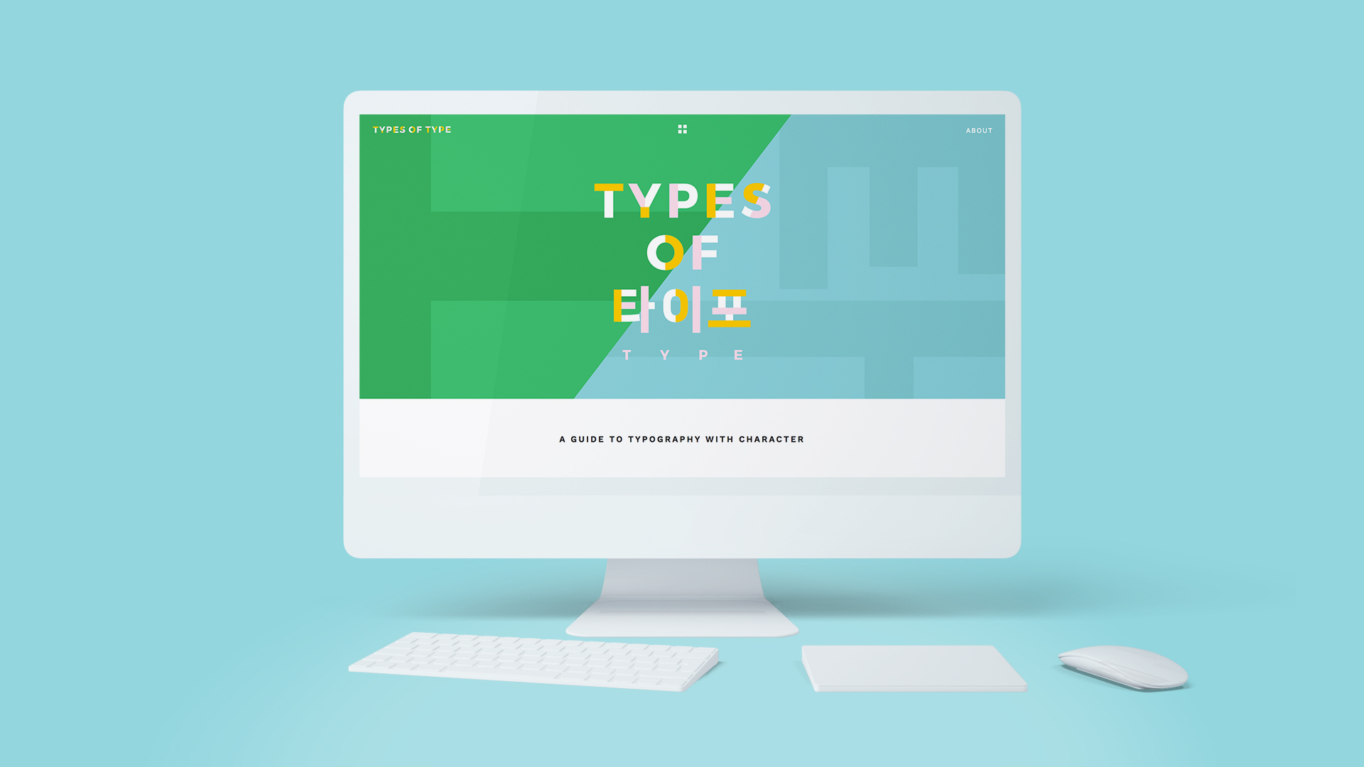
In Types of Type, I apply the concept of translation to typography. Specifically, I’m comparing the Roman alphabet used for English with the Korean alphabet, Hangul. (In Korean, Hanguk means Korea, and gulcha means letters. So, when combined, you get the word Hangul).
Experience the site at typesoftype.com
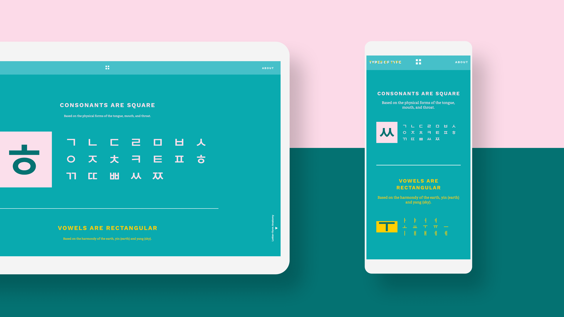
A basic overview of the Korean alphabet, Hangul from typesoftype.com/hangul-blocks
Translating type requires a historical understanding of how the letters were made, as well as the nuances in the forms of each letter. Types of Type assumes that its core audience doesn’t know (much) Korean, which is part of the beauty of it all. It forces people to look at how letters communicate visually as shapes rather than as words.
Written English is composed of sequential letters, one placed after the other, to create words. In Korean, sets of letters are assembled to create a modular character block. Putting one or more character blocks together then makes a word.

Letter-form Anatomy comparison between Korean and English from typesoftype.com/letter-form-anatomy
Both alphabets have a top line (cap line) and a baseline. However, the x-height found in the Roman alphabet is something that doesn’t translate to Korean, as the letters are stacked in character blocks with 2–5 characters per block. This results in multiple horizontal lines that guide the various character blocks. Due to the structure of the character blocks, there are no ascenders or descenders.
The serif shapes are very different between the Hangul and English. The form of the Hangul serifs is directly tied to the calligraphic technique of initial contact between brush and paper. The origin of the serif in the Roman alphabet is more ambiguous. Some people believe they resulted from initial brush strokes created when sketching letters prior to chiseling them into stone. Others credit the chiseling process itself. The position of the serifs also results from this difference. On English characters with vertical strokes (like I and H), there are serifs on both the top and bottom of the stroke. By comparison, Korean characters only have serifs at the top (for example lettersㅣandㅐ) Except for round characters—those have an additional serif that does not exist in English, called the topknot.
I was also interested in how type expresses connotations and finding equivalents between the alphabets. In English, ornamented blackletter typefaces are often used to conjure up a historical feeling. In Korean, a certain sans-serif style has a very historical connotation. This results from the fact that the original Hangul alphabet was a sans-serif. It turns out, that these two type styles co-existed around the same time period, Hangul being created by King Sejong in 1446.
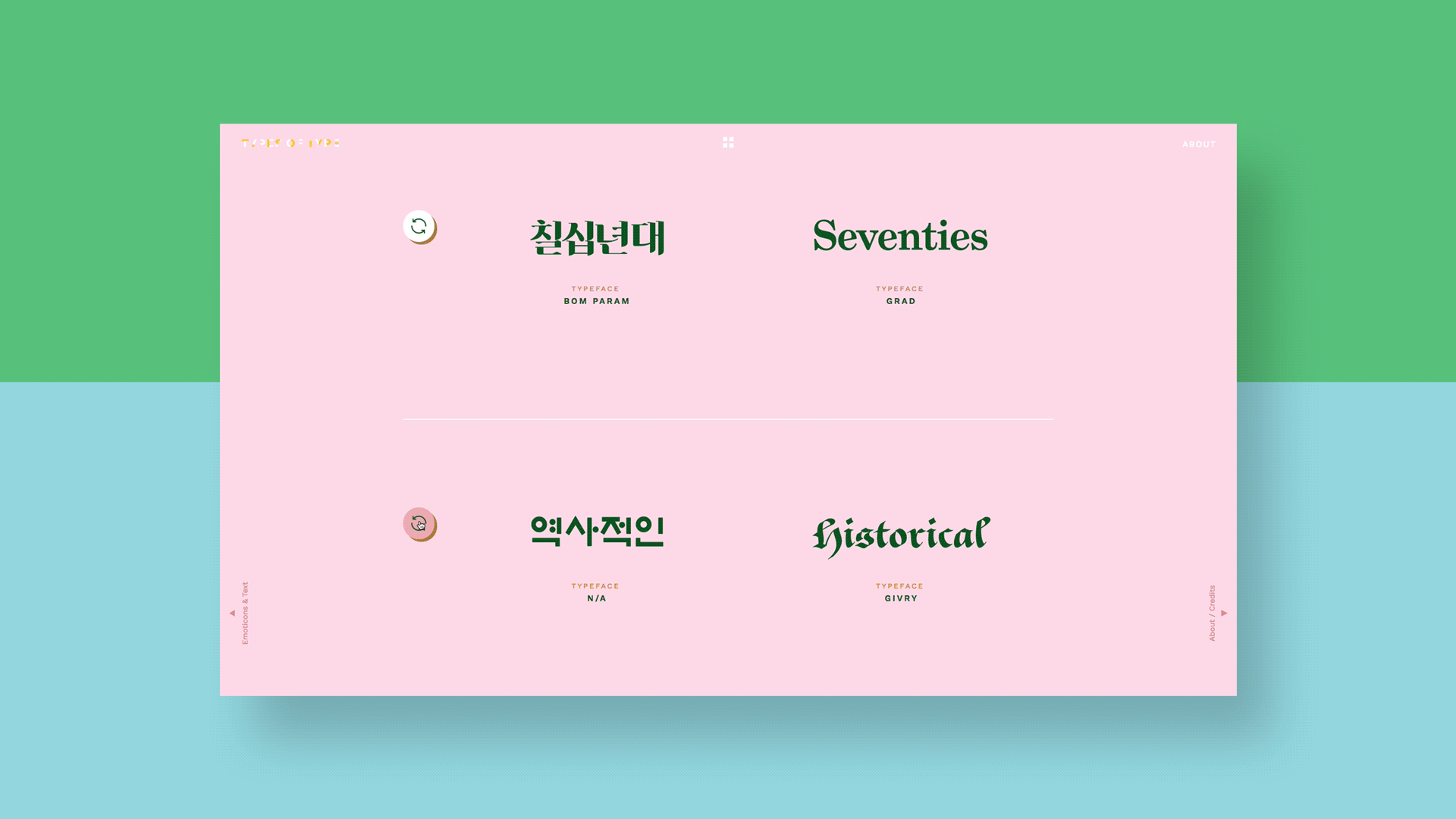
Comparing a seventies serif typeface translation and a historical typeface translation from typesoftype.com/expressive-type
One of my personal favorite comparisons: When typing text emoticons in English, there is heavier use of punctuation and the faces are oriented sideways. Both eyes are one character, and the mouth is a second. In Korean, the faces are upright and are typed in as eye-mouth-eye. So, :D translates to ^ㅁ^ for a friendly, open smile.
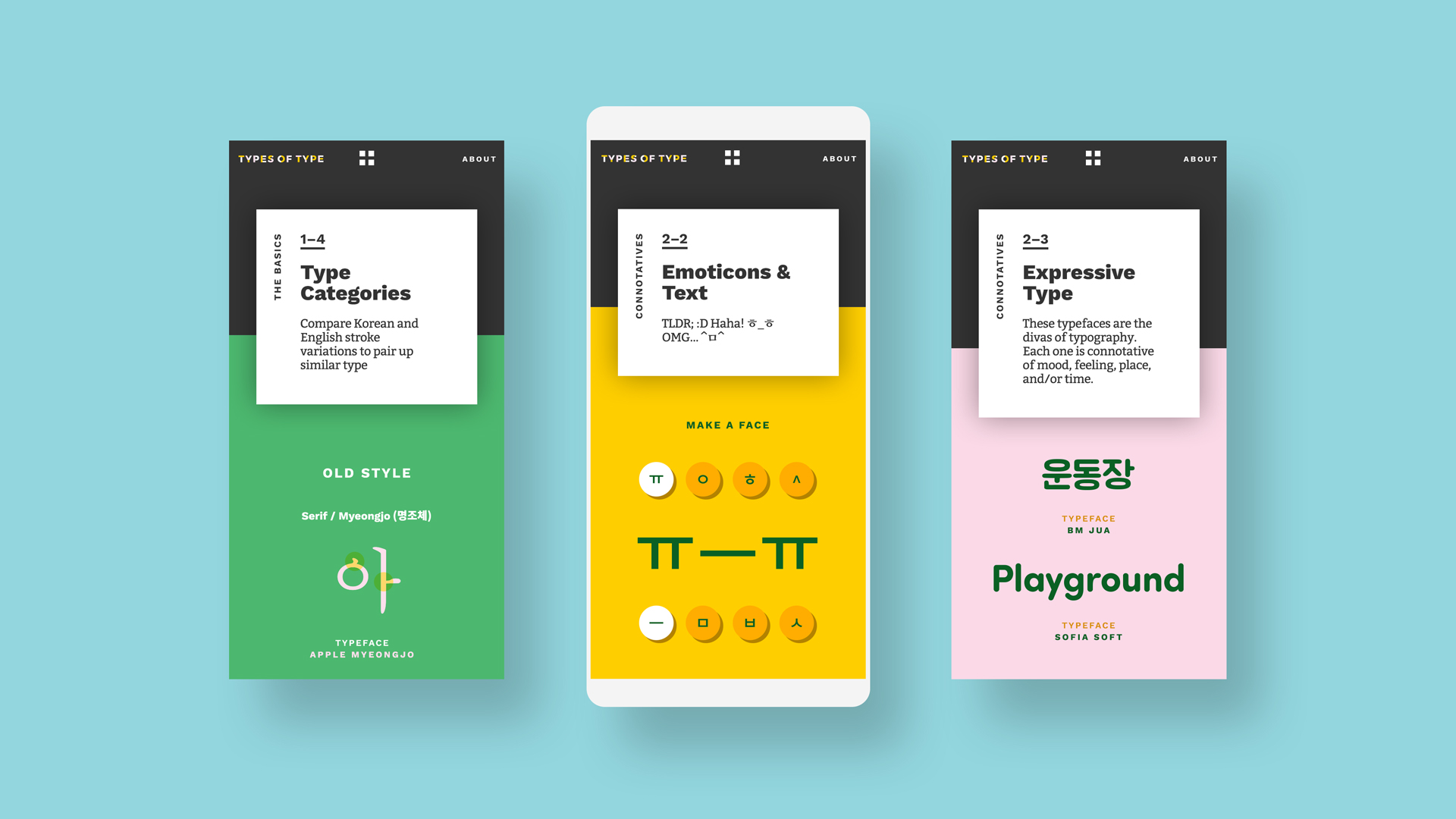
Middle: Components of Korean text emoticons. Left: An introduction to typeface categories. Right: Typeface translation examples. from typesoftype.com/emoticons-text
The Evolution of Types of Type
Prior to the current iteration, Types of Type was conceived in 2013 as an iPad app using the Adobe DPS InDesign plugin. The plugin was created to help print designers produce magazines for the iPad. It was very easy to learn, and it allowed me to focus most of my energy on the content and the design.
Flash forward three years. Apple informed me that I had to update the app or have it removed from the app store. I was unable to make the appropriate updates, but Types of Type was still something I wanted to share with people. And I realized that it could be more accessible and reach a larger audience as a website.
There were three guidelines I set for myself for the redesign:
1. Everything needs to be responsive, and the mobile/desktop experience should be as similar as possible
2. The information should be straightforward and quick/easy to reference
3. The design should not distract from the information, but rather help support it (no useless frills!)
I partnered with developers Jeremiah Montoya (brother to fellow CalArts alum Isaiah Montoya) and Nathan Specht to help bring an interactive spirit to the site. This collaboration strengthened the final product with input from each of our areas of expertise. After two months of development under the moonlight we launched the site.
We hope you enjoy it!
Visit the site at typesoftype.com
Amanda Lui (BFA14) currently works at Walt Disney Imagineering as an information designer. Her free time usually revolves around promoting Asian culture and her dog, Captain Lui van Hong.