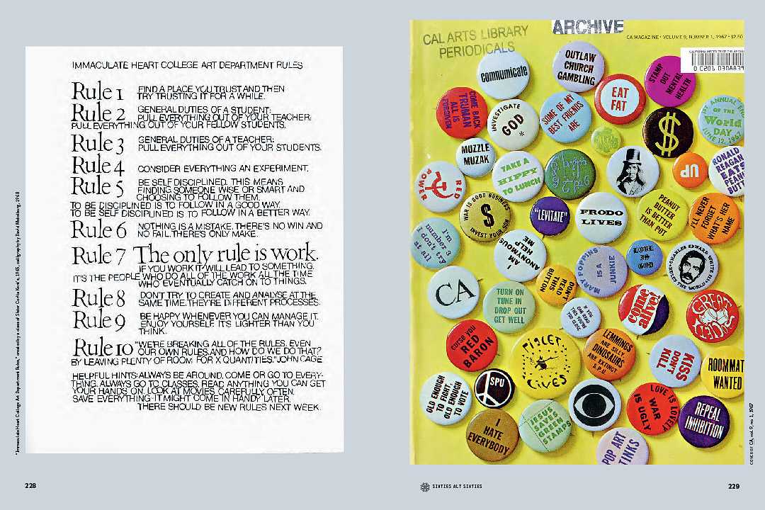
Earthquakes, Mudslides, Fires & Riots: California and Graphic Design, 1936–1986 (EMFR), showing Sister Corita Kent’s “rules” and CA magazine, 1967
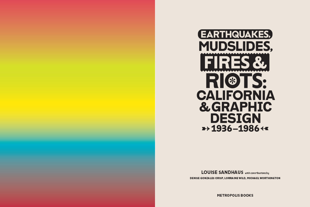
This Fall sees the release of Earthquakes, Mudslides, Fires & Riots: California and Graphic Design 1936-1986 (Metropolis/Artbooks D.A.P. and Thames & Hudson) a major publication that includes work by California graphic design icons as well as little seen West Coast design from the thirties to the eighties. The publication dusts off many hidden gems from California’s design attic, showcasing amazing, under-appreciated and often under-exposed design work.
The book has been a labor of love for CalArts faculty Louise Sandhaus, and represents a personally curated and subjective slice of design history. Very much in the vein of California lifestyle of the period covered, the book is bright, unexpected, quirky and left field. The book features essays by CalArts faculty Lorraine Wild and Michael Worthington, as well as alumnus Denise Gonzales Crisp. CalArts alumni and current students worked with Louise on the design of the book, which also features a specially redrawn version of the CIA type family by Jens Gehlhaar.
If you’re in the Los Angeles area there are two related events coming up. On Saturday November 22nd at 3pm, four iconic Los Angeles Graphic Designers— Lou Danziger, April Greiman, Richard Taylor, and John Van Hamersveld—will participate in a panel discussion, entitled What A Riot!: An Earthquake, Two Mudslides, and a Girl On Fire. The panel is moderated by Alice Twemlow, and takes place at MOCA Grand Avenue. Reservations are free at moca.org/rsvp. An event is also being finalized at LACMA on January 13, 2015.
How did the book come about? what was your starting point?
In the late 1990s aside from teaching at CalArts I also practiced as an exhibition designer with my partners Tim Durfee and Iris Regn. During that time, several commissions to work on exhibitions about California art and artifacts came our way, beginning with the huge millennial exhibition at LACMA, Made in California: Art, Image, and Identity, 1900-2000. It struck me that this work took a distinct turn towards rebelliousness around the mid-century: a “fuck-you” to New York and European art tradition. Makers who seemed to be defining art for themselves were challenging the older trends. You see this attitude and its outcomes exemplified in the “finish-fetish” work of Billy Al Bengston who employed materials used for creating surfboards and customizing cars, or in Robert Irwin’s investigations of the particular qualities of Southern California light, or in the work of Judy Chicago, who used women’s domestic labor as a worthy subject.
EMFR, title page
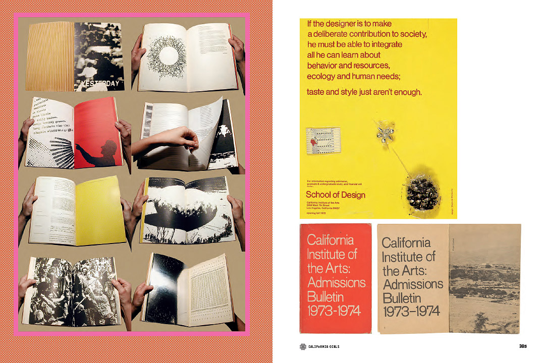
EMFR, featuring Sheila de Bretteville’s design of Arts in Society Vol 7 #3 and CalArts 1973–74 Admissions Bulletin
How long has the process been? What was the most difficult hurdle to overcome?
It’s been over ten years in the making, but the momentum really picked up in the last 3 years. Not being trained as an historian I had to learn “on the job” how and where to do research. The biggest hurdle was that I wasn’t working from an existing archive, which meant years and years of following my nose, first by looking at old design journals like Print and Communication Arts and identifying graphic design work that was made in California and also seemed to suggest something distinctively evocative of this place. Along the way I realized that the work officially recognized as “graphic design” represented only a narrow range of much larger bandwidth, so I had to open my eyes and look at tenuous connections.
The hurdles were non-stop: this book was an act of pure insanity from beginning to end. Sometimes it was the hurdle of tracking down information about the designer and/or the project, towards the end it was the hurdle of writing when I’ve never produced anything this extensive. But by far the most daunting mountain to surmount was getting permissions from the copyright holders, including finding out who the person or entity was that held the copyright. There are hundreds and hundreds of projects in this book, so you can only begin to imagine what this undertaking was like. I was exceptionally fortunate to work with Gideon Brower who had all the hunting, pecking and negotiating skills this monumental task required.
Can you talk about your curatorial decisions? What were your parameters for inclusion?
To decide what went in the book there were two parameters: Does this project quicken my heart? and Does it belie a California attitude? These qualities could be exhibited either formally or conceptually, but were the instinctual curatorial guidelines for inclusion. For the most part I had to turn off the voice that asked “is this piece or this designer important?” as well as turn off any notion that I could get objective distance or that I was trying to be comprehensive.
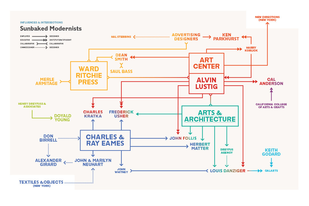
EMFR, diagram mapping Modernist connections in Southern California, designed by Kat Catmur

EMFR, showing the work of the politically witty Boston and Boston
What was the most unexpected piece of design you found?
There were SO many works of design that challenged all expectations. For one there was enormous cache of spectacular treasures that had been created by the Neuharts. If a designer didn’t enter the design competitions and their work wasn’t written about then the stuff can easily disappear. When Marilyn Neuhart, who was incredibly generous in sharing her extensive archives, pulled out one after another stunning example of the studio’s production I thought my heart would stop. But I was also stunned by the early video arcade game graphics done by David Theurer. His title designs for Tempest and I, Robot, were works of such incredible imagination and technical know-how created from very crude, limited means, yet they are spectacular.
The tone of the book is deliberately left-field. Can you talk about what informed your decision in giving it this particular editorial voice?
Left field=left coast? Just a speculation ;-). The role of bona-fide historical scholarship is to create a factual record, yet historians tell their stories through narrative. Story-telling (even though they may not refer to their work in such terms) is the means used to connect the factual dots and create a logical image of what happened by who, when, why and how. Their work carries the imprimatur of objectivity yet its means are literary. I just turned the dial up and down on the degrees of employing the literary voice versus the objective one. Different points of view and voices as well as different kinds of texts are used to create a more diverse and holistic image about the who, what, where and when. Each of the four sections of the book includes an introduction that offers my perspective on the work; a commissioned essay that may be more poetic or obtuse gets at qualities of the work that conventional expository writing might not be able to convey; reproductions of texts published during the period covered in the book show how the work or ideas were discussed or regarded in their own time; a diagram reflects influences and intersections that may not be easily perceived or grasped through other means; and then extended captions accompanying a full-page image of a design example are both factual and playful, intended for a reader who may want to dip into a pleasurable and informative pool rather than swim an entire marathon of knowledge. I also want to mention that the book is extensively footnoted so that it would hopefully be valuable to scholars.
EMFR, section divider

EMFR, showing early broadcast graphics by Robert Tyler Lee and Georg Olden
There’s a section in the book devoted to women designers in California. Did you see a change or evolution from the thirties through to the eighties in terms of women becoming better represented? How did those changes manifest themselves? Is there something intrinsic to the west coast that makes it better or worse in terms of gender representation?
I’m not sure that I have enough of a comprehensive view of the publishing landscape to know for sure whether there was an actual evolution in the representation of California-based women designers, but it does seem like they were published more and were more visible as the decades progressed. From what I experienced, it is true and not true that women played a secondary role in the field of design. I do believe they were patient and persevered with their work in the face of some tough treatment! I think they had to hold their noses in a lot of situations. This is a very complex subject that I’m just beginning to consider how to address, but I do feel that collectively women graphic designers in California became globally influential more so than any other place in the world, so the word must have gotten out.
What’s next? Do you have plans for EMFR 2? Maybe 1986 to the present day?
Sleep. Just kidding; I’ve got to continue the project as there’s SO much to be done. For one, I had to leave a lot on the cutting room floor, from the legendary to the obscure and definitely all the work past 1986. As it stands I’m depending on readers to recognize that this book isn’t an historical survey; it’s a buffet of some California graphic design “desserts” in hopes that it indicates that there are plenty of other tasty treats to be brought to light and inspire action. I certainly can’t and don’t want to create THE record of California graphic design. This needs to be a collective endeavor—one that represents many attitudes and points of view about what’s important and should be included. It was out of this concern that I conceived the Making History initiative to provide a platform on to which anyone could add to the record and support a culture of design research.
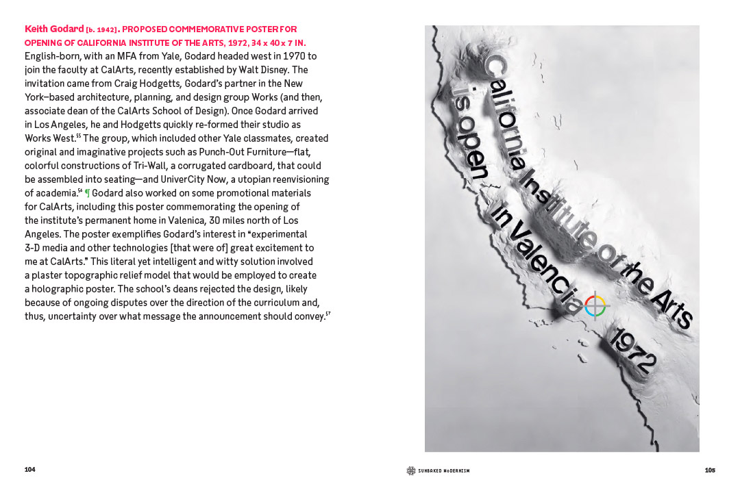
EMFR, showing proposed poster for the opening of CalArts by Keith Godard, 1972
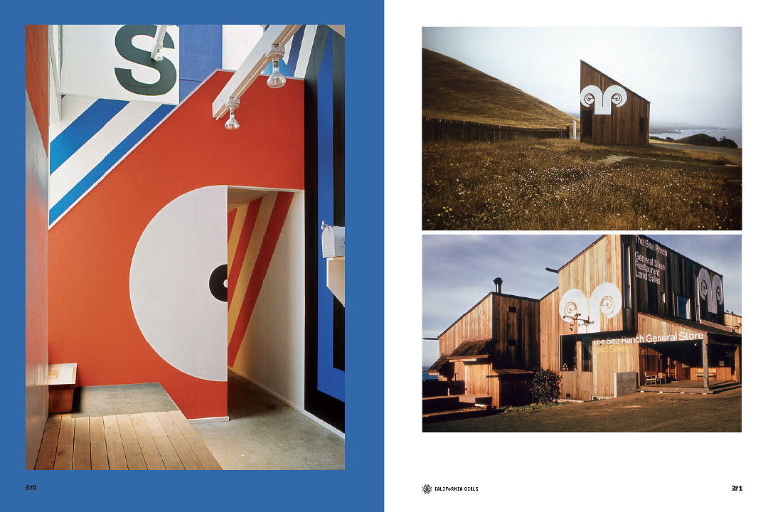
EMFR, featuring Barbara Stauffacher Solomon’s Sea Ranch super graphics, 1966–67
Can you tell us more about the Writing History initiative?
Writing History will be a website/wiki platform that will allow others (perhaps inspired by Earthquakes) to add their own research and research resources as part of a crowd-sourced endeavor to document California graphic design, designers, and influential institutions. This semester I’m offering a class by the same title to test a model for helping others (in this case, the students) on how to do research, write about their discoveries, and then publish. I’m also working with recent alumna Kat Catmur and Colomba Cruz Elton on developing how the platform might function and what it might include to provide the tools, resources, and inspiration to create this collective compendium of this distinctive and vast history.

EMFR, showing broadcast graphics by Harry Marks and Douglas Trumbull

EMFR, showing the San Francisco Digger Papers
Louise Sandhaus can be found at lsd-studio.net
Find out more about the Writing History Initiative