Earlier this year, CalArts Graphic Design alumnus Golden Krishna (BFA 2010) published his thought-provoking book The Best Interface Is No Interface. It’s an irreverent, humorous, challenging, and ultimately enlightening tirade against the tyranny of screen-based distractions and the contemporary wisdom (held by tech companies and designers alike) that every imaginable problem can be solved simply by making an app. Golden instead argues in favor of designing experiences that actually enrich people’s lives. Faculty member Roman Jaster (BFA 2007) interviewed Golden about his ideas via email.
Golden and I met at CalArts in 2006. He started his first year when I was in my fourth. We had this in common: being older than most of our classmates and a great interest in web design. We struck up a quick friendship. Later, when Golden was in his final year, I was back at CalArts teaching web design and I advised Golden on an independent study project. At Golden’s final review one remark stuck with me—and anticipated what Golden has achieved since. Right after his review, a faculty member, in an almost exasperated tone, commented: “Graduate-level work. From an undergrad. Incredible.”

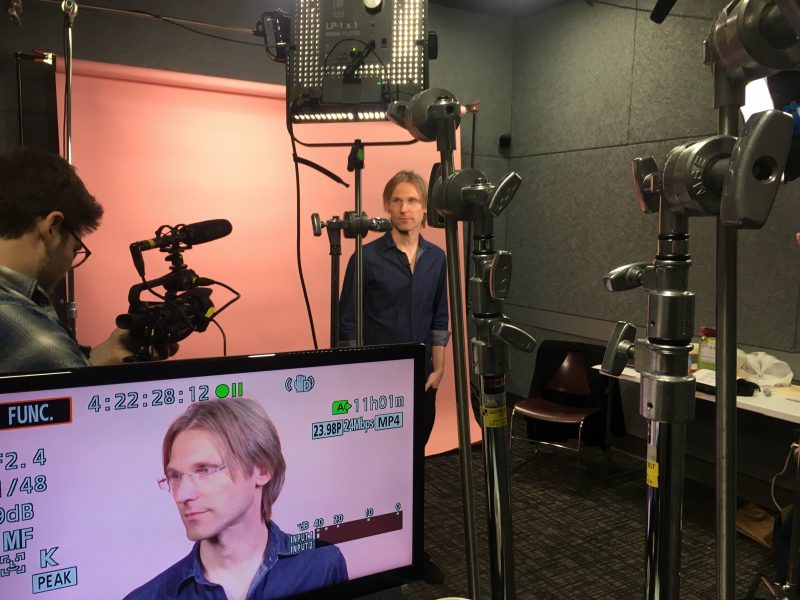
Designer, author, thinker, provocateur: Golden Krishna.
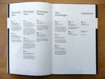
Table of contents of The Best Interface Is No Interface.
Roman Jaster: What was your path to getting your book The Best Interface Is No Interface published? Can you start at the moment of graduating from CalArts in 2010?
Golden Krishna: The idea of building screenless experiences first occurred to me when I was working at Cooper, a design consultancy in San Francisco—my first job after CalArts. Cooper was started by Alan Cooper, one of the pioneers of Interaction Design, and someone who isn’t afraid to tell you if you’re wrong.
Once, Alan spoke at an event for major donors to the Tech Museum in San Jose. That was in the early days of Office, and needless to say, when he got on stage his Powerpoint presentation crashed. Alan politely asked if anyone from Microsoft was in attendance, and when those employees rose their hands, he told them they should all be ashamed of themselves. (Microsoft has come a long way since then).
Alan helped form his own brand of critical thinking culture, creating an open-minded creative space that questioned the nature of what we do and how we do it. That space allowed me to have an enormous realization while in the midst of a large project with an important client: our solutions were wrong.
For that project, we were traveling around the country, observing and talking to dozens of people about an actual problem we were trying to solve. After we returned, and started brainstorming solutions, I realized how trapped technologists had become in screen-based thinking.
Our processes, and the way we evaluated products as an industry felt wrong…so distant than what many people really needed or wanted. Many people didn’t want more time with screens, they wanted less. So why did technology celebrate screen-based solutions?
I eventually penned a passionate essay that I assumed most people would ignore: The Best Interface is No Interface.
Turns out, I was wrong. In a few days, it became one of the most shared design essays ever, and eventually put me on stage speaking at the largest design conference in the world.
Flattering, but also nerve-racking.
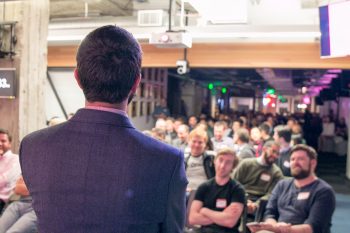
By the time I got on stage at SXSW, I was still putting the pieces together on how we could start building a screenless world. It was my first time speaking at any design conference anywhere, and I was so nervous I forgot about 10 minutes of topics on stage.
Nonetheless, it went well. After SXSW, I got unsolicited invites to give lectures around the United States and the world, including Moscow, Sweden, Sydney, and Montreal.
People asked tough questions. In Russia, privacy was a huge topic. In Sweden, there were questions about the long term relationship between us and machines. At a conference in the United States, a young designer told me that he liked my ideas, but hoped that I fail because he doesn’t know what he would for a living if he wasn’t drawing pixels.
Along the way, I was offered a book deal to expand the ideas. And from essay to the lecture to the book, the design philosophy became more and more robust. Hearing a lot of support and criticism along the way has made a big impact on the writing. The core principles are the same, but they have matured a great deal.
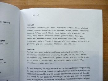
I really liked your chapter about the differences between UX and UI—how most people don’t acknowledge or understand the differences between user experience and user interface. They have become a single term that is thrown around. Emphasizing that they are not the same seems like one of the foundations of your argument: the interface is not the experience.
Below, is a set of job listings from some of the top technology companies in the United States. They’re not atypical.
UI/UX Designer – Apple Inc., Cupertino, CA
Lead User Experience & UI Designer – HP, Sunnyvale, CA
UX/UI Developer – Adobe, San Jose, CA
UXUI Mobility Designer – Dell, Round Rock, TX
If you look closely, you’ll see something unusual. They advertise for UI slash UX designers. But of course, UX is not the same thing as UI.
UI is about making and composing elements for a screen. For a User Interface. It’s an important job, but it’s very different than UX.
UX is about understanding customer problems and solving them. It’s about making a great overall experience.
Look, I hate acronyms. They cause confusion and are a tool to generate exclusivity for the talentless to provide job security. A blurring of these two design acronyms seems harmless.
But when it’s your job title, it changes how you’re evaluated. How you’re promoted or fired. And when you’re expected to be a UX/UI designer? Well, it’s your job to solve problems with screens.
Good experience design isn’t good screens, it’s good experiences.
There’s a lot of confusion about the role of design in technology. Partly, because the default road map for a lot startups and major technology companies is to get people more and more addicted to their technologies. In the book, I talk about the shift in the field, towards something I call Addiction UX where the designer exists to generate more clicks, not more joy.
Our output has become more screen time for more people. Children spend about 2 hours a day looking at a screen. Teens about 7.5 hours. College students about 9 hours a day. And adults, we spend about 8.5 hours a day staring into the light.
This isn’t good. And there are consequences that distract us away from the things that matter.
Earlier you talked about the encounter with that American designer who was scared to lose his livelihood if your ideas succeed. What advice would you give young graphic designers? What skillsets do they need in order to push beyond screen based solutions?
Ha. Yes. After a conference, I was approached by someone that told me he wanted me to fail. That if my idea that technology can actually unglue us from the screens that he would be out of work. He was a smart kid in Portland who wanted what many good intentioned designers want: for their work to be important and valuable.
But what I reminded him was that while he was trained to have a particular output, that creative process he knows and uses everyday—defining problems, finding inspiration, sketching and iterating—is and will always be the same. If you’re a designer who wants to work in technology, you have to adapt. What designers did in 1992 is not the same as 2015. You have to learn new tools and understand where we’re headed to beat the curve. My hope that we can one day make screenless experiences is just an evolution in the output, not a change in the fundamental, high-level creative process. Creating experiences that enrich our lives…that goal never changes.
Yet many of the examples in your book deemphasize the “graphic” part of “graphic design”.
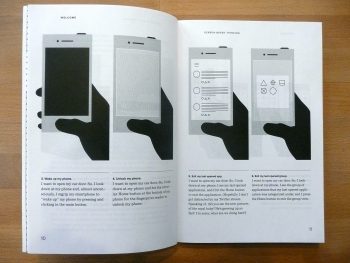
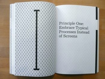
You write about embracing typical processes to tackle problems without relying on screens, without relying on visuals. (Such as the app that does its best work when the phone can stay in the user’s pocket. Or the dishwasher that senses how dirty the dishes are and automatically decides what cycle to use.)
So, are people trained solely as graphic designers even the right people to carry out your vision? Or do we need hybrid graphic design/engineers and graphic design/computer scientists and graphic design/molecular biologists?
I studied graphic design. I love graphic design. The world is a better place because of the field. Personally, if I hadn’t gone to CalArts my entire life would be different. I’m incredibly thankful of what can sometimes feel like an insanely rigorous design program and the teachers that I maybe didn’t appreciate as much as I should have while in art school.
Yes, I learned visual principles, and I do work with typography, color, form, composition, and the basics of graphic design on a regular basis.
But more importantly—for the future of technology I write, talk, and execute in the workplace—I learned at CalArts a creative process, an ability to give critical feedback and to be critical about the field. Those skills aren’t taught in computer science departments where a huge percentage of technology workers come from.
We need creative people to think differently. Uniquely. To create things that surprise and delight. Creative people to think outside of the box and define experiences. Data scientists, mechanical engineers, developers, and other skillsets are absolutely necessary to make brilliant tech. But there’s an absolute need for a creative person to be the architect to the experience. Great designers have thick skin and the taste and the perseverance to not be satisfied with anything but beautiful results.
Golden Krishna (BFA 2010) has worked for innovation labs at Samsung and Zappos to imagine, design, and build the future of technology. He began his career working at the world-renowned interaction design consultancy Cooper in San Francisco. Find out more about Golden and his book at nointerface.com, on Twitter, and on LinkedIn.
Roman Jaster (BFA 2007) is a graphic designer working in Los Angeles. He is the co-founder of the design studio Yay Brigade and teaches web design classes at CalArts.
