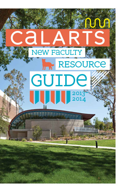
Faculty Resource Guide 2013–14 designed by Joe Prichard, Office of Public Affairs, CalArts
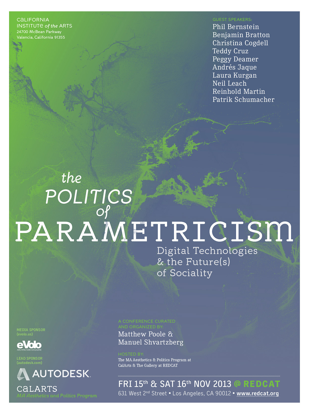
The Politics of Parametricism poster designed by Jacob Halpern, Office of Public Affairs, CalArts
Can you talk about the genesis of McBean? How did it come into being?
McBean was the result of a commission from Joe Prichard [former Director of Creative Services] in the Office of Public Affairs. My understanding is that the project grew out of ongoing requests from the administration to see design that made use of “the CalArts typeface—you know, the one from the logo.” The design office has always made great use of alumni typefaces for their collateral and there is a deep trove of really wild typefaces for them to choose from. In recent years they’ve relied heavily on Andrea Tinnes’s work, as she has made some really versatile and reliable typefaces. In art directing the project, Joe had a very clear idea of what he wanted from McBean, and one of the things he wanted was a display face that would pair well with Andrea’s Skopex, which they rely on for body copy in printed matter like the CalArts magazine.
What was your process in extending Scott Taylor’s logotype into three full families? What was the most difficult aspect of building out the full character set?
The logotype was an offshoot of an idea that Scott Taylor [former Director of Creative Services] had around 2005 for a modular type system for CalArts signage. He had an idea that there could be a basic letter set with snap-on serifs and variations like a stencil version and such. He drew a set of capital letters, but never really made a working typeface so much as doing custom lettering here and there for various projects. The capitals in McBean Sans a heavier version of the model Scott laid out with just a few changes here and there.
For McBean, it was important to build a family that would be versatile and functional, from text to display. The first thing I did was pull as many formal clues as possible from the logotype so that the typeface would be recognizable as an extension of the CalArts “brand” to someone who doesn’t know type. In that way, it was necessary to kind of reverse engineer the type system from the logotype, which was a fun challenge.
The most difficult part of the process was incorporating the vibrant history of CalArts type design as a stylistic inspiration. My aim was to make a type family that fit into the larger community of CalArts type design, but it was a little overwhelming looking at all of those resources—especially some of the really weird student work made under Ed Fella’s tutelage in the ’90s. So I looked in-depth at a few designers: Andrea’s Skopex, Roletta and Switch all provided inspiration; Jens Gehlhaar’s thesis CIA Compendium was a great resource, as was Sybille Hagmann’s Cholla. And of course, Mr. Keedy’s looming influence was a big part of the psychological process. I’m not sure that was resolved, but I was happy to see a formal connection between Keedy Sans and McBean develop in the variation between rounded and squared-off terminals and serifs.
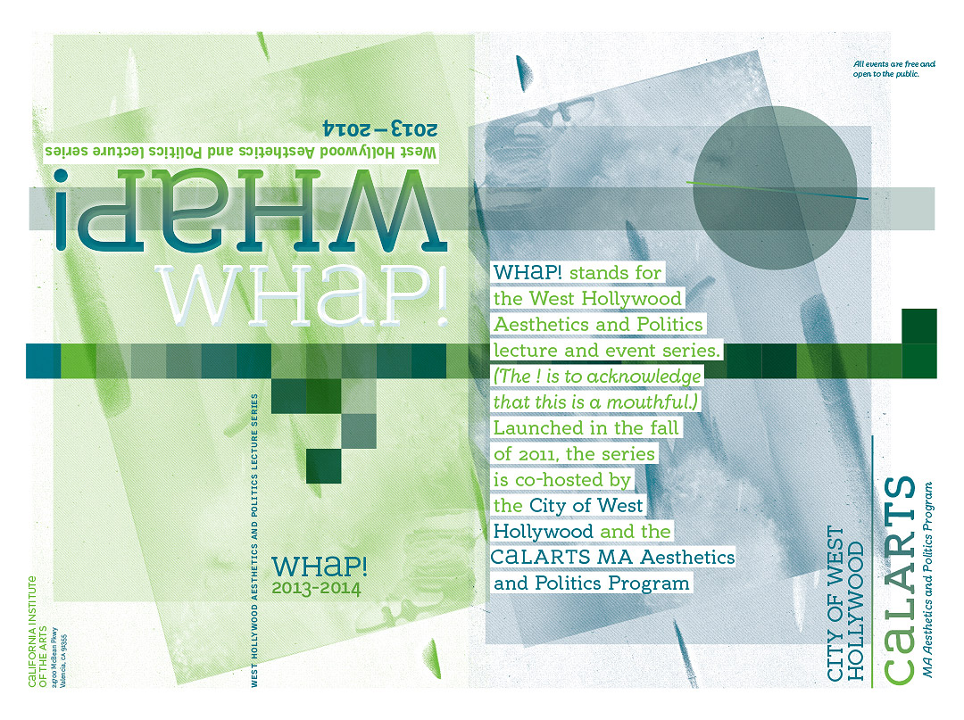
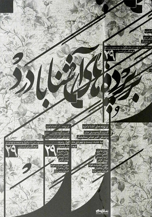
Poster for 2013–14 Whap! Lecture series, designed by Joe Prichard, Office of Public Affairs, CalArts
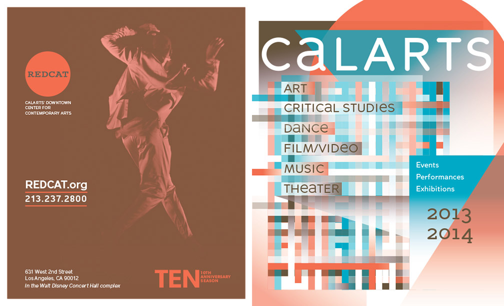
2013–14 performance program designed by Cassandra Chae, Office of Public Affairs, CalArts
Can you explain how you intended the three families to work together?
Essentially, the three styles need to combine and interchange seamlessly. I had just been working on a similar problem with my thesis—making a type “superfamily” out of a sans, a serif, and a more ornate, script-like italic—so I was warmed-up to the challenge. In both projects this was a really fun part of the brief. Type design is really about creating pieces of the whole and deriving character on a large scale from a multiplicity of smaller relationships. Making a “superfamily” allows for another layer of relational development, like looking for connections between cousins.
What are your plans for McBean in the future? Does it keep growing into an even larger family?
My plan is to expand each style of McBean into a bunch of weights. I think there’s a lot of potential there, and there are certain styles I can’t wait to draw. McBean Slab Ultra Black, for example.
What was your intention in creating a number of unicase alternate characters for McBean?
I knew right away that McBean would pull the idea of alternate unicase character from the logotype. When they’re used well the alternates provide a clear brand extension for headers and subheads. We looked at a number of different characters that could be subbed in as alternates in a “switchcase” and kept paring it down when we discovered that less is more for those sorts of substitutions. There is an OpenType scripted style set that subs in the A, E, M, N, R, and U (and lowercase equivalents) the designers quickly discovered that it worked better to just to use these glyphs in on a case by case basis.

National Portfolio Day flyer designed by Joe Prichard, Office of Public Affairs, CalArts
Totebag insignia designed by Joe Prichard, Office of Public Affairs, CalArts
Once you’ve made a typeface you put it out into the world and other designers get to use it—a limited amount of designers on this case. What’s the best and worst use of McBean that you’ve seen?
I get really excited to see what other designers do with my typefaces and I’m constantly surprised at the ways people find to use them. I’m really pleased with McBean’s use in digital platforms—on the 24700 blog and the informational screens that have popped up in the lobby of the school. But in particular, its great to see Cassandra Chae and the designers in the Office of Public Affairs make such versatile use of it in the CalArts Magazine. It pairs well with Skopex which is a great relief. It was also really fun to see Michael Worthington use McBean to answer his own Typographics 2 syllabus in issue 16 of Threaded (a design magazine from New Zealand). He really put the typeface through its paces, from his essay on typography (which used carefully detailed typesetting to support its argument) to a monstrously layered “slogan” that I can’t un-see.
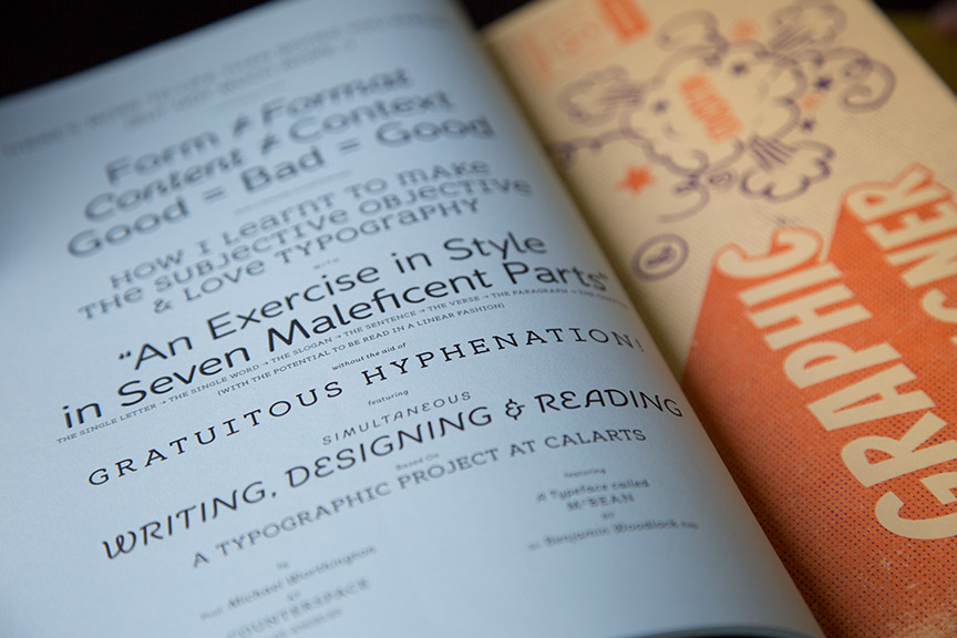
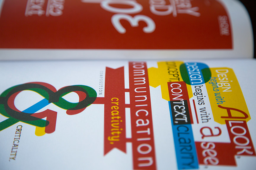

Pages designed for Threaded Magazine #16, by CalArts faculty Michael Worthington
Ben Woodlock is a type designer based in Los Angeles. He currently teaches typography at UCLA Extension and CalArts Fall Residency Program.
Special thanks to Ben Woodlock and CalArts Office of Public Affairs for allowing inform.design to use McBean.