What do Lucha libre wrestlers and public transportation have in common? To find out, we sat in on Colleen Corcoran’s (MFA 2008) recent lecture at CalArts, where she discussed the quirky ad campaign she helped craft for L.A. Metro, featuring a portly masked luchador on his car-free morning commute. She also shared examples from her CalArts thesis project, and how it has helped to inform her current work with local community organizations that promote social and environmental justice.
We spoke with her after the lecture to see what it’s like designing for a city built on a history of car-culture, and what programs like CicLAvia are doing to change the way we engage with the urban environment.
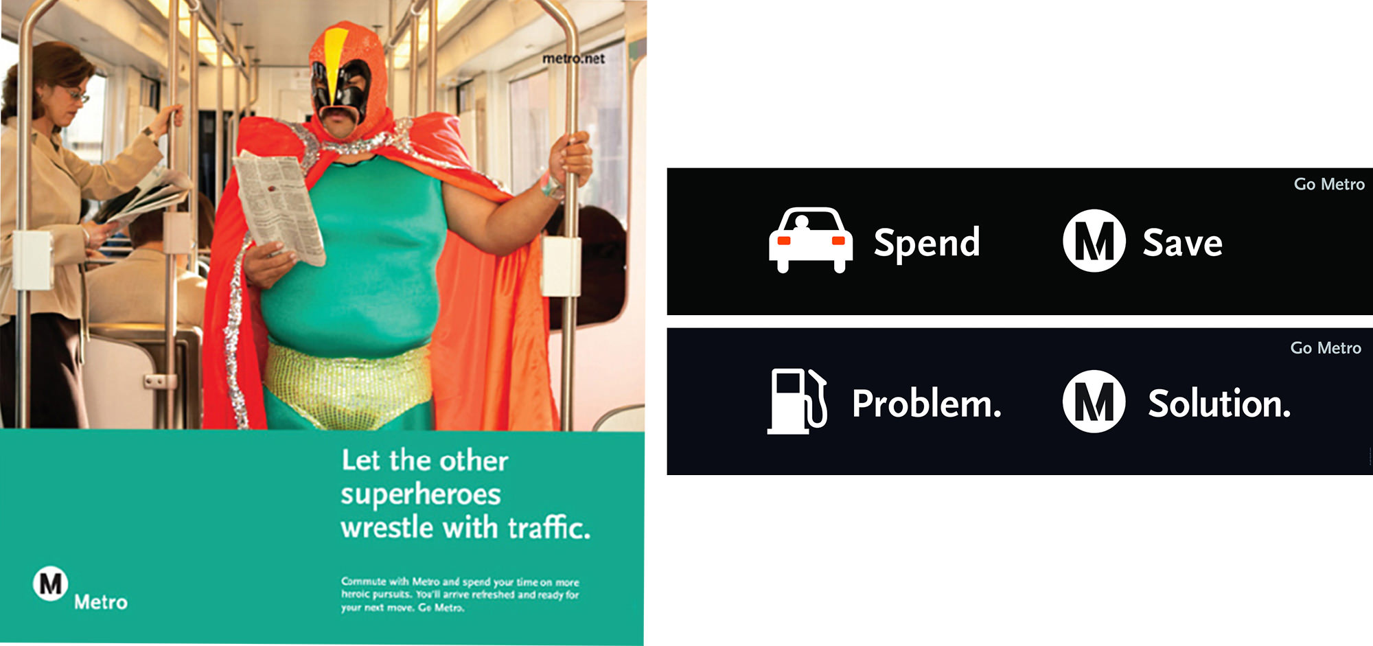
L.A. Metro ads
Tell us a little about your design current practice, and how it’s changed since graduating from CalArts?
Being in the design program at CalArts is a special opportunity to experiment with ideas in your practice, by stripping away the context. What I mean by that is, you can really drill down into the ideas in your work, in a way that’s not possible when working with all of the outside factors that we have to consider professionally—budget, audience, implementation, etc. CalArts is a magical place, secluded up in the desert, a little bit removed from society, and that’s a very specific learning environment that engenders really crazy and interesting work.
Today, the audience is always the guiding light to my work, but if I didn’t have the time I spent at CalArts, exhausted out of my mind, experimenting with these ideas of humor, absurdity, play, and story telling in design (in a way that made no sense) I think I would lose my way today. Those are the things I always return to as ways to connect with people through design.
In your lecture you highlighted joy, humor, absurdity and functionality as key elements in your design. How do these concepts help you when designing for non-profits and community projects?
Since I work a lot with organizations doing advocacy work, as well as public agencies, a lot of the content that I deal with is very wonky or weighted in the language of public policy or urban planning, I constantly think about how to reframe those things to make them interesting and accessible to the general public. Simplifying the message and relating it to people’s everyday lives is key, and jokes, stories, and metaphors are good strategies for that.
Can you talk a little about your time at Metro, and how their use of narrative design strategy makes for a successful design campaign?
The in-house design team at Metro has been very skillful at engaging with its huge audience—all of LA County—on a personal level. They do this primarily through a friendly/cheeky brand voice that addresses the audience directly (The Creative Director at Metro, Michael Lejeune actually is a writer more so than a designer). The voice is combined with a very simple visual language—type on a bright background or next to an absurd staged photo or simple icons/illustrations.
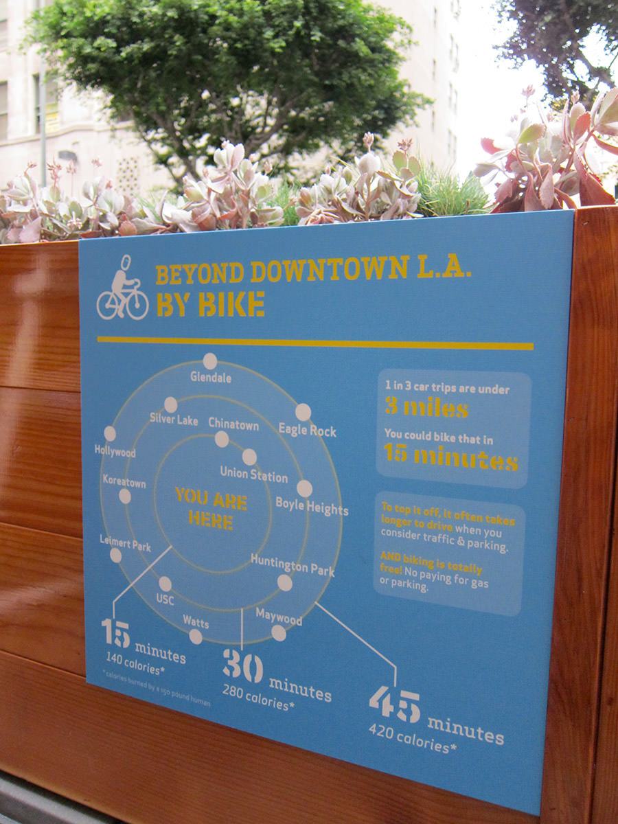

You designed a really interesting infographic about biking distance in L.A., which seemed to be a good example of what you refer to as “humanizing data”. What are ways designers can make big data relevant to real people?
It’s very important for data to be attached to something (a story or piece of daily life) that people can actually relate to. For example, that graphic shows biking times to destinations (not distance!) because people, in fact, don’t realize how long it takes to bike or walk for short trips, if they never do it. A couple miles may sound far, but can actually take less time than driving or at least be more enjoyable. This is inspired in a way by Matt Tomasulo’s Walk Your City open source wayfinding project, which is a great example of humanizing the information design of a wayfinding system.
CicLAvia is an amazing event that keeps growing in popularity every year. Can you talk about how you developed the branding for it, and what you think an event like this means for the City of Los Angeles?
I became involved with CicLAvia in 2009, joining the original planning committee as a volunteer. At the time, I had been doing a lot of work with Joe Prichard, who was one of my CalArts classmates (he and I continue to collaborate on projects together). He also bikes a lot around L.A. and was one of the people who inspired me to risk my life doing so (I’m still alive!). The CicLAvia planning committee had come up with the name, putting L.A. into the word ciclovía (ciclovía events are car-free streets for biking and walking, common in many cities in Latin America).
Joe and I first worked on the logo with the goal of having it explain simply and visually what the event would be: physical recreation outdoors in L.A. (walking, biking, family friendly, the saturated colors you see here when the sun is always shining). Our goal was that this would be understood by anyone, regardless of language spoken. Just having a logo was so important to the volunteer-led committee early on and lent our efforts a legitimacy that we may or may not have had. Because of it, I think real funders and politicians thought we actually knew what we were doing and gave us money to pursue this crazy idea. Now it is a quarterly event that impacts hundreds of thousands of people around L.A. County, encouraging them to consider biking, walking, or taking transit in their daily lives.
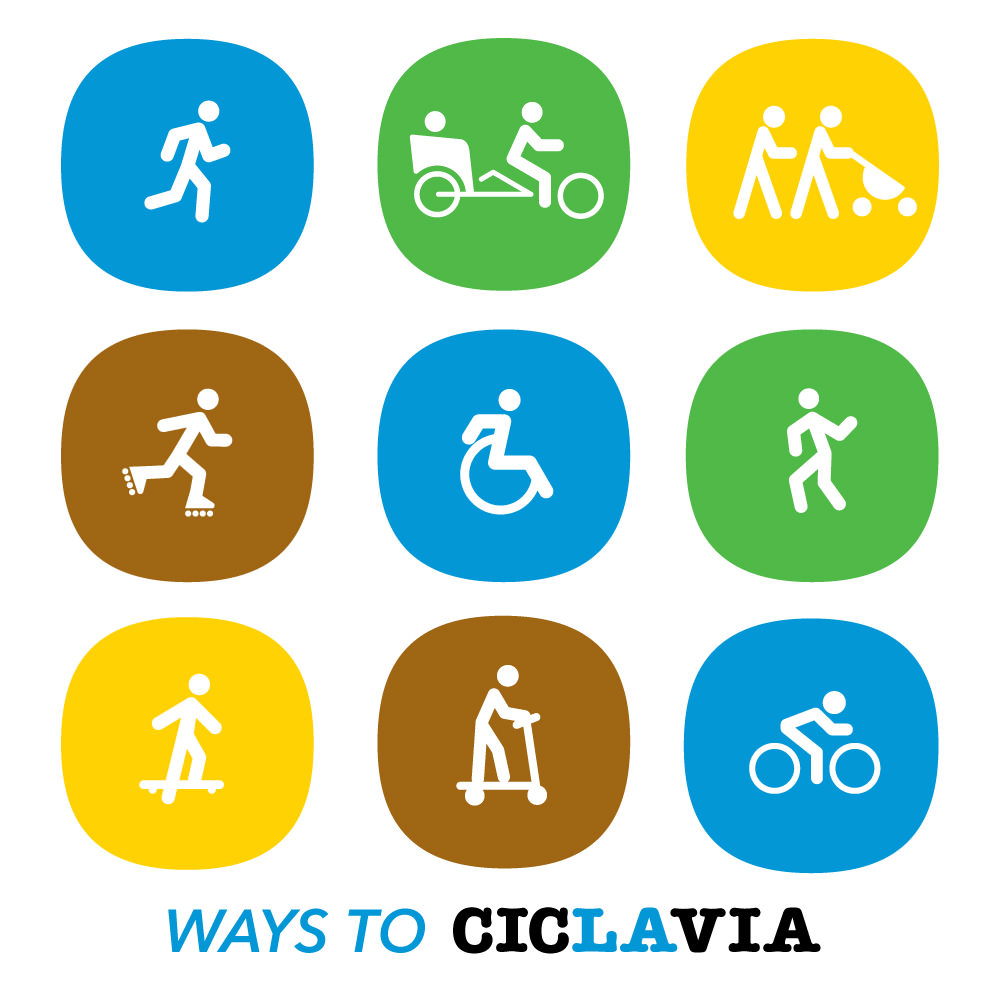
CicLAvia branding icons
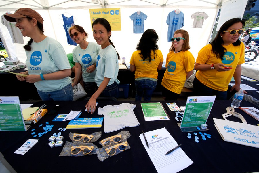
Volunteers selling t-shirts and other items at a recent CicLAvia event.
The visual identity developed over time and came to include a system of icons of different activities (different bikes, skating, dancing, jump roping) as well as illustrations of the landmarks along the routes, which CalArts BFA alum Tiffanie Tran has worked on a lot. There are also a number of sub-brands for the different routes and things like CicLAvia Explores.
You’re an Texas native. What has been the biggest change for you coming from Austin to L.A.?
What I love about Los Angeles is that you can live here for decades and still be discovering new places and new parameters. It is a place of unlimited discovery and unlimited potential. The problems L.A. faces, in terms of economic, environmental, and social injustice, are also vast and do not have straight forward solutions. It is possibly the most diverse place in the world, with huge populations of people from many different countries living side by side. I believe L.A. can be a microcosm of experimentation for solving many problems that face cities across our country and throughout the world. It is a place where we cannot avoid contending with the problems and perspectives of people who are quite different from us, and for a designer working here, that forces you to constantly rethink your solutions and assumptions.
A comparison I’ll make between Los Angeles and Austin is this—the thing that I loved most about living in ATX was how you could be in Downtown, and then five minutes later be in nature, along one of the creeks or in the greenbelt. Austin is known for that. But, in fact, that is also the case with Los Angeles. Just a few minutes from Downtown, you can be in these beautiful parks along the LA River, or in Elysian Park or Debs Park, but somehow many people here don’t know these places exist! That is part of the magic of LA but also a design challenge for the city to develop wayfinding, maps, and online information to make its breathtaking park spaces more accessible.