It’s been about a year since David Chathas completed his MFA at CalArts, and he’s already got several substantial professional projects under his belt. Five days after graduation, he packed up his car and moved to Portland where he joined Nike’s Global Brand Design team. He contributed to campaigns for Lebron XIII, Nike Women’s Basketball, Hyperdunk, Athlete Logos, and the Spring 16 Elite series. After his contract ended, he spent some time freelancing, developing a few personal typefaces and book projects, and is now working at Wieden + Kennedy, where he had previously interned for their Old Spice campaign.
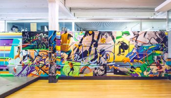
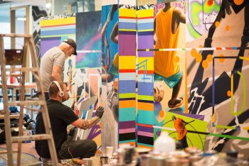
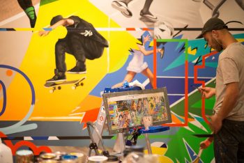
If there’s one thing I learned about David while we were attending CalArts, it’s that he does things BIG. He lifts big weights; he cooks big steaks; and his design aesthetic embraces the maximalist style that has become a reactionary roundhouse kick to the norm-core default systems of the current design zeitgeist. That’s why I was excited to see his new work roll out at the W+K offices: an intricate, multi-colored mural produced by the artists at Colossal Media for Nike, which not only captures the company’s Just Do It spirit, but is a larger-than-life extension of the design projects David explored at CalArts. I spoke with him about how he balanced fulfilling the requirements of the brief while also letting his personal voice come through:
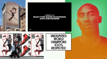
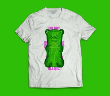
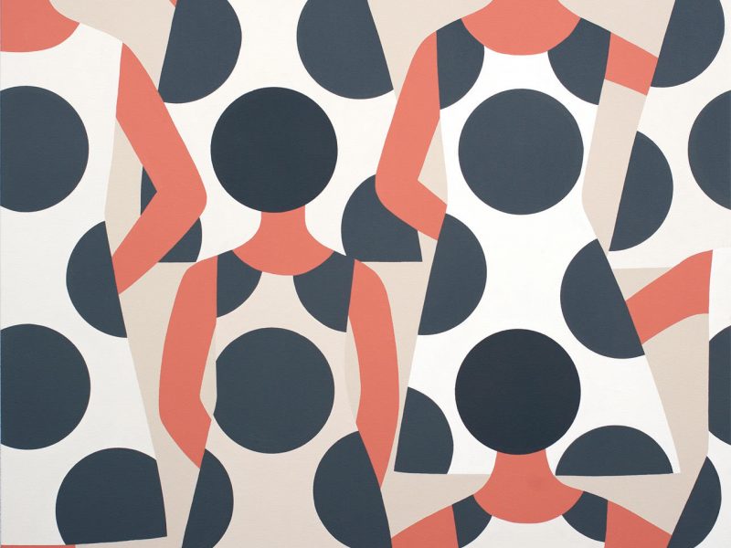
Typefaces and design layouts for various ad campaigns design while at Nike.
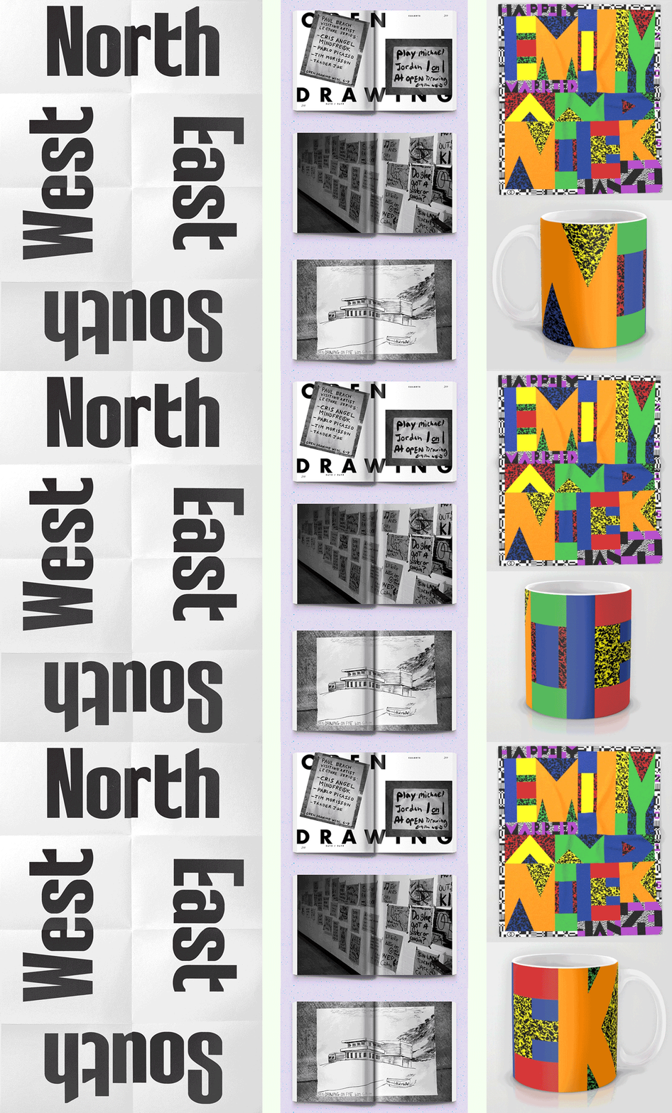
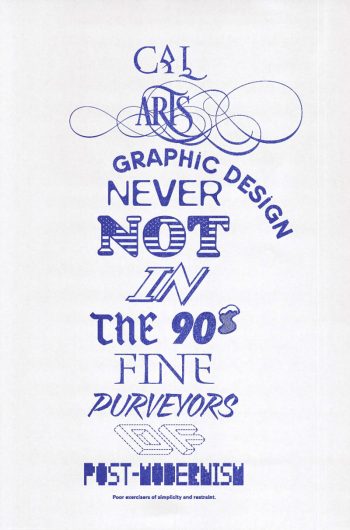
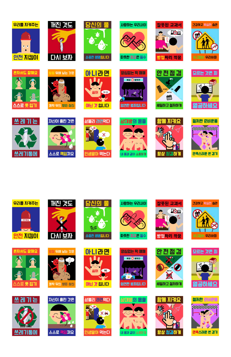
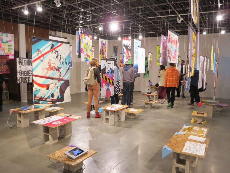
Self-initiated projects, left to right: Rage Babe typeface poster; spreads from the book Open Drawing: Rules and Regulations; custom pattern for wedding mugs and blanket.
David: Well first off let’s give shout-outs to W+K for being so supportive of me since being here. They have consistently been very gracious in giving me great opportunities in such a short period of time. Simone Takasaki, Guy Featherstone, Rehanah Spence. I’ve been able to exercise my design chops, creative ideas, writing, personal endeavors and visions all in the two-ish-and-a-half months since being there.
The [mural] Project started off by getting a brief from Colossal Media to W+K saying they wanted to paint a wall for Innovation Week. Something that would showcase their talent, skills, and versatility. The W+K side of it was make it a Nike Just Do It. wall. Something that captures the essence of the JDI slogan. Our interpretation of that was to try to make the sickest mural possible. “You want something hard to paint? I’ll give you something hard to paint alright… I’ll design something un-paintable…” The fact that the mural happened in “international design waters” allowed it to come together: it’s a Nike wall, designed by W+K for the Nike quad, in the W+K building.
As for the design process… My original co-partner on the project Deb Lee and I did a bunch of image research of things we liked and aesthetics and other murals. Then we started with some sketches and mockups, digital and analog. Executed some big idea things as well as some different aesthetic explorations and executions. We then decided what was most interesting and contemporary and captured the vibe of Just do it.
After that it was very much Keedy Methodology 2.0… Execute versions and variations within a concept see where it takes you, compare them, narrow them down, and try some more things. Throw out what’s not working try to understand what is working. Slowly begin to build a narrative within the composition where things are begining to speak to each other. Think about balance. They have to work on a macro and micro level especially at that size because you experience on a 1:1 human level. It’s much easier to dismiss something chaotic in a magazine spread than it is to dismiss it on a wall. So things eventually had to make sense have a little bit of a story.
Getting the rights to all the photo was sort of a temporary nightmare. everything had to be approved or purchased, and we had to swap out an image or two, which at first felt like a real knife to the heart because I spent so much time trying to find the right thing to complete the puzzle… but it actually worked out for the best in the end. I can’t actually imagine the wall in any other way, although I did 200 version/variation combos to get to what it is now!
Finally, one night on the last check-in, I stayed up till 2:30am on my own time working on it, trying to solve the last pieces of the puzzle, and magically it all came together: colors, composition, and narrative, it all just clicked.
The Nike Just Do It wall is quintessentially ‘chaos meets control.’ It’s something that makes you say ‘Whoah! Fuck, that’s cool, I wish I did that.’ which more or less is what I want most from all my work.
But beyond that, it takes some time to process the complexity of the wall. It gets better with time. At first you think its one thing but later you begin to understand it in a new way, you see different things, you make different inferences, and create new connections.
The wall captures the spirit of Just Do It through content and style: energetic imagery mashed with contemporary aesthetics met with a sense of nostalgia. But it also tells a narrative across the wall, instances are not singular and images interact across the space. The wall also speaks to a challenge. It’s not simple and it takes effort to take everything in.
The painters didn’t think they could paint it, we didn’t know if we could get it to a point we were satisfied with. At a certain point it’s like ‘this is what it has to be and should be’ we’re just going to make it happen regardless of limitations. I’m just very thankful I got the opportunity to work on it and I hope people think its as rad as I do.
Special thanks to Colossal Media, and everyone in the studio who helped clip out the final images, Simone, Rehanah, Deb, Guy, and W+K.
