MFA2 Graphic Design students presented their thesis projects to the faculty and student body (as well as emeritus professor Ed Fella and a few surprise guest alums!) on Thursday February 4th in the swanky new Generator Building. The subjects ranged from typographic explorations in virtual reality, to the invention of an activist design group fighting against digital surveillance; from a trans-human cross-media “newspaper”, to a set of tools to tackle misogynistic Korean slang words.
Students have the rest of the Spring Semester to revise, rework, develop and continue with their thesis projects, so we took this chance to ask some of the presenters about the “dreaded” thesis experience, and to find out what they intended to do next with their projects…
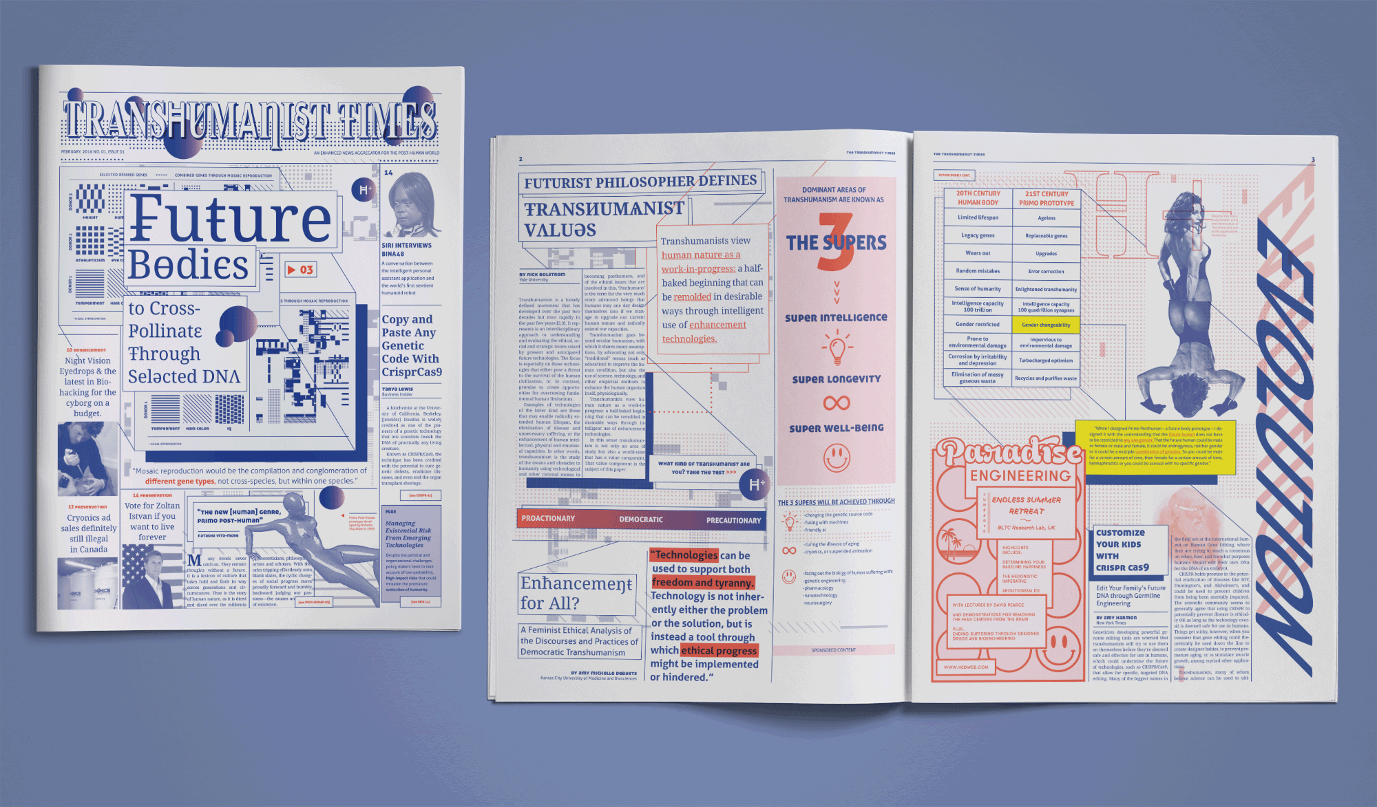
Left: Cover page of the Transhumanist Times. Right: Select interior spreads explaining the Transhumanist philosophy and bioethical debates relating to genetic engineering and human enhancement.
Name: Margaret Andersen
Thesis Title: Techno-Progressive Print: Hybridity and Enhancement in Visual Journalism
Tell us what your thesis is about?
My thesis focuses on the idea of enhancement as metaphor. I explored how design and technology can enhance traditional print journalism through interdisciplinary storytelling.
What form did it take and why?
I designed a 16 page “hybrid” newspaper that features longform articles, satirical ads, information graphics, and interactive content which is accessible through an augmented reality app. I wanted to make the experience of reading the news offline as visually engaging as it is in a digital environment, while still retaining the tactile experience of holding a pre-internet news source in your hand. I have prior experience working in newsrooms, so I wanted this project to reflect my interest in journalism but through the lens of a designer. The content for my newspaper was a curated series of articles relating to Transhumanism, which is a philosophy that seeks to augment, enhance, and transform the human condition through technology and machines. Focusing the content on this idea of post-humans, integrated with machines, helped to reinforce the metaphor of enhancement and hybridity.
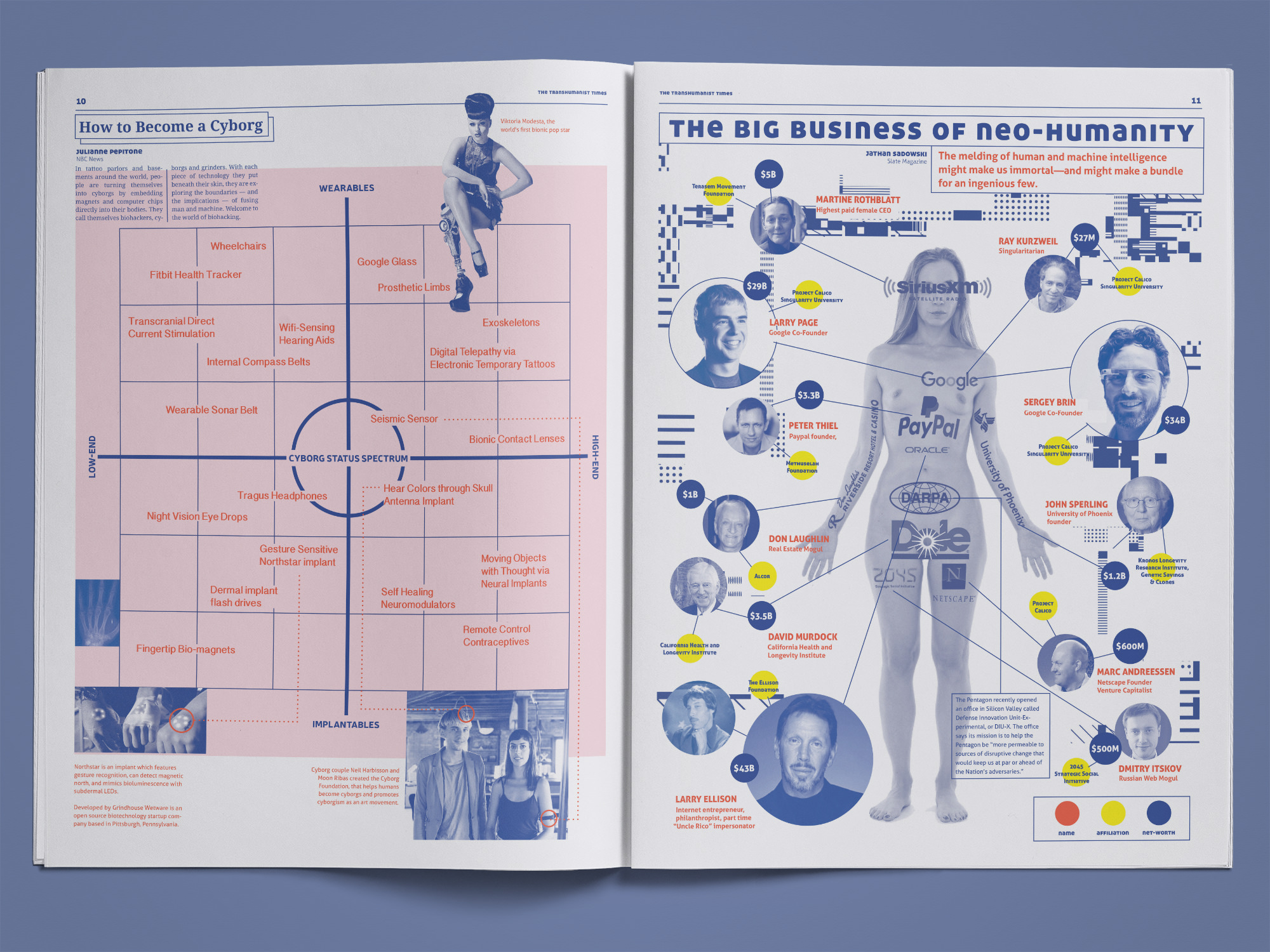
Left: Grid matrix diagram detailing the range of options for becoming a Cyborg, from high end to low end body modifications, and if they are considered wearables or implantables.
Right: Infographic showing some of the wealthiest entrepreneurs, their net worth, and the Transhumanist related research they are funding.
What are you going to do with it next?
I’d like to continue adding more interactive elements to the spreads and explore how programming and generative design can further enhance the newspaper’s content. This project was kind of a prototype for a future publication that I’d like to produce on a larger scale, so I’m investigating ways to take this from a grad project to something that’s available in the real world.
Do you have any self reflections on your work? On the thesis process?
After struggling to find a cohesive visual style for this project, adding restrictions for myself definitely made it an easier creative process. My thesis had a lot of moving parts in terms of structuring a range of content thematically into a limited number of pages. To help myself in the pre-planning stages, I created a branding guide for my newspaper with strict design parameters. Allowing myself to only work within the constraints of that system kept me focused on creating tighter, more dynamic spreads, rather than getting distracted by endless design possibilities or by my impulse to just use all the fonts.
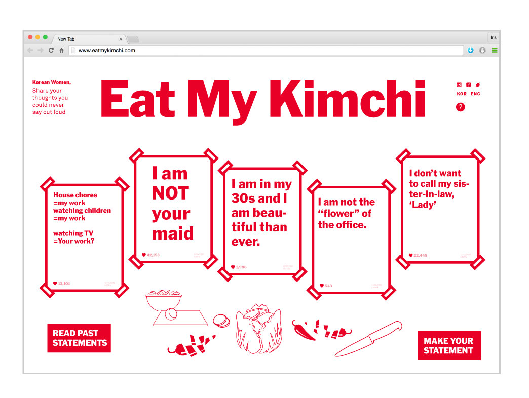
Eat My Kimchi: An Intervention for Kimchi Women
Name: Iris Chung
Thesis Title: Miserable Witch, A Spicy Makeover: Graphic Subversion and Intervention of Korean Misogyny
Tell us what your thesis is about?
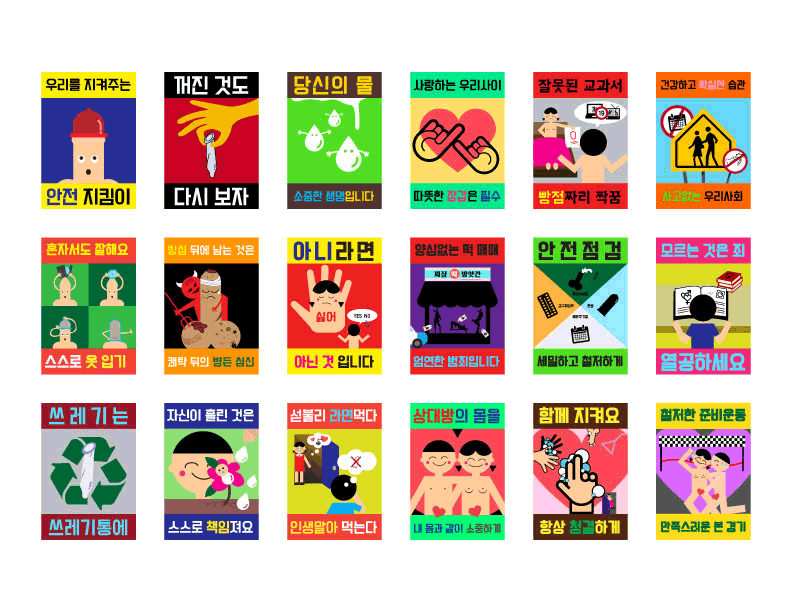
I wanted explore ways to keep the container of the current misogynistic vocabulary, but recast the their contents/connotations. I selected six common representative Korean misogynistic words that contain gender stereotypes, analyzed their context and sociocultural background, and created graphic interventions for each word to subvert the misogynistic meanings. I explored how to deliver more meaning beyond the superficial meaning, contextualizing and decontextualizing through re-interpretation and storytelling as well as changing the negative connotations attached to such misogynistic words and enable women to truly ‘own’ the words through a graphic design approach.
The six words are Kimchi Woman, Soybean Paste Woman, Mrs. Kim, Abortion Insect, Mom Insect, and Surgery Monster.
What form did it take and why?
The project was made up of six “interventions” that work to break down the misogynistic words and gender stereotypes and re-cast their representation. I had to come up with a different format for each intervention because each phrase contains different misogynistic meanings, criticizing certain types of women, so each required a specific solution. I had to consider and approach each phrase differently according to social, cultural contexts and backgrounds. I tried to engage contemporary mediums for each intervention in order to reach out to the target audience and bring up conversations in real life.
Fun Fun Sex-Edticon: An Intervention for Abortion Insect
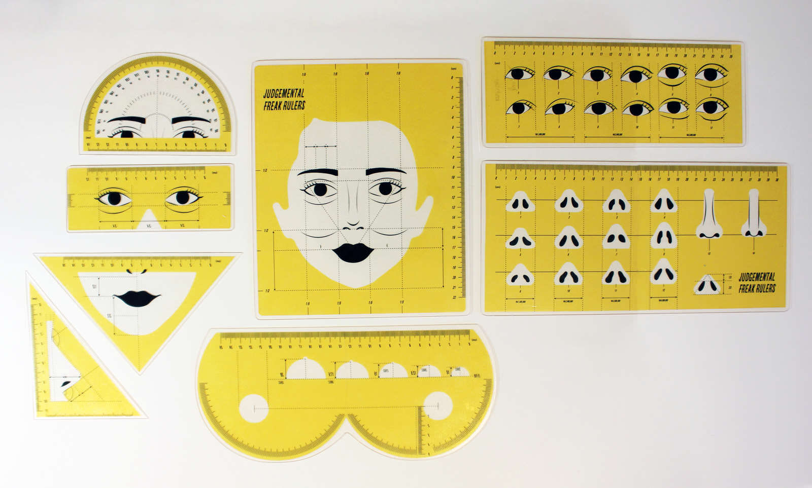
Judgemental Freak Rulers: An Intervention for Surgery Monster
What are you going to do with it next?
My future plan for this project is to revise these projects and find a way to make it really happen in public. Moreover, I’d like to resume creating subversion and intervention for these words in different scales, some smaller projects, some larger projects.
Sadly, these six words were just part of many. There are a lot of misogynistic terms being created online even as we speak. Some get ignored but some get adopted by the public.
Do you have any self reflections on your work? On the thesis process?
In contemporary culture, virtual space is the main platform for the exchange of ideas and information. Many stereotypes made through the Internet get spread around very quickly and get solidified by anonymity. The role of graphic designers is increasingly important in creating meaning, visuals, and language because designers’ productions can have a huge impact in the Web environment. Language and words are containers that deliver meaning, visuals, and context. They are such powerful media to communicate ideas. We share ideas that are embedded within words and we visualize upon these shared ideas through words. Put another way, words can take control of how we think, act, and communicate. Graphic design and communication can never be separate.
As I was working through my thesis and collecting references, I was very much surprised and sad to find that there wasn’t a lot of Korean feminist discourse out there related to graphic design. Almost none in Korean graphic design history. Being one of the most conservative and patriarchal societies in Asia, a Feminist graphic design field hasn’t been established in Korea. It was very meaningful for me to frame this thesis project as a Korean female designer and bring a feminist agenda to the fore. I learned and experienced that design activism offers designers the opportunity to align designers’ work with their beliefs. Using our skills, we can help give voice to those not being heard through a range of different design forms and strategies.
Dancing Type
Name: Jessica Lee
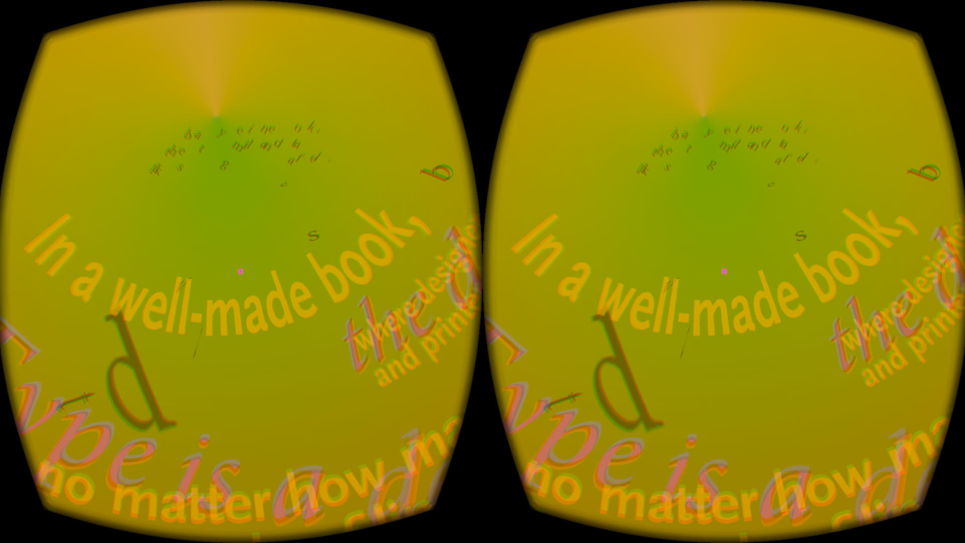
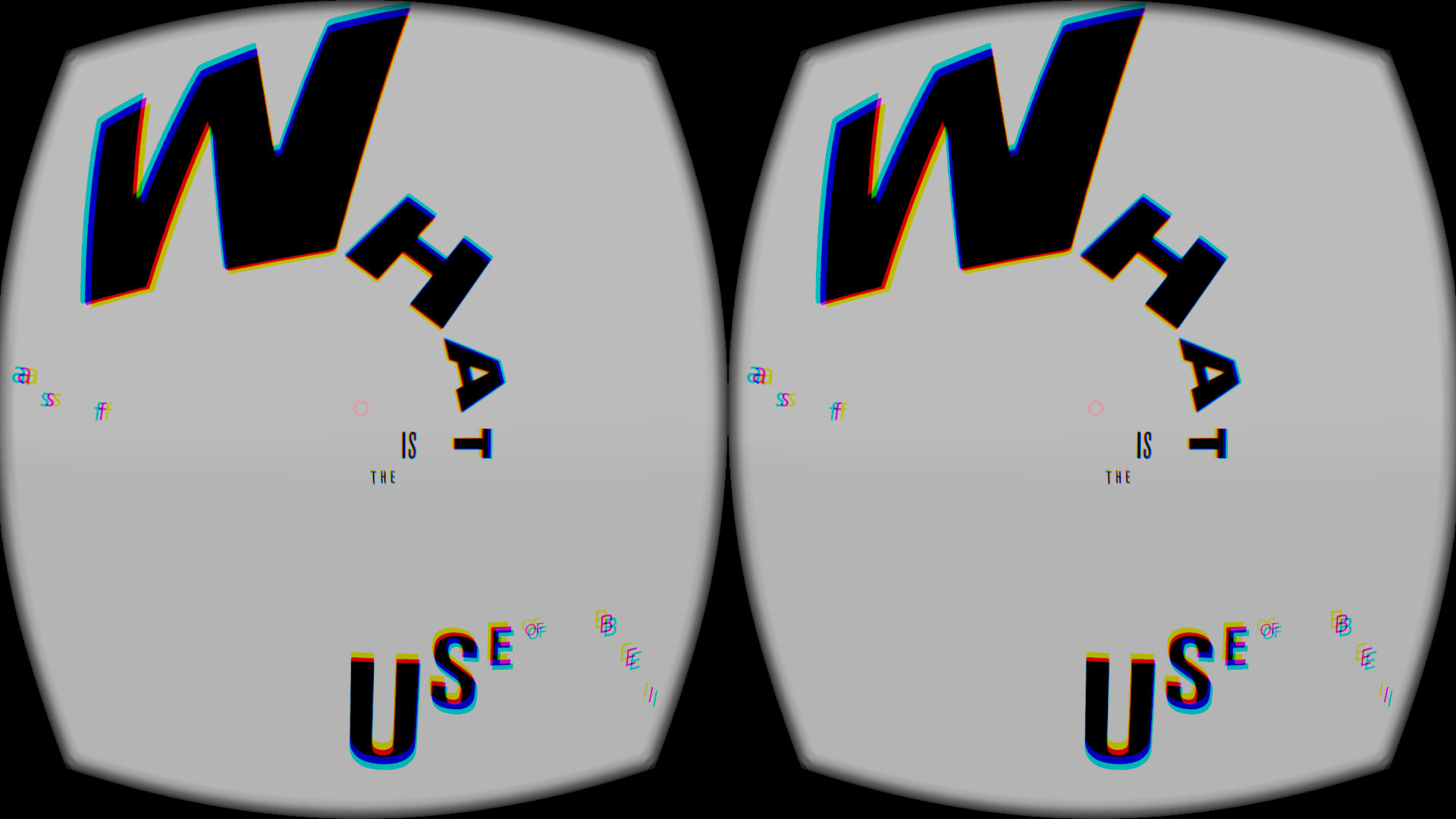
Thesis Title: Type Wonderland: Exploring how to Redefine Typography in an Immersive Virtual Environment
Tell us what your thesis is about?
Designers are mostly trained to design for two-dimensional surfaces and flat mediums versus an immersive environment: these are two fundamentally different challenges. The advent of new technology, Virtual Reality, would not only change the rules and function of typography in the mediums of yesterday, but also change the reading experience for the viewer. My thesis, “Type Wonderland,” examines how 2D letterforms live, function, and interact with the viewer in VR, and also explores how dimensional type can experiment with conventional functions and interactions.
What form did it take and why?
I made a series of VR pieces. Rather than making prototypes (and producing more iterations) I chose to build working VR environments since seeing VR on a regular screen is completely different from experiencing the environment in the headset. You absolutely have to experience the VR to see how it really works. I was also able to develop ideas and understand the immersive environment at the same time as I was literally creating it.
Breathing Type
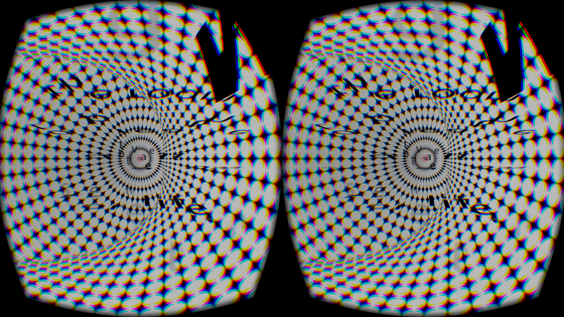
Breathing Type
What are you going to do with it next?
VR is a very complex and rich medium, and there are so many more things we can do with this. I just tapped into the basics for my thesis, and I would like to keep working on it and see what implications this world has for designers. My current VR builds only work in the Oculus headset, I would like to make a Google cardboard app or interactive video to publish online and make it more accessible to a wider audience.
Do you have any self reflections on your work? On the thesis process?
I tried to show my work to as many people as I could in order to see how people react. VR is an immersive experience. Seeing people interacting with my projects enabled me to see what needs improvement and what is working. It’s easy to be a less critical thinker as a designer, blinded by new computer effects when you are dealing with emerging technology. Talking with other designers helped me stay critical. Even though I wanted to show off some new computer effects in my VR, if they were not related to my projects or they had no meaning, I just let it go. I regret that I didn’t look at architecture or urban design and consider how those areas use spatial experience. I mostly looked at MIT’s Media Lab projects or other new media projects for reference at first, but those limited my creativity somehow to produce similar things. But when I looked at traditional graphic design works—like Wolfgang Weignart or El Lissitzky—that gave me more inspiration and ideas about the space in relationship to typography.

Our face is worth our privacy. By wearing the f***ing face, we all stay anonymous in a surveillance society.
Name: Jimin Kim
Thesis Title: DADS: A Guide to the Four Graphic Design Strategies to Defeat Big Brother
Tell us what your thesis is about?
My thesis is a guide to the four graphic design strategies to defeat Big Brother, as written by Designers Against Digital Surveillance (DADS)
What form did it take and why?
It’s a book. As my thesis consists of various types of works such as video, installation, and photography, I needed one container which can cover all different formats with consistency. In that sense, a book was an appropriate form that I could take. And also, in a way, a book is against digital technology, which makes sense for my concept.
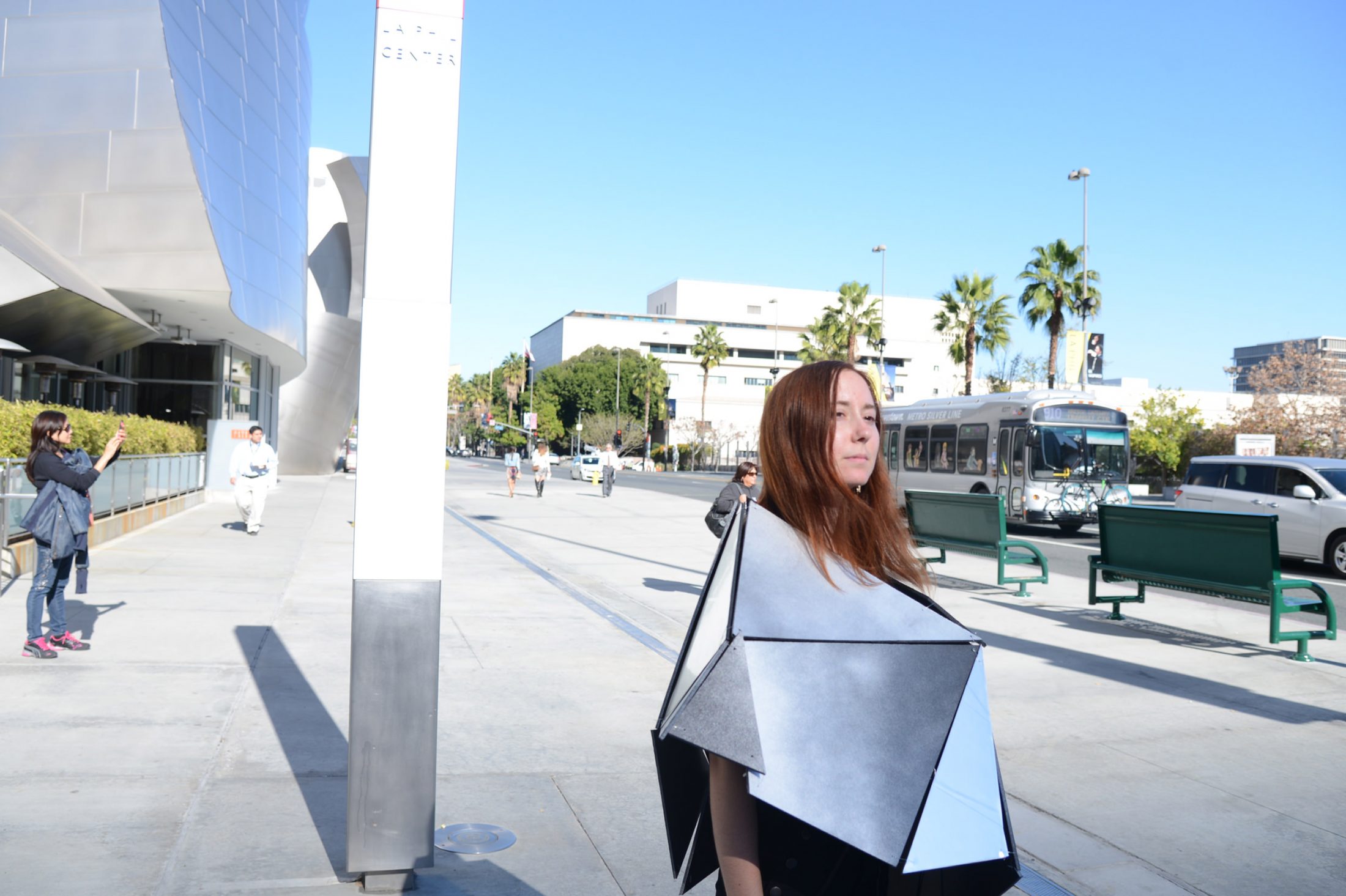
Using three camouflage strategies (resemblance to the surroundings, self-decoration, and countershading), the urban camouflage jacket protects users from digital surveillance in the urban surroundings.
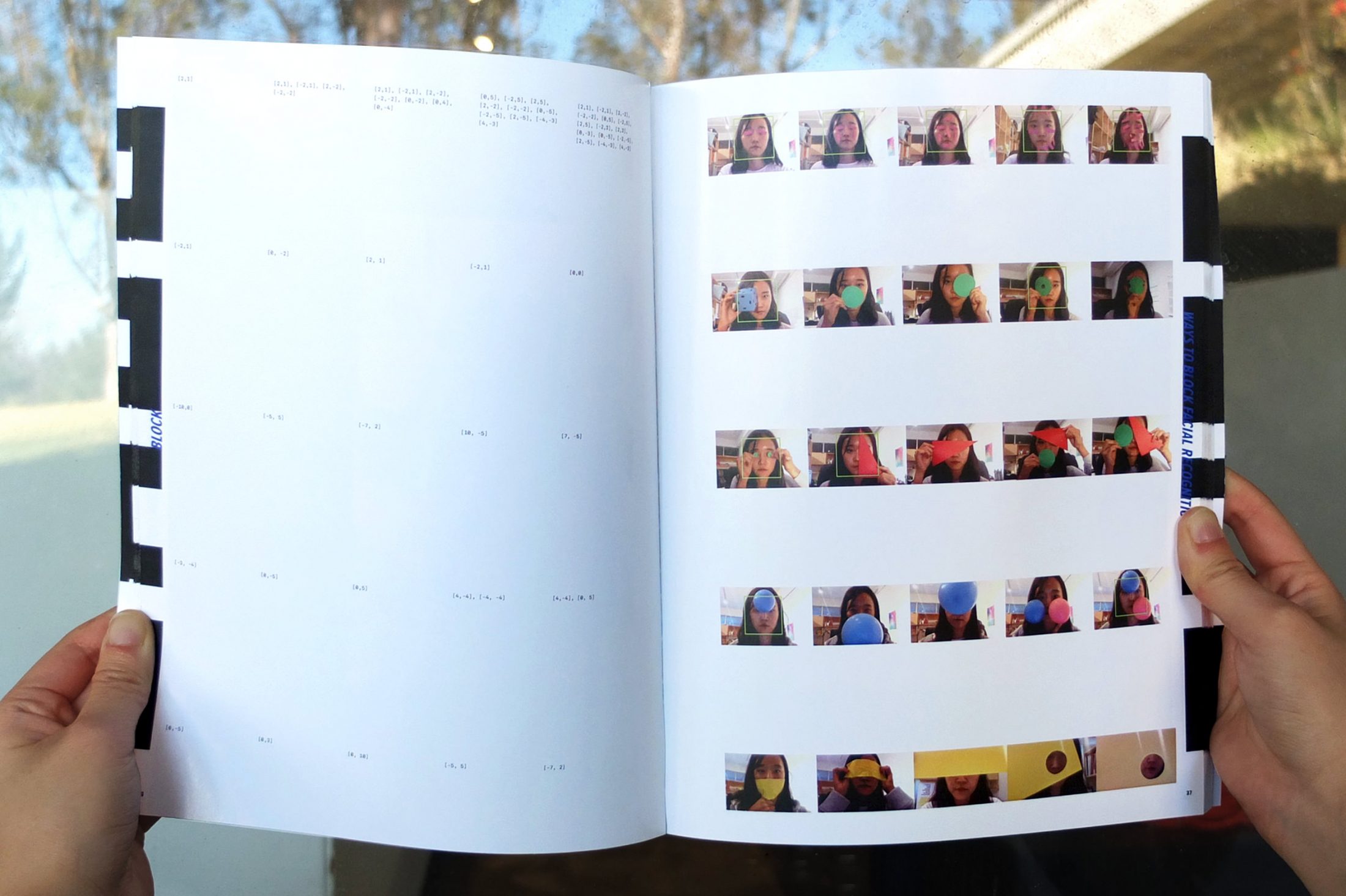
Designers Against Digital Surveillance (DADS) book.
What are you going to do with it next?
I’m planning to work on the website to share my project with the public and bring the conversation into a larger forum.
Do you have any self reflections on your work? On the thesis process?
The thesis was challenging. Because above all, it required me to define my own areas of interest, which had been the hardest thing for me. But now (after my thesis) I know what I’m sincerely interested in, and what I should keep doing even after leaving school. Even though I still have so many things to do to finalize the project, I think that’s the greatest reward of my thesis.
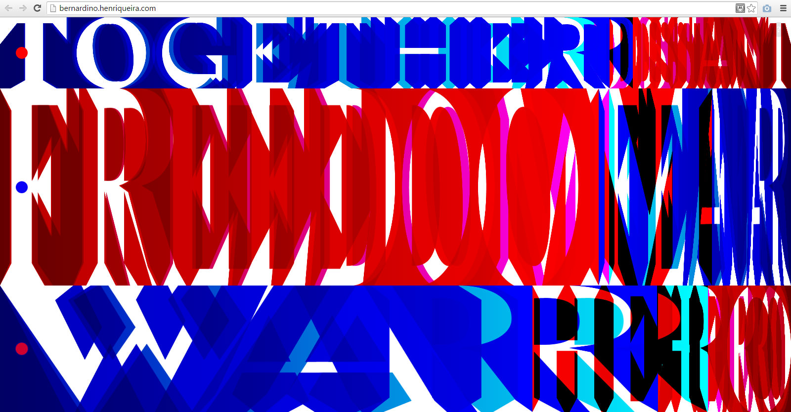
“Bernardino” is a web-poem showing the tensions and contradictions between the loaded words in Barack Obama’s speech after the shootings that happened in San Bernardino, CA, on December 2015. It can be read at bernardino.henriqueira.com
Name: Henrique Eira
Thesis Title: re:verse | Toward a poetics of graphic design in the digital everyday
Tell us what your thesis is about?
My interest in this thesis is twofold. On the one hand, it is a critique of the contemporary landscape of (rational, straight-forward, minimal, universal) web design and a search for alternative aesthetics and behaviors. On the other, it is an investigation of reading and writing on the web, and the poetic possibilities of web-based narratives. The goal was to create interfaces that communicate on an emotional, visceral level and that are open to multiple readings and interpretations.
What form did it take and why?
I designed a series of 15 web-poems, which were later translated into posters as a secondary exploration. The content for each piece was either a reaction to news shared online, or a play with internet vernacular and conventions. The thinking with the web-based experiments was to cover as big of a range as possible in terms of functionality and form-making with HTML, CSS and Javascript, so I could later see which of those produced the most interesting results. The goal with the translation step was to force myself to have a different point of departure for concept and form in my print-based design, hoping to achieve results that looked and behaved differently from my usual work.

“City of Light” is a web-poem about the terrorist atacks that happened in Paris on November 2015, created from the testimonials of the survivors. It can be read at cityoflight.henriqueira.com
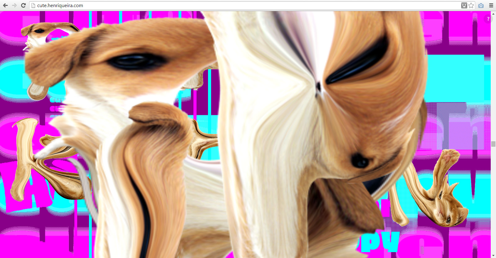
“Cute” is a web-poem on the overwhelming amount of internet content about cute animals that you see every day. It can be read at cute.henriqueira.com
What are you going to do with it next?
First, I’ll fix technical bugs and finish the mobile versions of the web-poems, while continuing to explore the possibilities of translating those experiments into print media. Later, I want to select the most effective strategies to use as starting points to build more complex narratives with more elaborate form.
Do you have any self reflections on your work? On the thesis process?
This whole process was a dive into something new for me. Having never worked too intensely with web design before, it was interesting to see how that shift in media and tools also led to a shift in thinking processes and formal solutions. I think what was great about doing a project structured as a series of experiments is that now I have a lot I can work with and deepen to continue exploring the things I am interested in.
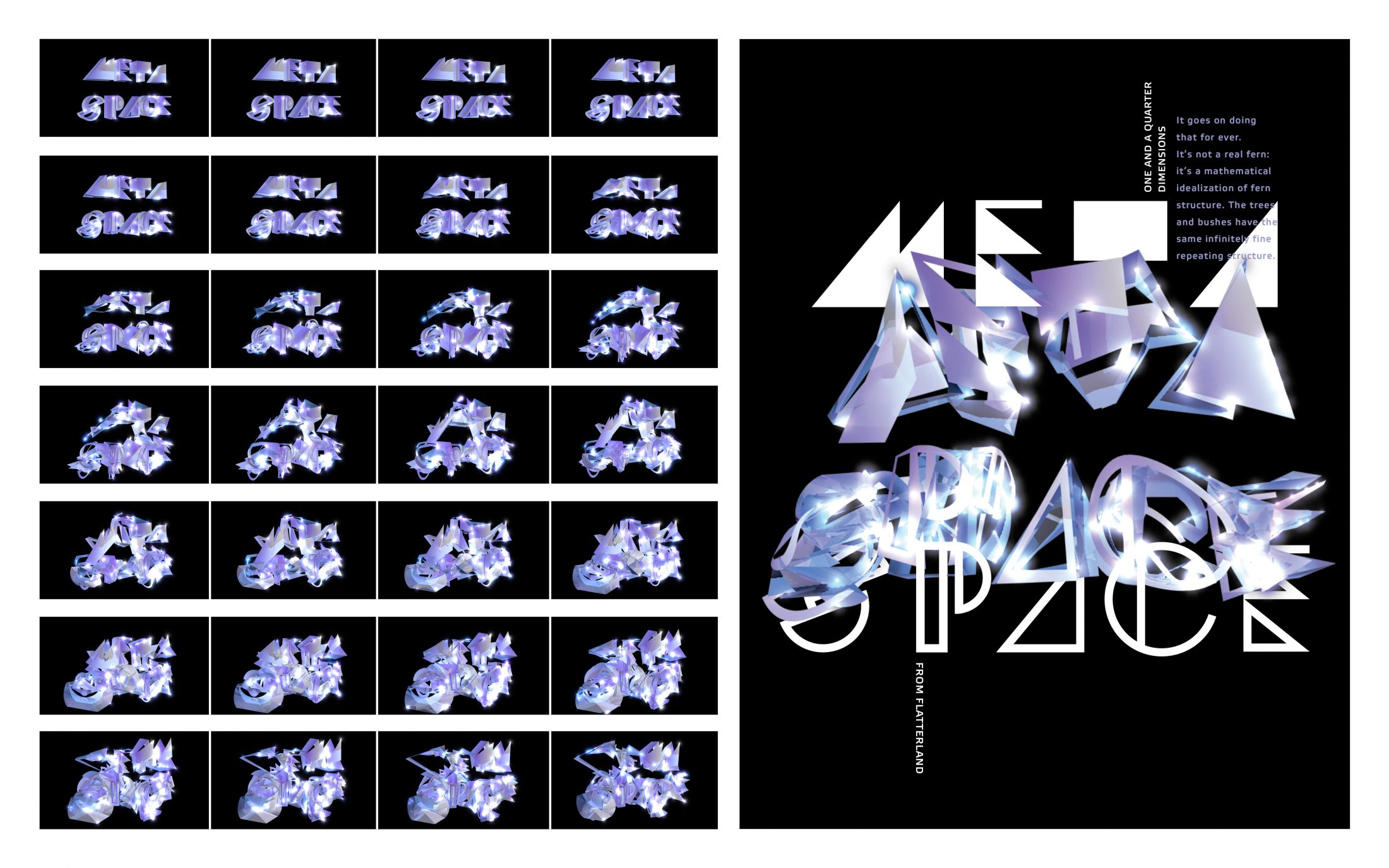
MOMENTypography
Name: Dasol Jung
Thesis Title: MOMENTypography: Capturing Typography from Performative Dimensional Processes
Tell us what your thesis is about?
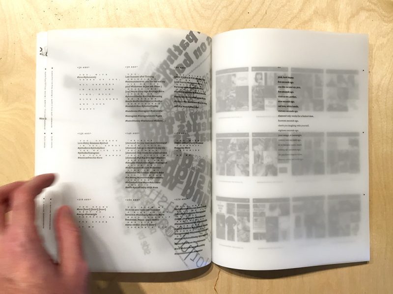
MOMENTypography is a new mode of typography methodology. By investigating the area of undefined typography, which is using motion as a part of process, this project will expand the graphic designer’s own typographic criteria. The result is an unpredictable design, performative typographic processes and experience, as well as a response to the unique qualities of the current technology. My thesis is about the relationship between static and motion conditions, 4d to 2d, abstract to actual.
What form did it take and why?
This thesis transforms 2d typography into 4d graphics, capturing the static image from the motion process. Typography was built in Cinema 4d, with various effects and camera movements contributing to the unpredictability of the resulting frozen image. I wanted the forms to be dynamic, giving dimension and movement to the typography.

MOMENTypography
What are you going to do with it next?
This process has raised new challenges about making strong relationships between typography and time and composition. With the wide range of formal experiments I have done so far, I want to focus more on editing the content and the structure.
Do you have any self reflections on your work? On the thesis process?
I’m glad that I was able to make explorations based on risk and undefined areas. This thesis process allowed me to have my own graphic methodology that explores the full range of approaches and structures.