When someone says Graphic Designer, the image that comes to mind isn’t usually one that is associated with athletics. However, as Jon Sueda (MFA 2002) explained in his recent Visiting Designer Lecture, being a great designer requires the same level of focus and skill-building that an athlete dedicates to training their bodies. I spoke with him after the lecture to learn more about his recent work with Experimental Jetset, and current role as Department Chair of Design at CCA.
For your lecture intro, we learned a lot of entertaining facts about you from your former classmates and colleagues, one of them being your history as a tennis player. What principles of tennis or of being an athlete apply to life as a designer?
First of all, my “tennis player” history has gotten quite exaggerated over the years… I was never a “professional” but played at the collegiate level and was a pretty decent doubles player, but there was never a moment I thought tennis was a career option, I was never good enough.
However, I have to say I really do look through the lens of an “athlete” at everything I do including Graphic Design, although it seems like a totally different activity. Maybe the first aspect is simple, practice, practice, practice… I spent endless hours as a kid playing for 6+ hours a day, hitting the same stroke over and over again until it improved. In design school, I had a similar work ethic, simply working on skills like composition, type, reading form, etc everyday, until I got better at it. It sounds a bit silly, but I would essentially design daily “drills” for myself that would develop these areas.
Another big lesson I took from tennis was about strategy. I was a smaller player (5 foot 9 inches), and some of the guys I played in college for way over 6 feet and could simply overpower me with their size and strength. The harder you hit to them, the faster they would blow you off the court! At the college level, I really needed to be highly strategic to have any chance of competing… I would have to quickly read the opponents weaknesses, sometimes they were physical (a bad backhand), or emotional (a bad temper)… and make them do things they didn’t like. Sometimes this meant committing to playing very “unorthodox“ or even “ugly” tennis in order to get a positive result. I take a similar attitude when it comes to process and form in design. I love assessing all the limitations in a project, this might include things as simple as budget, time, or my own skills (or lack of certain skills), and determining specific processes or strategies to address a particular context. At times these processes might yield uncomfortable or strange results that would be easily discarded or dismissed as ugly or bad… but to me this is where things get really interesting.

Left to right: Wattis Institute exhibition, Wide White Space, 2011; Statement and Counter-Statement: Notes on Experimental Jetset, 2015.
You’re currently the Design Chair at CCA. Tell us a bit about the differences between working in an educational setting versus a studio, or a non-profit like the Wattis Institute?
In your own studio, you are trying to create the best conditions for you to make the best work possible…in my case, I’ve mainly worked alone so I had total control of my work environment. When leading a graduate program, it’s not “all about you” anymore. As the chair of CCA MFA Design, I’m trying to create the best conditions for 80+ students to make amazing work. The really interesting and challenging thing about CCA is that our program is transdisciplinary, housing three disciplines (Graphic, Industrial, and Interaction Design) rather than just one. This condition has created very interesting student work, conversations, and posed a series of questions that have been really interesting to think about, for example; what is the shared language between different disciplines? How can we rethink design foundation courses that encourage working across disciplines? What new design practices can be created through cross-disciplinary work?
In your lecture you showed slides of your design project built out of Ed Fella’s garbage that you stole. How much did you actually collect, and what was the final outcome of the exercise?
I collected Ed’s trash for about a year, but most of it was gathered during the summer between my first and second year where I stayed in Valencia and worked in the studio. Ed was the only one around and when he used the copy machine, he’d throw his trash out in the public garbage can outside his office…during school he tends to throw his garbage away in his private trash can. As I showed in the lecture, this was a continuous project that I did three times. The last iteration in 2013 was for Ed’s retirement celebration. I decided to design a homage poster that I made from all the straight lines I could extract from Ed’s trash. To me, this was an interesting way to distill the essence of Ed’s work, in a sense showing a collection of the most “elemental” and “basic” marks he could possibly make. This result was a stark contrast to the very ornate and dynamic signature style Ed is known for. I don’t consider this the “final” outcome, perhaps I will do another one in 10 years… who knows.

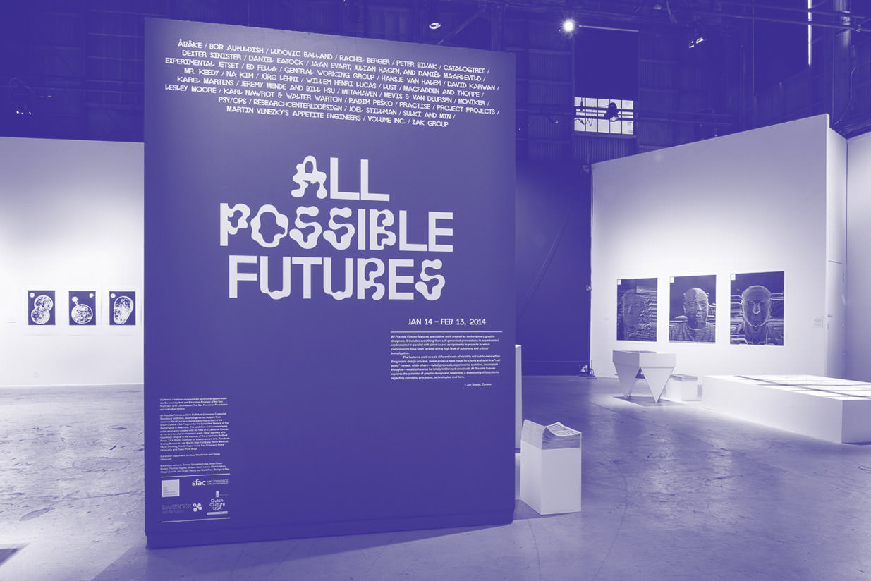
The branding for the All Possible Futures show was really striking. Can you discuss your design strategy for this project? What font, or exhibition flow, or catalog design best represents the futuristic or speculative aesthetic your participants explored in their work?
In all the exhibitions I’ve curated, I’ve also functioned as the graphic designer. At some point all the responsibilities became too much. I began to experiment on how I might “outsource” part of the graphic design to others to help relieve some of the workload. In “Work from California” that I curated for the 25th Biennial of Graphic Design in Brno, I experimented with commissioning the exhibition identity as a piece in the exhibition. I actually asked Ed (Fella) to design the exhibition logotype and displayed the original past-up drawing framed on the entry wall flanked by the exhibition text.
For “All Possible Futures” I essentially did the same thing, but conflated two projects in the show together to form the identity. I discovered this font “Lyno,” designed by Karl Nawrot and Radim Pesko, that embodied the speculative narrative of the show. Instead of multiple weights, it offered multiple typologies that resisted the idea of singular form. I combined this with Zak Kyes identity for the Nouveau Festival, where Zak proposed a fifth color to the pallet of the Centre Pompodou. This color was called “New Extreme Violet,” and would be applied to a range of materials without a traditional logo. So basically I used the typeface Lyno in the color New Extreme Violet for all the materials throughout the show including the title wall, labels, etc…
Graduating from CalArts means you come away with not only a great design practice, but some pretty unique memories. Tell us one thing about CalArts you’ve never said to anyone else!
I don’t have any good secrets or anything… my memories revolve around the people… my favorite time of the week was talking sports with Scott Zukowski and Stuart Smith on Fridays.