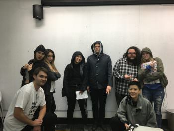
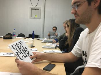
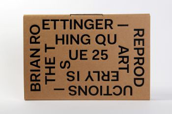
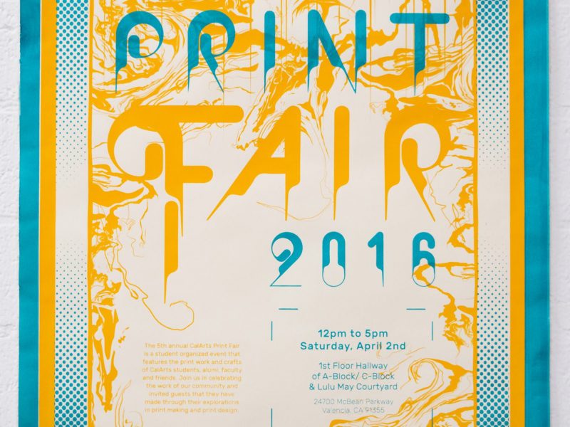
Unlike most art institutions, CalArts offers an intersession practicum between it’s fall and spring semesters. These courses and workshops are a chance for undergraduates to learn skills outside of the their regular course load and provide an opportunity for students to work closely with practicing designers. This January we were fortunate to have among our visiting designers returning alumni Brian Roettinger.
Roettinger received a BFA in graphic design from CalArts in 2004. Shortly after graduating he was appointed the Design Director at SCI-Arc (Southern California Institute of Architecture) where he re-developed the institutes graphic language and visual identity across a large range of mediums and platforms. During this time he also operated his own interdisciplinary design studio Hand Held Heart (originally a vinyl only record label).
In 2009, Roettinger left his post at SCI-Arc to focus purely on his own studio in Los Angeles. He has worked closely with many local and international artists, cultural institutions, and architects to design, produce, curate and direct many projects and exhibition catalogues. In 2014, he received his second grammy nomination for album packaging for Jay Z’s Magna Carta Holy Grail. (wikipedia)
Brian was generous enough to sit down with Ella Gold and myself for the following interview.
Dameon: I was researching into your history as a designer, so correct me if I’m mistaken, but didn’t you start out as a musician?
Brian: Yeah. I mean I played music, but I guess calling me a musician is unfair to people that actually are musicians. You know, I work with real musicians now and I’m like “oh I’m not a real musician”. Yeah. Most of the early design work I did was band ephemera, posters, CDs, LP covers. stuff like that.
D: Ah yes. It’s like the music and graphic design go hand-in-hand.
B: It’s like when I started, not everyone had a computer and not everyone knew what design even was. So if my friend’s band was putting out a record, they may be like “how am going to make this? How am I going to print this ” That was my gateway drug. I had a computer, I knew what CMYK was, I knew how to screen print. I had multiple friends that were playing in bands and like we’re putting out records. None of them were designers so the designing was left up to me.
D: This is a perfect segue into some boilerplate questions. I’d like to give some context for the readers that might not know who you are. My first question: how did you get interested in graphic design?
Brian: As a teenager I was really into skateboarding and playing in punk bands. Music and skateboarding were my outlets and I worked at a skate shop in Newhall (a town near Valencia, CA and CalArts). Working at a skate shop was my introduction punk and skateboarding. I not only learned about design, but aesthetics of what design could be. Like style and ideas of being like, “oh that’s a punk T-shirt or that’s what a punk logo” it looks like this Dead Kennedy’s logo or you know, Minor Threat. And then pairing that with skateboarding graphics it just sort of snowballed from there.
D: Yeah. It seems like a lot of designers in their 30s, have that similar story as to how they became interested in graphic design. Music, skateboard graphics, punk logos and Thrasher magazine. Which leads me to my 2nd question: why did you choose to attend CalArts?
B: I literally grew up right off Lyons Avenue (in Newhall). You know it’s funny, I was coming up here (to CalArts) when I was maybe like 10 or 11. I would sneak in here with friends and we’d be like freaked out. Like “what is happening here?”. Now it seems very normal. You know what I mean? But that wasn’t my segue into design. That was just to give you some context. At the time I would go on tour and I would be gone for two months and I would put records out and then I was like, oh I should go to college for design. So as the music became less interesting to me and the design aspect became more interesting.
D: How did your education at CalArts shape or influence your current design practice?
B: It just became more interdisciplinary. So it wasn’t just strictly design. When I was here (CalArts) I was like “what’s happening in the dance school? What’s happening in the music school? What’s happening in the film school? What are the art kids doing?” That’s the pedagogy of the school. It’s that you all share ideas under the same roof. I tried to embrace that as much as my schedule would allow. I think design should be more embracing of other practices. It is very similar to the interdisciplinary field that I am working in now with major level pop stars, to low level super experimental artists, to making books for artists, galleries and museums.
Ella: I was wondering how you got into doing art books?
B: I always made printed ephemera. So I was always into books and zines. You know, I like books for the simple fact that if don’t live in a major city and you are interested in an artist it may be the only way you get to see their work. It’s like all the art that I originally saw growing up as a kid I saw it in books. All the design I saw was in books.
So yeah, my relationship to a lot of art is how it exists in a book. But I also love the intimate quality that a book holds and people’s relationship with books
D: Can you talk about your time and work at SCI-ARC (specifically your architecture lecture series posters)?
B: I knew of SCI-ARC (Southern California Institute of Architecture), but only its relationship to graphic design. Michael (Worthington) did this amazing poster and Rebecca Mendez did a couple posters for them as well. All these designers that were like very L.A.
My first job that I started right out of CalArts, was at the ad agency Ogilvy & Mather. They have a design studio within the agency. It was my first job and it lasted like four months. After a while, I was like “What am I doing here?”. I’m not making anything I like. I’m making stuff and they are saying, “great idea, now let’s move on”. Like, it’s never going to get made. I’m so used to designing things that actually get made. I knew I wasn’t going to last.
So I left for a job at SCI-ARC. In the beginning I was the only designer and I had to produce a lot of material. April Greiman had worked on a lot of SCI-ARC’s previous posters and identity and the school was it was very much attached to April’s visual language. When I was in there, I was like I want to erase all of this! The directors really pushed me to experiment with visual forms and create a new identity for the school. I would present a poster on paper and they would say “what if this was made out of plaster?”. It just immediately it made me think differently about what I was doing.
D: Yeah, I saw a series of posters you did for SCI-ARC that were cut up and one was even shrink wrapped!? Very cool. How did you transition from architecture posters to designing for major label artists like Jay-Z and Florence and the Machine?
Yeah. So at the same time I was working at SCI-ARC, I was doing my own studio too. I was juggling. I would do like a couple of books here and there. When the first No Age record that was nominated for a grammy for packaging and I didn’t tell anyone at SCI-ARC. So when the administration found out and they were like “is this you? You were nominated for a grammy?” I knew that they had no idea about anything outside of their world. After all this stuff sort of started to happen to me, it just clicked. One day I was like “why do I still work here?” (laughs) You know you it’s like; you just have to jump. I think Ray Bradbury said, it’s kind of cheese ball quote. “Jump off a cliff and you learn how to fly on the way down”. I mean if you learn how to fly before you jump off then maybe you waited too long. So I knew could stay at SCI-ARC and be comfortable, but I don’t like being comfortable.
D: To what extent has being a former musician influenced your design practice? Does it give you any specific insights into creating an artist’s brand or record packing?
I mean musically I was into everything; like 90s like hip hop was all I wanted to listen to. And then it was like oh I would listen Joy Division. I was just a sponge for like everything. I can speak a language that understands the trajectory of music and know what I like. I’m like on board with the discussion. You know if you don’t understand the music it’s going to be a, sort of hard time. When you’re design a record everyone’s like “you want to hear the record?” I don’t even want to hear it. It doesn’t mean anything. I want to read the lyrics to know what the record is about. I’m not making a visual that’s like a counterpart to what it sounds like because that’s totally subjective. Yeah because when I listen to something I may hear the baseline or I may be listening to the rhythm section; you know? Hopefully there is a connection there. Just like if you like a Napalm Death record and you try to use that esthetic for an Enya record or something. It may not work. There are certain visuals that have sonic relationships. So if you’re not Kandinsky; you kind of represent the now.
E: Yeah exactly. I think that’s so arbitrary. What’s your studio practice like? All digital? Do you start in the physical and then move to digital? Can you describe a typical day in your studio?
Yeah I mean it’s partly coming back to (analog), so I have to get off the computer; But It isn’t driven by that. I think Ed (Fella) told me this one time it was about melding everything together so the stuff that’s super high tech stuff that’s super low tech. High tech would be like “OK I’m writing software that makes images low tech”. And then no tech. Where it’s like Xerox on newspaper or newsprint printing and the cheapest form of printing. So I like to mix high tech, low tech, and no tech. But also, not just graphic design; like all across the board.
So if it’s like a photo shoot, I’ll try to do everything in camera. If it’s like a live show production, I’ll think “oh how can we do this without making graphics and having a big LCD screen”. What if we did something that’s a little bit more like no tech? You know, so I always I’m always falling back on that. For example, if I had to paint line or something I wouldn’t do it digitally. I would just paint and then scan it. Once, I did a whole album campaign and live show and I shot everything with my phone with a tripod and a selfie stick. (laughs) Yeah. So there’s a lot of a lot of that.
E: Brian, is your favorite typeface right now?
Fakt.
D: Any last words or comments?
Oh when I was a student (at CalArts) in my third year I made this poster that said the “artist of the future is: the painter, the sculptor, the dancer, the filmmaker?” I crossed them all out and I wrote the designer. So a really the artist of future is the designer. I hung them everywhere and it created quite a stir!
Yeah. It was a big thing. They (art students) were like “who made these posters?” People started stealing them and tagging on them “fuck you, 90s Retros hacks!” (laughs) It was perfect because it’s true.
And then I made a little business card of me holding it and then I put those around campus.
