We spoke with CalArts Graphic Design alum Ian Lynam about the distinctions between design and art, design education, and what it’s like to teach design as an American in Tokyo
Ella Gold: Early on in Cannibals, you mention a distinction between art and design as art being something people go to, and design is something that comes to people. I think this is the most succinct distinction I’ve heard so far. Can you talk about that a bit more? Particularly I think newer exhibition-making models are trying to blur this distinction, and I’m interested in how that may have an effect on the kind of work artists and designers are producing.
Ian Lynam: That definition of the difference between art and design is something that I deploy when I need to create distinctions in extreme shorthand. It is not a totalizing definition, nor is it necessarily correct, but it helps explain aspects of the difference to people. The actual difference is very long-winded and you lose people trying to explain it. It is kind of why you never see Noam Chomsky on TV— he refuses to bullet point out his ideas. (And that is where you lose people—they usually don’t want to hear the long-winded answer. Like when folks ask me why I came to Japan, I always say, “I came for love and I stayed for the food… and then I found love again”. That’s enough for most folks.)
First, let’s parse out what l believe graphic design actually is:
Graphic design is a sector of cultural production in which conceptual and thematic thinking are applied using the synthesis of visual form and typography in an applied setting, usually resulting in media which are disseminated in multiples or in broadcast form. Graphic design embodies a mass communicative function.
Art, on the other hand, is the conscious use of skill and creative imagination toward the production of aesthetic or conceptual objects or assemblages or scenarios that exist in contexts that are defined as being art-based. Even in the case of Joseph Beuys-informed Social Sculpture, the result is art, even if the context is greater society and the goal being a Eurocentric utopian ethos.
Note that neither is a totalizing definition, but they start to stab toward a difference. The slippery edges between what VCFA alumna Laura Rossi Garcia describes as that special place between “the art fair” and “the design conference” is often where a lot of both the ‘good’ and ‘bad’ stuff goes down—design with inquiry as its base, as opposed to ‘problem-solving’ or design-flavored art.
It is important to note art’s annexation of certain design aesthetics—from Julian Opie and Brian Alfred’s adoption of digital aesthetics to the fetishization of the Risograph as kickstarted by CalArts alum Zak Kyes and former Faculty Mark Owens, as well as certain designers’ cooptation of relational and social practices, notably Åbäke’s spaghetti dinners and cutlery-making workshops. One could easily confuse one for another, but greater contexts define each in opposition.
Then, there is the difficulty in regards to theory and criticism—art offers a much deeper historical well of reflection and reflexivity than design in regards to theory—design has been ‘forked’ toward focuses on ‘Design Thinking’ and the plutocratic goals of Big Tech in recent years. The general global populace confuses technology with design and design with technology right now, and conflates the two, which is incredibly problematic and frustrating.
Exhibition-making muddles things further, as the rise of Relational Design and smaller initiatives make things a bunch more confusing. There is a global aesthetic sameness that is occurring right now, as the tools of graphic design are available to all and are largely the tools that a wide variety of artists use, as well.
This confusion is compounded by the self-esteem problem that a lot of designers seem to have. Metahaven dropped “design” from descriptions of what they do, Print magazine called the top emerging designers “New Visual Artists” in their now-defunct magazine.
I think my own practice, which includes a little bit of pretty speculative exhibition-making that uses a lot of the tools of graphic design, and which I call “graphic design”, but has the aroma of art, problematizes these definitions, but I consider myself a graphic designer, not an artist.

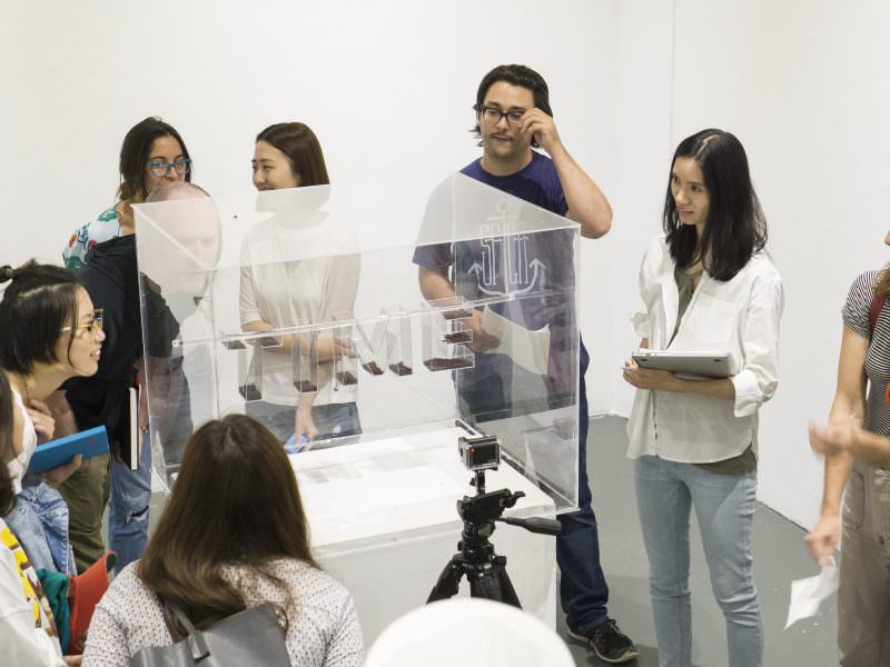
Slouching Towards Delphi, 2017
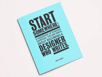
Start Somewhere: A Handbook of Dubious Exercises, Tips and Rants about Becoming a Designer Who Writes, 2016
EG: Many designers and educators ascribe their CalArts education to where they are today. I’m interested in that, and how (if at all) did your experience at CalArts shape your practice of designing and educating?
IL: My time at CalArts was essential—being taught by Mr. Keedy helped give me a foundation in theory and criticism, Lorraine Wild helped give design history a deeper sense of meaning to me, and Keedy, Michael Worthington, Ed Fella, and Louise Sandhaus all taught me rigor in regards to creating work that is typographically, formally, and conceptually sound. Gail Swanlund and Keedy both showed me aspects of how to teach through their extraordinarily divergent methods in their classes as a teaching assistant. A number of my peers were incredibly important to my development, as well—notably Catherine Guiral, Randy Nakamura, Megan McGinley, Mark Kulakoff, Brian Roettinger, Samuel Farfsing, Max Erdenberger and Eli Carrico.
Taking two years “off” from my life was essential in building on my design skills, as well as working on being a better person.
EG: On that note, what are the particularities you find teaching in 2018 that are different from when you were in school?
IL: It’s funny—a recent VCFA grad and incredibly talented designer and extraordinary person, Chad Miller, told me that he viewed the time when I was in school as being the “halcyon days” of graphic design, which I found both odd and strangely funny. There was a lot less access to stuff in the early 2000s—the internet was a lot smaller than it is now content-wise, and that affects the educative experience tremendously. My current students have a tremendous amount of access to larger and more niche quantities of information, but maybe that’s a McGuffin—honing one’s typography is just as important now as it was then. I was chatting with Lorraine Wild in LA a few weeks ago and that is one thing that we believe programs should emphasize more—even if responsive web design is the contemporary milieu in regards to designed output, if you can’t make the type look decent and communicate what you want, then why bother shifting design education toward UI and UX?
If one learns to be able to impart visual and semantic hierarchy, create a wide variety of form, gains an understanding of the relevance of theory and history to help deepen their understanding of culture, as well as hopefully feel like one is an active participant in society and cultural output, then the goals of education haven’t changed very much over the past two decades. And that is a *good* thing—of course technology changes, and the methods of design will shift, but if you have solid outcomes in place, then that is what is important.
In regards to the actual transmission part—the teaching—I am unsure. I was a student at that time, and I have had to learn how to teach. Like many folks, I started out teaching very much how I was taught, but that has changed a lot. I’ve matured as an individual—I had to learn a new language (a lifelong project), learn how to do typography in that language, be re-socialized, and really take a hard, long look at who I am and how I am. I left the US a supposed ‘master’ (due to my MFA) and arrived in Japan as a baby.
That whole process ‘softened’ me a lot—and the contexts in which I teach are incredibly different than where I went to school.
EG: As well, do you find there to be a big difference between teaching in Tokyo vs. teaching in the US? Are the pedagogical models different?
IL: Yes and no. Temple University Japan is an international university and I teach graphic design classes in the Art program—we don’t have a Graphic Design major. That shifts things a bit, though the university uses the American Liberal Arts model as its base. Our student body is a mix of Japanese folks, US military vets on the GI Bill, embassy kids, Study Abroad folks having their ‘otaku moment’, and students from greater Asia. It’s like a weird, very international island in monocultural Japan. I have to attenuate my teaching to each student and their individual background—trying to work around the annoying Confucian bits, instill rigor in the gamers, inject as much feminism into the classroom as I can, plus teach them appropriate design terminology in both English and Japanese so that they’ll be functional in their future workplaces.
Meme Design School is a school where I teach in Tokyo which is wildly different—the students are older and are looking to make a career change, getting into the design industry, and they go to the school in order to learn typography, design, history, and theory. Despite the students being older, there is a heavily enforced sense of social hierarchy between teachers and students which I’ve tried to deviate from, but it is difficult as I don’t spend a lot of time teaching there.
I have taught at a handful of other universities in Japan, and there is a much higher insistence on hierarchy and social propriety. I’ve been able to get around a lot of it by trying my best to activate classes through group socialization and mobilization—if you can get the people to talk to one another, then there is a giant chance for success no matter the pedagogical setting.
EG: In Cannibals you encourage educators to do the homework they assign. I love that idea! I feel like there’s this push in design education today to move away from the teacher-as-master, which in turn has somehow taken the instructor outside of the role of designer and into the role of educator. I feel like if the teacher does the homework, they are able to exist in a more liminal realm. As an educator, can you speak to this?
IL: Here’s what the Canadian philosopher and economist Joseph Heath has to say about this kind of thing in his book The Efficient Society:
Historically, hierarchies have played a very important role in the development of human societies around the world, precisely because they permit large-scale organization. For example, no agricultural society has ever succeeded in building an irrigation system without at the same time developing a centrally organized state.This is largely because the construction of irrigation systems is subject to serious free ride problems. (Instead of digging a canal from your field all the way to the river, why not just wait until your neighbor digs one, then just hook up yours to his?) A hierarchy institutionalizes the trust needed to eliminate these free-rider problems—you can go to work digging the canal knowing that your neighbors will be forced to help out as well—along with providing the straightforward co-ordination required to assemble and mobilize works crews, and so on.
Hierarchies did come under sustained criticism in the 1960s, when the hippie counterculture made a sustained effort to eliminate hierarchical forms of organization—substituting instead “horizontal” forms of direct decision-making. In the end, none of this had much effect, primarily because we lack effective substitutes for hierarchy. Thus, the major impact of the 60s was to give us a society whose overall style is anti-hierarchical, but which resorts to hierarchical patterns of organization whenever it needs to get anything done.
Growing up in the 70s, kids of my generation were constantly subjected to hippie teachers trying to create a less hierarchical ethos in the classroom—the old “let’s put our desks in a circle” routine. The problem is that there is no way to get around having a hierarchy in the classroom. Teachers know more than students, which is the whole reason for them to be there. This superior knowledge puts them in a better position to judge what should and should not be learned, and how it should be learned. As a result, the teacher-student relationship is either hierarchical or pointless. Making us put our desks in a circle did nothing to change that. If anything, its function was not to make us feel better, but rather to make them feel less uncomfortable with the authority they were wielding.
I love Heath’s writing and ideas—when I first read that passage, it really sparked something in my mind. I had been struggling for years to fight hierarchy, coming from the anarcho camp in regards to my personal belief systems, but it is inherent in education—and valuable—but I wasn’t able to see the proverbial water for the well.
Working alongside students provides a chance for them to see that just maybe the work at hand is of intrinsic value emotionally and intellectually, so much so that the teacher might find it interesting, and dare I say, fun, to partake in, as well.
That being said, the students in one of my classes at TUJ are going to typeset “the perfect paragraph” (of their own crafting—an exercise in micro-fiction writing as much as typography) using 8pt Letraset dry transfer lettering this week, and I am unsure if I am going to get down, as well. ;)
EG: This makes me think about design education at-large and the different camps in which schools tend to situate themselves. I am thinking particularly of schools like CalArts, which are hyper focused on critical rigor and making meaning, which seems to exist in opposition to the more pre-professional design degrees. I wonder if there’s a middle ground that can exist, in which students learn professional practices while simultaneously engaging in the kind of critical rigor CalArts offers. Do you feel like there can be an in-between space in which the best of both worlds are taught and neither is found lacking?
I thought of this particularly in your section about how to set up files; which may seem banal but is actually so important and something no one will teach you in school!
IL: I think that some type of perfect balance is definitely achievable—CalArts’ Professional Practices class is an excellent example of hacking the ‘real world’ part in, and there is not enough of that. TUJ doesn’t have anything equivalent in regards to classes, so I make sure to go over estimates, contracts, invoices, time tracking, and paperwork every semester in my classes. It is important for students to have a sense of the mechanics of business prior to graduating.
This is the kind of stuff that I never learned in school and figured out on the job, as well as from veteran designer friends along the way. A number of my students at TUJ are doing freelance work prior to graduating, so I try and make sure that they know what they are getting into.
In regards to both models of education that are mentioned, what is often incredibly lacking is a robust additional focus on the Liberal Arts. Graphic design is great, but if you don’t have any form of grounding in expanded culture—literature, philosophy, et al—a career in design might be ultimately less meaningful. My favorite class that I took in undergrad was a Political Economy class, and discussions with the professor who taught it helped me begin to bridge radical politics and to design a career in step with that.
Also, in regards to setting up files, most Asian printing companies are not running the latest and greatest software, so that ‘real world’ experience is vital to make production files that actually work.

Interior graphics for software innovator Pivotal’s Tokyo offices designed by Lynam

Interior graphics for software innovator Pivotal’s Tokyo offices designed by Lynam
EG: This also made me think about the argument for a low-residency design school, particularly VCFA and also OTIS is beginning to engage in a similar model. There’s something to be said for remaining in the workforce while also engaging in higher education. Because design is so inherently outward-facing, it often seems antithetical to participate from the ivory tower. Can you speak to that?
IL: The educational institution one chooses to participate in is largely motivated by life circumstances. I went to CalArts because I needed to be taught. At that time in life I needed 24/7 dedication to the topic at hand, and my life circumstances were such that I could take on a massive debt load and I just might be able to pay it off. I was 30 when I started. I didn’t have kids or any ‘adult’ stuff in my life, and I really wanted to be a brutally thorough and intellectual designer (not that I knew what the hell that meant at the time), so a residency-based program felt like the only option. Additionally, the OTIS and VCFA models didn’t exist then, and they wouldn’t have been right for me at that time in my life. Michael Worthington and Lorraine Wild talked to me one-on-one and showed me how much personalized attention I’d get, and I did get that. It was great and totally worthwhile.
That being said, students at VCFA get exactly the same amount of attention, but it is more focused due to our mentorship model. I work with five or six students a semester and they get as much individual attention from myself and the other faculty as I got from my faculty at CalArts, though the model is completely different.
Additionally, the students are wildly different, as well—the median age of our students is 37—many have been out working in the design field for decades, and if not, most are older, have families and careers, and there is no real possibility of embedding one’s self in a full residency MFA program for two or three years in regards to finances and life situations.
VCFA students want transformation in their adult lives—many are adjunct teachers and designers who desire certification, while others want to deepen their discursive and formal abilities. These are the same reasons I went to graduate school—I wanted a life rich with meaning and for that to be reflected in as many aspects of my life as possible.
What I and my fellow faculty at VCFA provide is just as rich in regards to education—our students get much of the same education, though it is parsed out differently, one-on-one with a faculty mentor over six-month semesters instead of it being in studio classes and history/theory classes. We get to convene in the Ivory Tower for two weeks a year, which is incredibly liberating for everyone involved. When we are not at residencies, faculty get to help participate in facilitating an incredible amount of change in our students’ lives—this year alone, a handful of students that I have been mentoring have started incredible jobs in top design firms, begun teaching in universities while still working on their MFAs, extended their prior teaching careers, won a number of design awards, and spoken at conferences all over the globe. (Note: This is not PR bullshit.) Having just been at CalArts, I cannot emphasize enough how different the student bodies are in regards to age, backgrounds, and professional experience.
Just like the philosophy of Pragmatist and educator John Dewey—we meet people “where they are at”, and that is incredibly important in this moment of Late Capital—our program offers a different way toward very similar goals. It is just that the tower shape is different.
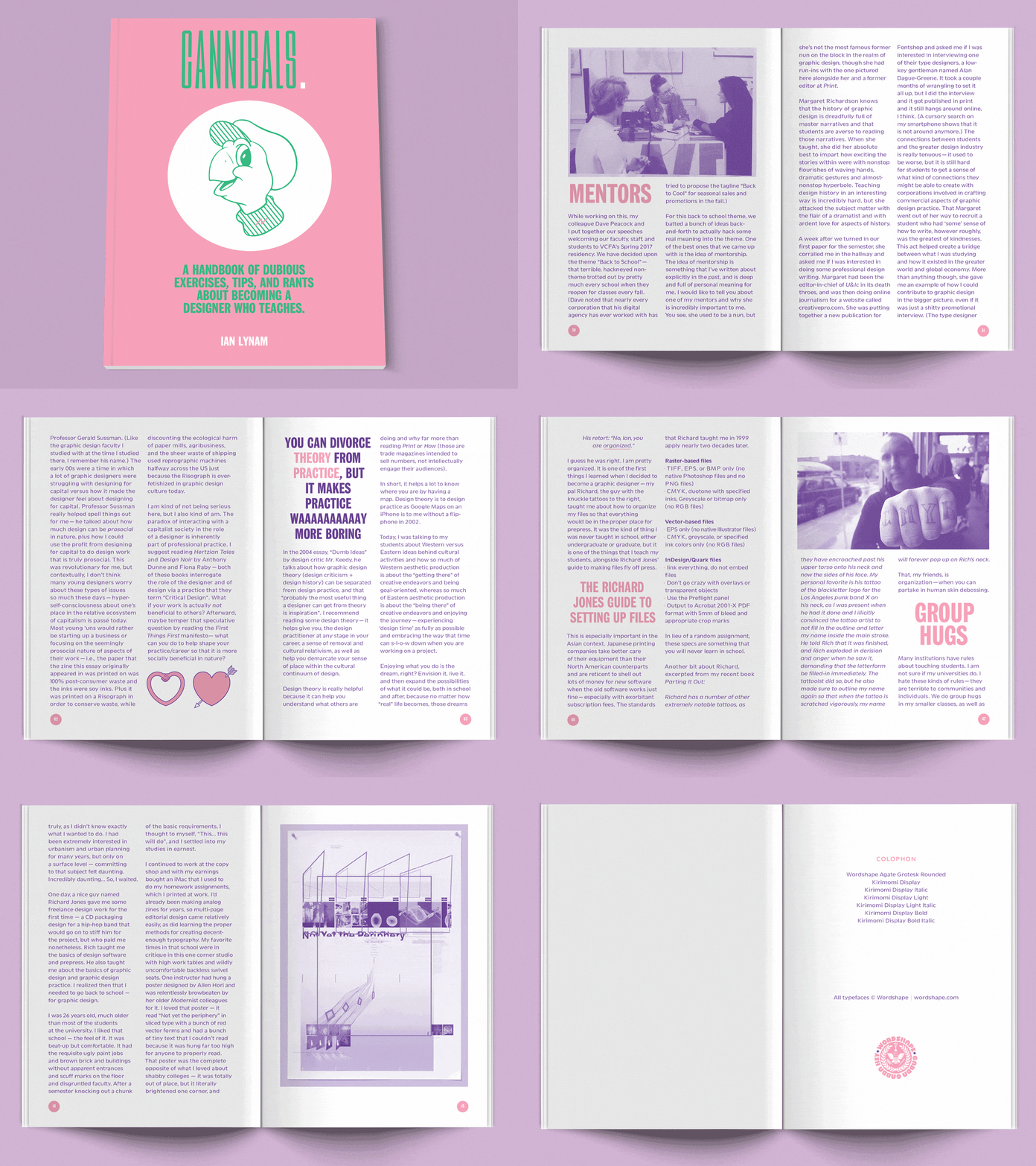
Spreads from Cannibals, 2017
Originally hailing from New York, Ian Lynam has a BS in Graphic Design from Portland State University and an MFA in Graphic Design from CalArts.
Lynam is former Co-Chair and faculty at Vermont College of Fine Arts in the MFA Graphic Design program. Ian is also faculty at Temple University Japan. There, he teaches in the Undergraduate program, actively engaged in developing curricula concerning typography, graphic design, image-making, identity design, UI/UX and motion graphics. He is also faculty in Tokyo at Meme Design School where he teaches bilingual typography and design history.
Currently, Ian writes for Idea Magazine (Japan) and Slanted Magazine (Germany). He is a co-founder of Néojaponisme, a critical cultural online journal.
Ian is one-half of Corinthians, a Tokyo-based art and design curatorial practice with partner Renna Okubo.
