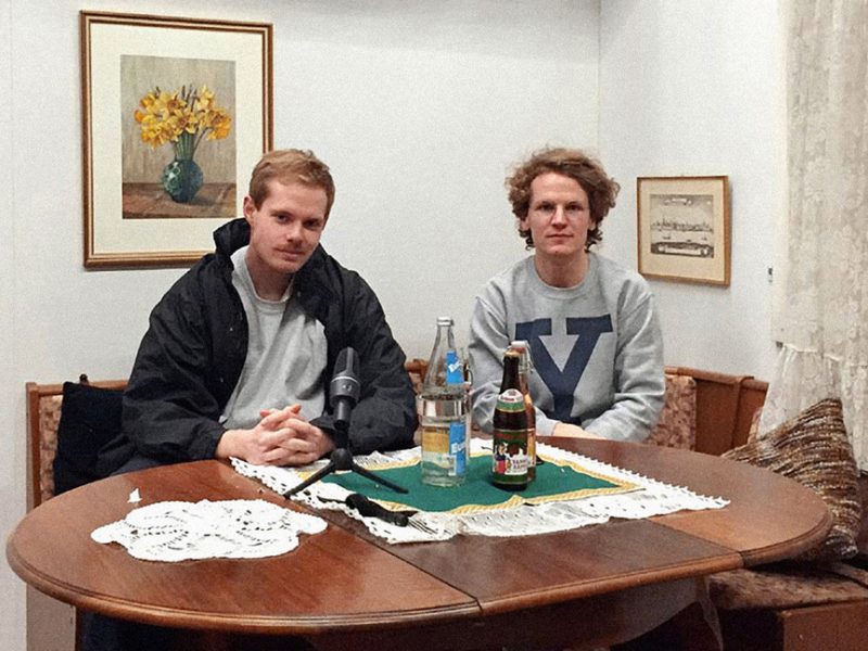
Designers Achim Reichert and Patrick Vollrath of Vier5 discuss typefaces, titles, and touching exhibitions.
Favorite color:
Achim: I don’t have a favorite color.
Patrick: Yellow.
Favorite typeface:
A: Although I don’t have a favorite one, I think that the idea of favorite also depends on the situation. Sometimes it works and sometimes not, and it’s suitable for some stuff and it’s not suitable for other things, so it’s not about liking anything. It’s always this term of “liking.” I tell students liking is not enough. It’s always the interaction between reality and the choice of the artist or the designer to create something more. Two things come together and a bigger thing comes out of it, so it’s not about liking anything. You have to act on reality and change the reality, so it’s not about personal choices.
Favorite type designer:
A: It’s good to know the basics, people like Adrian Frutiger, Hermann Zapf, Gerard Unger. These people made stuff and I find this work very interesting. This work has also helped me, or opinions of them help me—how they see type design now with this new media. Sometimes, even if you don’t look for it, you find some type designers where you think “ah, interesting.” They are also exploring stuff that you want to explore or already did explore. I really think the last five years had a big, enormous change of freedom going on in what type designers are willing to explore, or feel capable [of exploring], or feel they have the right to do. I would say 15 years ago, you as a student didn’t think that you had the right to work like that—to make typefaces that perhaps are not legible, or don’t look elegant, or don’t look professional. This really changed and the idea that it has to look good or it has to have impact is enough. If it’s good, if it looks good, it is valid. It has the right to exist.
P: If I make a poster, the thing is I use imagery that I did on my own and I like to use a typeface that I also did on my own. If you use a typeface that’s from somebody else, it becomes something like a remix of something. It’s not my own work anymore. I think that’s the important thing—to use self-made typefaces. You don’t want to work with the work of somebody else.
A: Which was done 15 years ago, 50 years ago, also in a completely other history.
P: Or from another time.
Favorite album cover design:
A: About cover design I can only say that, when I was student, this was the most interesting field—to work in music, to make cover designs, to get in contact with musicians. At the time it was techno music and you had the possibility to create form or space that is then distributed and that people can see is used. This is very thrilling for a graphic designer, and he can do a product and be glad that we create products that are then in the world. People could touch it and vinyl is a very good format. It’s big enough, and it has a certain value, so this was one of the most interesting things. Also music was part of culture—of youth culture, and other culture, and contemporary culture which defined it also, and this changed as everybody knows. So, at the moment, I have no relation to it. Also, perhaps it would be too easy. I think I would need time to make something really interesting for a music cover because I’m totally out of it. I don’t see the problematics. If I do work for someone for an exhibition, people come [to me] now and I can create or solve problems; I can help this movement of people, all these things that interact with people like orientation systems. I’m interested in where I can trigger feelings or where I can change the way people see stuff in exhibition design for example. The thing with illustrative work I have—I can’t do this. I can’t do an illustration, but you need an illustration on music perhaps. I just have to have someone ask me to do, then we will see.
P: I made CD covers, but they were illustration. What I like on music covers is, for example, old Snoop Dogg covers where they are completely illustrated. They have nice colors and nice drawings. That’s what I like.
Favorite book or book design:
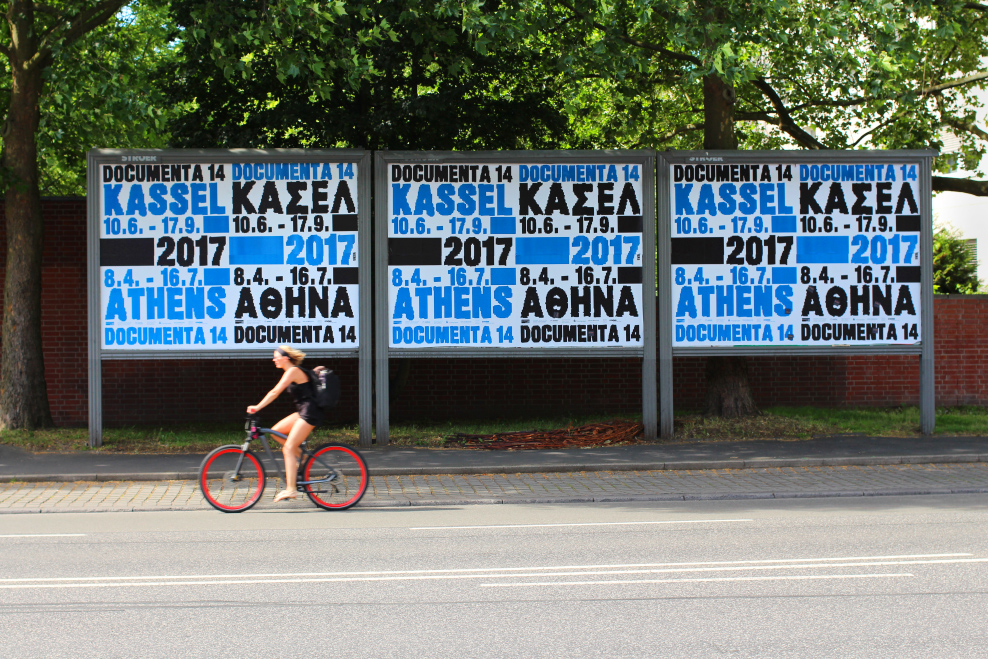
A: I was at a fair in Paris—Offprint. All these independent publishers show their work and there was a Mexican stand with a Mexican editor, and he had a very interesting printing technique using two colors which have nothing to do [with each other] and they make a big contrast. One was violet and pink only, and neon orange. It was a little more like a leaflet where they did steal our graphic design we made for documenta at Athens, because this was a book talking about the documenta at Athens. It was done by people who were not against documenta, but they were very critical to what was going on in that summer. They used our graphic design to make a title and everything, and this I liked. The text was more like citations, but it was not a novel; it was more like a little book. When we do books, I really have problems doing a nice cover or something elegant, or that is a nice object which feels good and everything fits together. I have a difficult relationship with that. I have no capacity for that and no feeling, but if I find something like that then I’m really into it. Then I really feel it and I enjoy reading it.
P: I have no favorite books in terms of book design and it’s not so interesting for me. I use books to learn something; I don’t look at design.
Favorite film:
A: The last film I remember spontaneously is from Gaspar Noé. I always like these films, also the title sequences are awesome. I like this new style of horror movies like It Follows. I like this thing of a reality which is normal but you have one [thing] that’s a change of the reality because something is going on that is bizarre.
Like Yorgos Lanthimos?
A: Yeah, stuff like that, sure. I think he’s more popular in the states, no? In Germany nobody would know this guy. This guy is great. I also like comedy and all this Netflix stuff about Mexican football clubs and this stuff playing in West Covina like Crazy Ex-Girlfriend. I’m really consuming a lot, also with books.
P: I don’t have one.
Favorite title design:
A: It’s changed. There was a period where title design was not new but it was really well done by these people from Imaginary Forces and Kyle Cooper, and also from this French couple [Kuntzel + Deygas]—Catch Me If You Can, for example, was very famous. And now with Gaspar Noé for title design. But there’s not so much going on at the moment. I always wanted to do it, title design, and I also think that it’s cool sometimes but it’s difficult to do really experimental work. I don’t know why—it’s too much work I would say, and also I’m very lazy. [When] doing a typeface you can really work and it’s really direct. It’s like a drawing, but also it makes sense. It has usage and this is what I need—I need that it’s used in the world in reality and not standing for itself, and with title design it’s so much work. It’s all this movement and it’s a lot of freedom sometimes, but also not so much freedom for experiments. What the students did [in the workshop] I found really interesting; I think I have to try to be better to continue that. The second part of that title sequence they really found a good way to work with different typefaces that they created. Someone has to ask me then I can go for this too. It’s always because a title design is mostly the servant of the movie it has to introduce, or it has to create the mood of it and it’s not an independent work. Sure, as a designer you should always try to make work independent, or that could stand alone also, or that has a certain independence inside. But some years ago when I was thinking more about this, this was something that was disturbing me—that I felt second class to, or in second position to, the movie. If it’s good, if the whole thing should be good, I should step behind the movie and this I couldn’t do. If we do a poster for an art exhibition, for example, the poster for the art exhibition is influenced by or is in reaction to the art exhibition. It’s a reaction to the space, it’s a reaction to the time, but it’s our thing and it should be the best we can do on the medium of the poster, and the poster medium is our medium. The content is an influence or it helps, sure, but the movie opening sequence is not my medium. It is part of the movie that is not mine, but it’s a problem that can be solved. I have to think about it—how to get rid of this problem.
P: My favorite movie titles are from the 60s from a James Bond movie, Goldfinger, where the text was projected on a woman. She was all painted in gold and letters were across her body, and as she moved the letters were kind of disturbed. That’s a great example of movie titles.
Favorite exhibition:
P: I’ve been to Paris’s Centre Pompidou and seen David Hockney. That was a really great exhibition, really good paintings.
A: Yeah I was crying in that exhibition. I really had tears in my eyes just seeing it. The last really touching exhibition was Cy Twombly in Munich at Museum Brandhorst. There were really big images—only gestural, with color and big space. I was standing there and I said “Achim, why do you work so small?” It was so big and so touching and so powerful, and it showed me what possibilities we have as a designer or as a person to create, and that you should not be limited by anything and that you can always go for the biggest thing. I knew this work [before], but that exhibition persuaded me of him because it is not only about elegant gestural stuff, it’s really about impact.
Something people may not know:
A: I think what I realize now is that we get in contact with people and these people also know friends of us, and that the world is very small. We have friends or people in the past we were playing football with, or we did stuff together, and now they are completely in another part of the world and have their career too and are known for their specialties. In the past, we were close friends or we did a project together for some years and [now] they are also known for and recognized for what they are doing. Like Eike König, for example, was here [at CalArts] last year and we know him from Frankfurt days, from music days. We had not had so much contact the last ten years, but I would consider him a friend and it was so funny that he was here one year before. There’s no link between us and it’s been years, [but] it’s nice to see that in certain parts of your life it’s important to be somewhere where other good people are that influence you. Or like Ed Fella, who we met in Chaumont eight years ago and now we had the opportunity to meet again. The answer to your question is that I would say people are more linked that it appears normally. All people are linked, and not only in the terms of networking; they really are linked for having part of their lives together.
P: I have nothing to add.
Words of wisdom:
A: The wisdom? The wisdom is “do it.” Just do it.
P: Do what you can’t. If you think you want to do something, but you can’t do it because of “this and this” reason, just do it.
The work of Vier5 is based on a classical notion of design. Design as the possibility of drafting and creating new, forward-looking images in the field of visual communication. A further focus of their work lies on designing and applying new, up-to-date fonts. The work of Vier5 aims to prevent any visual empty phrases and to replace them with individual, creative statements, which were developed especially for the used medium and client.