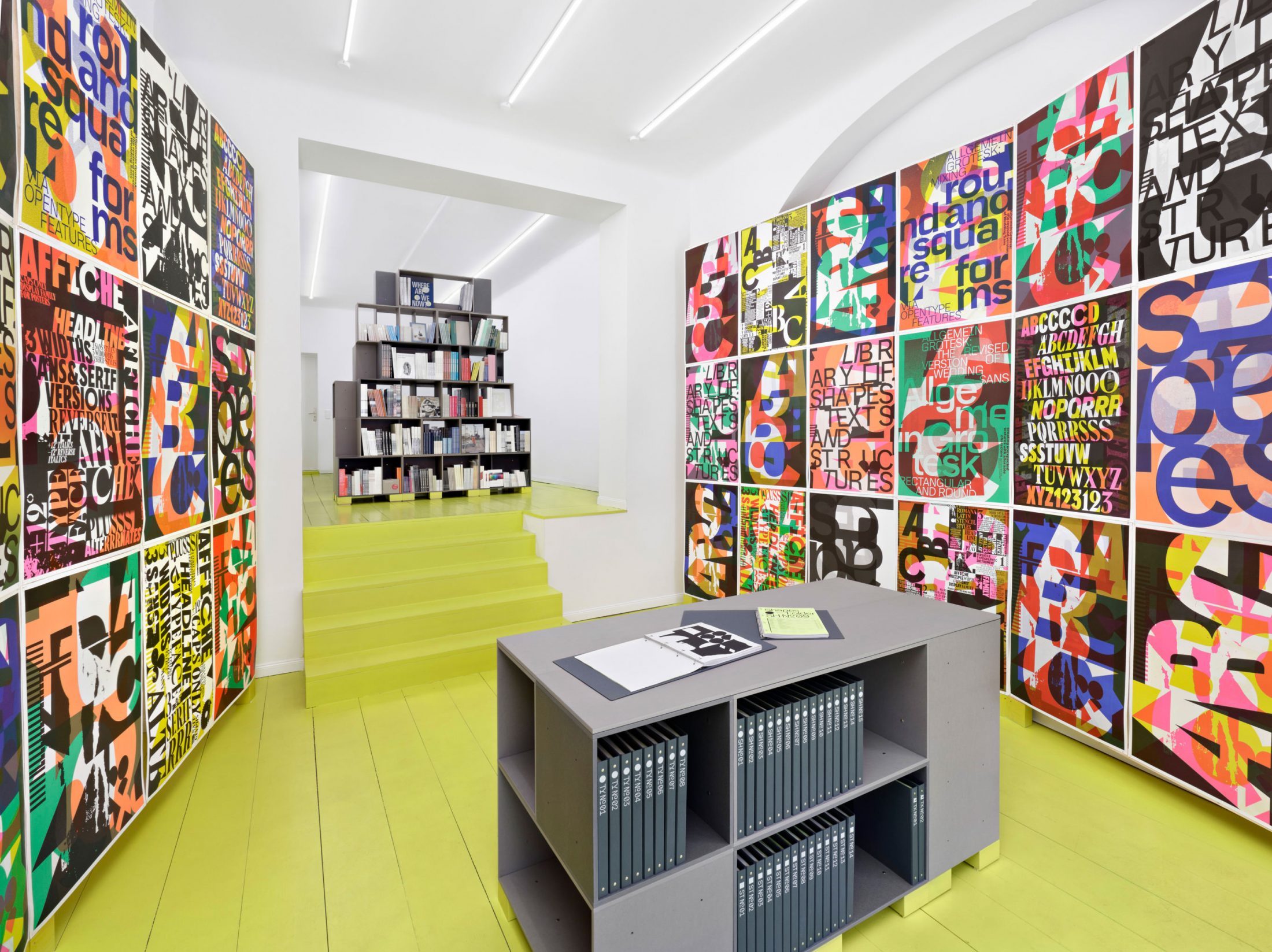
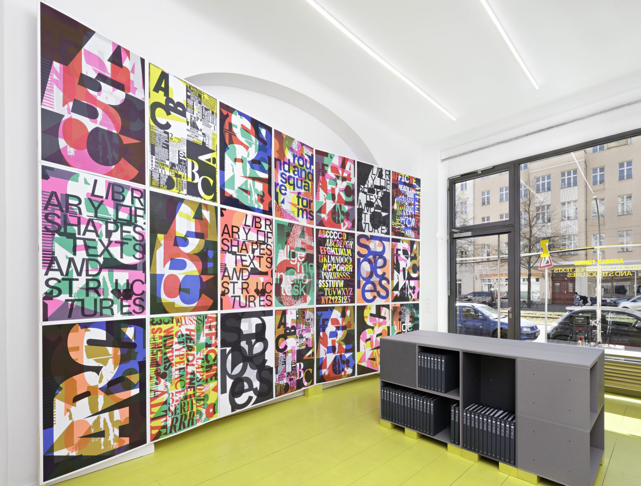
In April, CalArts GD alum Andrea Tinnes MFA ’98 opened her exhibition “Library of Shapes, Texts and Structures” in the new Berlin gallery space, A—Z.
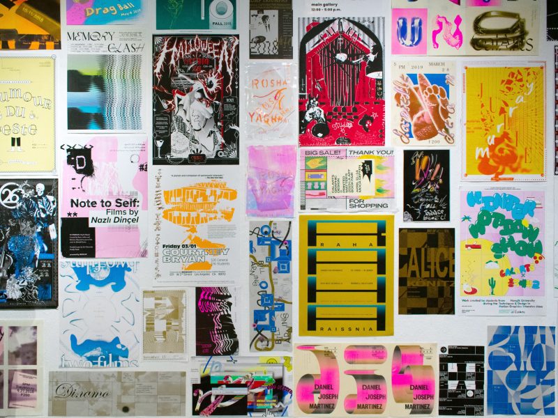
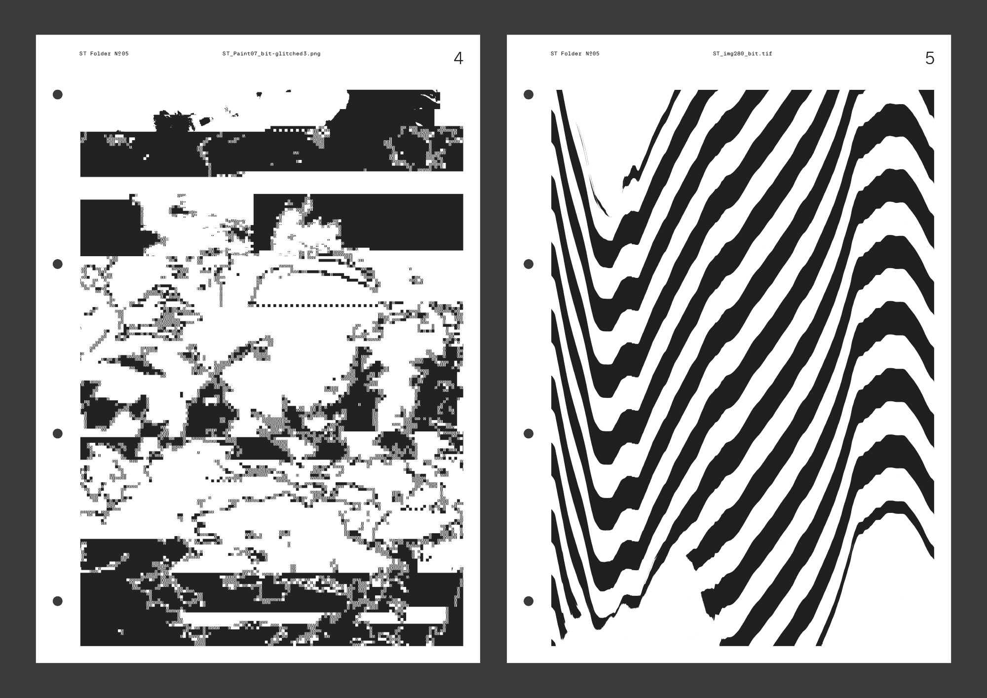
A—Z “aim[s] to develop, showcase and promote projects at the intersectional realm of graphic design, artistic publishing and contemporary art,” and Tinnes uses the space to display her personal archive of collected graphic elements. The library consists of 45 folders with a collection of shapes, texts, and structures, totaling around 4,500 pages, as well as 245 different posters making use of the space.
“The initial concept of the library revolved around the idea of developing and establishing my own visual archive and toolkit—a collection of typefaces, shapes, texts, structures and typographic imagery to actually use in my work or to simply get inspired by,” Tinnes said. “I have been collecting and documenting for quite a while all sorts of visual and typographic material, fragments of texts and ephemera as graphic snapshots and remnants of everyday life. At the same time, an important part of my design practice is the design of alphabets and abstract shapes as well as structures and patterns. Having all these elements and materials scattered around in digital and analogue folders, I felt at some point the need to organize, categorize, and archive the entire material in a logical system in order to access and expand the collection.”
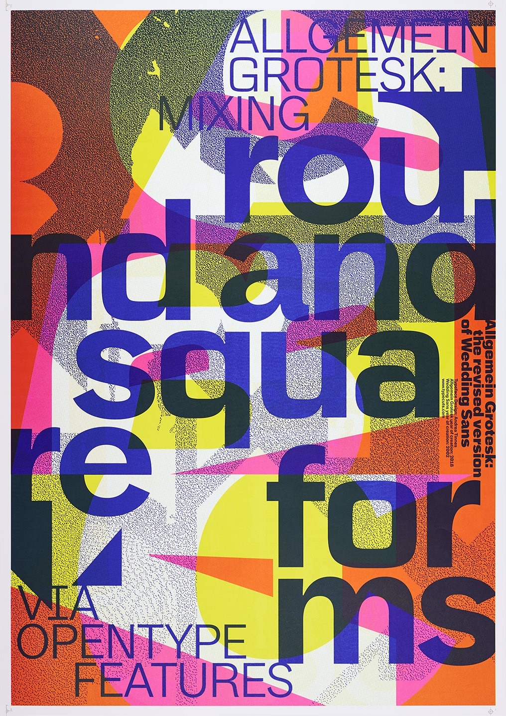
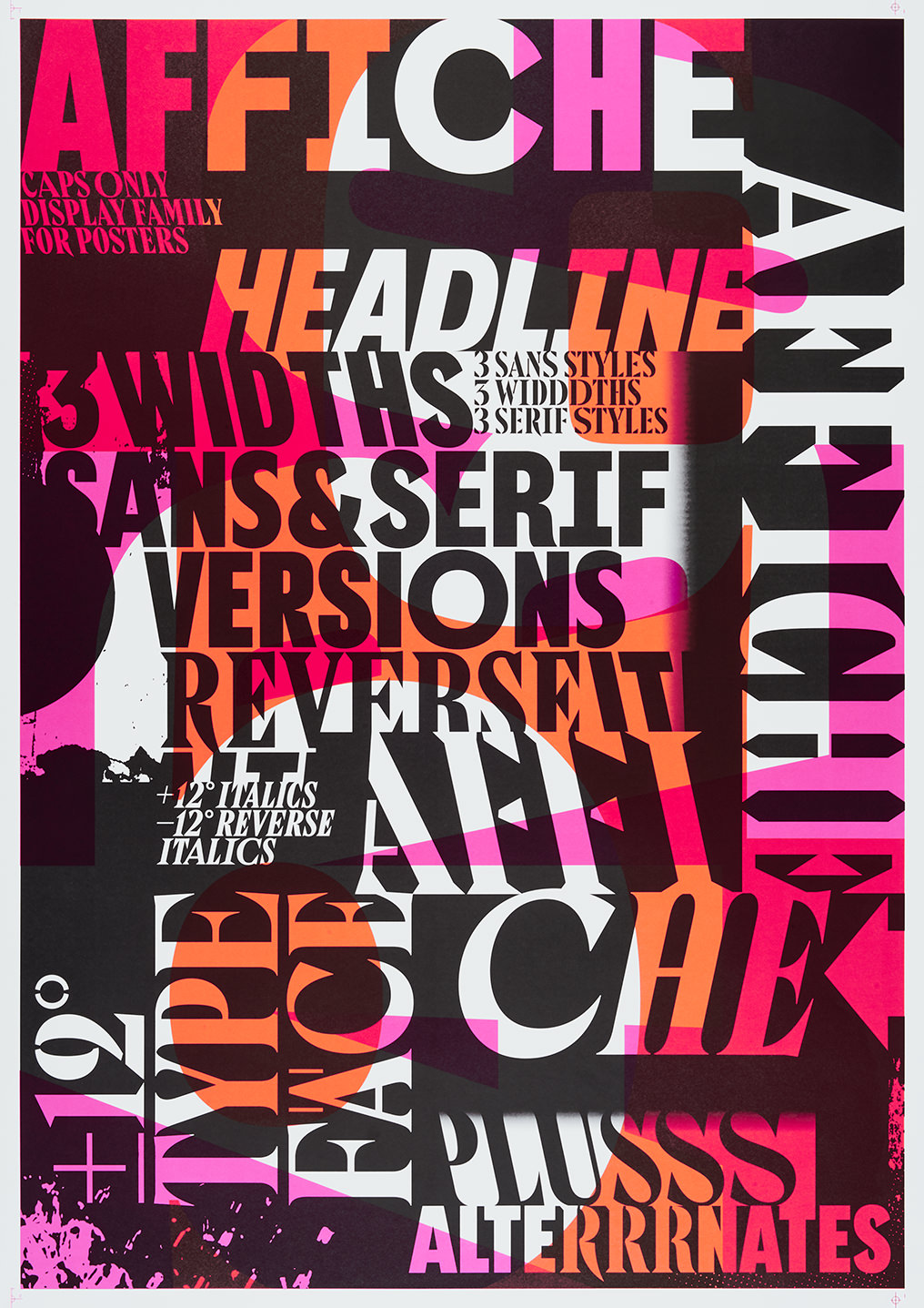
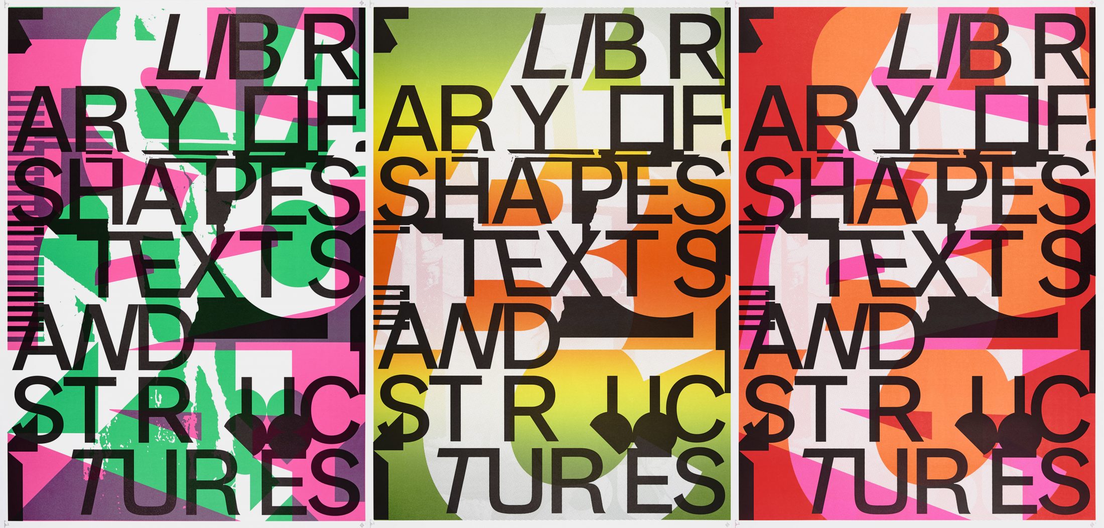
The library also includes two of Tinnes’s typefaces, Allgemein Grotesk and the Affiche Collection, vibrantly displayed through a series of posters meant to show the unique characteristics of the typefaces along with graphic elements from the collection.
“Both typefaces have in common that they collect and combine different skeletons and shapes within one typeface; they also include many different alternate characters and typographic features,” Tinnes said. “In a sense they actually both serve as a library of shapes.”
Tinnes said part of the inspiration behind the poster portion of the exhibition was wanting to make the gallery space “alive and tangible” instead of using traditional type specimen boards.
“I wanted to create kind of a typographic ‘Wunderkammer’ with the dense hanging of the posters within a tight space, a celebration of type with bold graphic statements, and a playful use of color,” Tinnes said. “From my perspective the challenge lies in finding a rather expressive and emotional approach to experience type in a unique spatial atmosphere.”
Organized into three parts, the library’s “Shapes” section focuses on the Allegmein Grotesk and Affiche Collection typographic systems, while the “Structures” section holds analog and digital textures, as well as photographic imagery of vernacular typography.
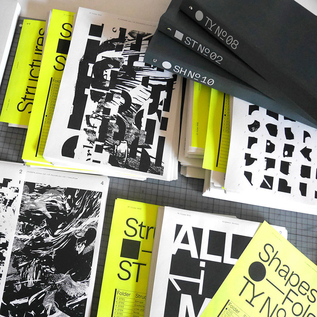
Finally, the “Texts” component contains excerpts from newspapers, magazines, books, and social media posts sorted chronologically. Tinnes stressed the need for these clips to provide background for the more visual parts of the exhibition.
“This ‘textlog’—a simple text document—serves on one side as raw text material for possible future typographic projects,” Tinnes said. “On the other side it’s kind of a diary of my reading habits. This text collection is quite important to me since it adds a contextual layer to the purely visual materials.”
“Library of Shapes, Texts and Structures” is on view through June 8.
Andrea Tinnes is a type designer, typographer and educator based in Berlin. Her design practice is focused on client-based as well as self-initiated projects. Through her own label, typecuts (founded in 2004), she publishes as well as promotes all her type designs and typographic projects. After several years of teaching at Norway’s Bergen Academy of Art and Design she became Guest Professor at Burg Giebichenstein University of Art and Design Halle in 2007 and was appointed Professor of Type and Typography in 2008. In 2010, she was appointed a member of the Art Council of the Federal Ministry of Finance. From 2010 to 2014, she was vice-rector for communication at Burg Giebichenstein, being particularly responsible for the school’s new visual identity.
Andrea has a degree in Communication Design from the University of Applied Sciences Mainz and a Master of Fine Arts in Graphic Design from the California Institute of the Arts. Her work has been featured in many national and international publications and exhibitions and has received many awards, including two “Certificates of Typographic Excellence” and a “Red Dot”.